Classic Analog Gauge
A simple process indicator consisting of one frame, one scale, and one pointer.
EOS SCADA • CIRCULAR GAUGE • MULTI-LAYERED INDICATOR
CIRCULAR_FRAME is not merely a basic indicator that draws a single gauge in EOS SCADA; it is a comprehensive Gauge engine that enables the creation of a wide variety of circular gauge designs by combining different visual layers.
Within a single control, circular frames, scale bars, multiple pointers, colored ranges, text labels, numeric frames, and digital segments can be used together. The resulting designs can then be managed as templates for reuse on SCADA screens.

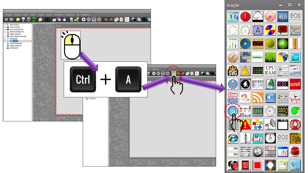
CIRCULAR_FRAME can be considered a core engine that defines the geometry and visual layers of circular gauges. Rather than using a single drawing structure, its source code shows multiple collections working together.
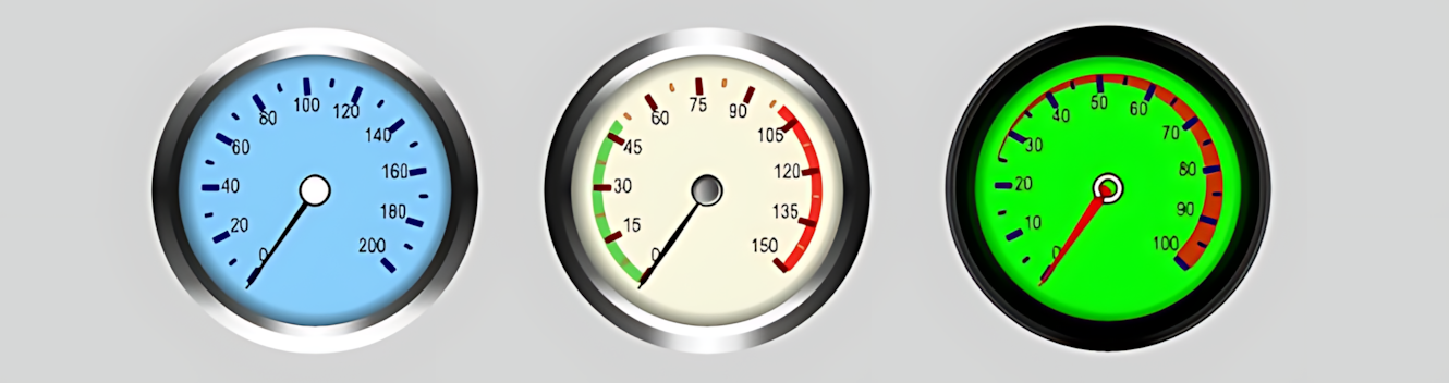
The control brings together the CircularFrames, Scalebars, Pointers, Ranges, Labels, NumericFrameCollection, and DigitalSegments collections. This makes it possible to create either a simple indicator or an advanced, multilayered gauge with multiple pointers using the same underlying structure.
This architecture provides a strong foundation for applying a consistent visual language to different types of equipment on EOS SCADA screens. For example, different scale and pointer arrangements can be created for generator power, turbine speed, pressure, temperature, flow rate, level, or electrical quantities.
The collections that form the foundation of CIRCULAR_FRAME represent the different visual layers of a gauge:
| Collection | EOS Turkish Equivalent | Function |
|---|---|---|
BASEUI_CIRFRAME_COLLECTION[] |
Circular Frames | Defines the gauge's main circular surface, radius, width, colors, gradient, and geometric type. |
BASEUI_SCALEBAR_COLLECTION[] |
Scale Bars | Creates major and minor ticks, scale values, the angular range, and the scale appearance. |
BASEUI_POINTER_COLLECTION[] |
Pointers | Defines the appearance of one or more moving pointers linked to SCADA data. |
BASEUI_RANGE_COLLECTION[] |
Ranges | Displays specific value ranges as colored regions. |
BASEUI_LABEL_COLLECTION[] |
Labels | Places descriptive text and label layers on the gauge. |
BASEUI_NUMFRAME_COLLECTION[] |
Numeric Frame Collection | Provides the foundation for displaying numerical values in a separate visual frame. |
BASEUI_LED_COLLECTION[] |
Digital Segments | Provides the foundation for creating LED-like or digital-segment value displays. |
A structure such as Frame → Scale → Range → Pointer → Label → Numeric Frame → Digital Segment can be created. The source code uses array structures that allow multiple instances of these collections to be defined within the same control.
| Property | EOS Turkish Equivalent | Default | Purpose | Typical Use |
|---|---|---|---|---|
UCType |
Control Type | CIRCULAR_FRAME |
Specifies the type of control. | In the EOS SCADA User Control definition. |
UpdateInterval |
Update Interval | 1000 ms |
Specifies the control's update period. | Visually refreshing live SCADA values. |
DecimalPoint |
Decimal Places | 0 |
Specifies how many decimal places are displayed for numerical values. | Displaying values such as MW, bar, °C, rpm, and m³/h. |
UCBackColor |
Control Background Color | Transparent |
Specifies the control's background color. | Designs that blend into the SCADA screen background. |
UCForeColor |
Control Text Color | Black |
Specifies the control's default text color. | The general appearance of labels and values. |
UCFont |
Control Font | Arial Narrow, 8.25 pt |
Specifies the control's general font. | General text displayed on the gauge. |
BASEUI_CIRFRAME_COLLECTION creates the gauge's primary circular surface. Supporting multiple circular frames makes it possible to create nested or overlapping visual layers.
| Property | EOS Turkish Equivalent | Default | Purpose |
|---|---|---|---|
FrameLocation |
Frame Location | (5,5) |
Specifies the frame's position within the control. |
Radius |
Radius | 140 |
Specifies the size of the circular frame. |
FrameWidth |
Frame Width | 10 |
Specifies the frame thickness. |
CFMainColor |
Main Color | Black |
Specifies the circular frame's main color. |
CenterColor |
Center Color | Black |
Specifies the center color of the frame graphic. |
CFEndColor |
End Color | LightSkyBlue |
Used as the gradient or ending color. |
FillGradientType |
Fill Gradient Type | Center |
Specifies the fill gradient structure of the circular frame. |
Outline |
Outline | Type3 |
Specifies the frame's outline type. |
FrameType |
Frame Type | Circle |
Specifies the geometric type of the circular frame. |
FrameImage |
Frame Image | "" |
Allows an image file to be specified for the frame. |
BackImage |
Background Image | "" |
Allows a background image to be specified. |
Scalebars define the measurement scale of a circular gauge. Properties such as major ticks, minor ticks, value labels, start/end values, and sweep angle can be configured together.
| Property | EOS Turkish Equivalent | Default | Description |
|---|---|---|---|
OffsetFromFrame |
Offset from Frame | 0 |
Specifies the scale bar's position relative to the frame. |
ScaleBarSize |
Scale Bar Size | 2 |
Specifies the size of the scale bar. |
BorderStyle |
Border Style | Notset |
Specifies the scale bar's border style. |
MajorTickNumber |
Number of Major Ticks | 11 |
Specifies the number of major scale ticks. |
TickMajorSize |
Major Tick Size | 3 × 8 |
Specifies the size of the major ticks. |
TickMajorFillColor |
Major Tick Fill Color | DarkBlue |
Specifies the fill color of the major ticks. |
TickMajorEnableGradient |
Enable Major Tick Gradient | false |
Specifies whether gradients are used for major ticks. |
TickMajorTickPosition |
Major Tick Position | Inner |
Specifies the position of major ticks relative to the scale. |
MinorTickNumber |
Number of Minor Ticks | 2 |
Specifies the number of minor ticks between major ticks. |
TickMinorSize |
Minor Tick Size | 2 × 4 |
Specifies the size of the minor ticks. |
TickLabelFontColor |
Tick Label Font Color | Black |
Specifies the text color of the scale values. |
TickLabelAngle |
Tick Label Angle | 0 |
Specifies the angle of the scale labels. |
FillColor |
Fill Color | White |
Specifies the fill color of the scale bar area. |
ShadowOffset |
Shadow Offset | 0 |
Specifies the shadow offset in the scale graphic. |
SweepAngle |
Sweep Angle | 80 |
Specifies the angular span of the scale arc. |
StartValue |
Start Value | 0 |
Specifies the scale's starting value. |
EndValue |
End Value | 200 |
Specifies the scale's ending value. |
StartAngle |
Start Angle | 45 |
Specifies the scale's starting angle. |
CustomLabel |
Custom Label | "" |
Allows a custom label to be defined for the scale. |
CastLabelToInteger |
Cast Label to Integer | false |
Specifies whether the label value is treated as an integer. |
ConnectedFrameID |
Connected Frame ID | "" |
Identifies the frame to which the scale bar is connected. |
One of CIRCULAR_FRAME's greatest strengths is its ability to support multiple pointers on the same gauge. Each pointer can be linked to different SCADA data and can have different geometric and color properties.
| Property | EOS Turkish Equivalent | Default | Purpose |
|---|---|---|---|
PointerDataName |
Pointer Data Name | "" |
Specifies the name of the data represented by the pointer. |
PointerWidth |
Pointer Width | 2 |
Specifies the pointer's thickness. |
PointerLength |
Pointer Length | 55 |
Specifies how far the pointer extends outward from the center. |
FillColor |
Fill Color | Black |
Specifies the pointer's fill color. |
EndColor |
End Color | White |
Specifies the pointer's ending or secondary color. |
BorderColor |
Border Color | Black |
Specifies the pointer's border color. |
EnableBorder |
Enable Border | true |
Specifies whether the pointer border is drawn. |
EnableGradient |
Enable Gradient | false |
Specifies whether a gradient is used on the pointer. |
PointerShapeType |
Pointer Shape Type | Type2 |
Specifies the pointer's geometric shape. |
OffsetFromCenter |
Offset from Center | 0 |
Adjusts the pointer's position relative to the center. |
PointerImage |
Pointer Image | "" |
Allows an image file to be used for the pointer. |
PointerPosition |
Pointer Position | Inner |
Specifies the pointer's position relative to the scale. |
CapPointerVisible |
Show Pointer Cap | true |
Specifies whether the pointer's center cap is visible. |
CapType |
Cap Type | Type1 |
Specifies the geometric type of the center cap. |
CapOnTop |
Cap on Top | true |
Specifies the drawing order of the center cap. |
CapPointerFillColor |
Pointer Cap Fill Color | Black |
Specifies the fill color of the center cap. |
CapPointerDiameter |
Pointer Cap Diameter | 15 |
Specifies the diameter of the center cap. |
Three different pointers can be defined on the same circular gauge for Active Power, Reactive Power, and the Setpoint. Since the source code supports multiple BASEUI_POINTER_COLLECTION items, these types of compositions are compatible with the engine's architecture.
BASEUI_RANGE_COLLECTION is the layer used to visually highlight specific value ranges on the measurement scale. Colored zones can be created to help operators quickly identify conditions such as normal, warning, and critical ranges.
| Property | EOS Turkish Equivalent | Default | Description |
|---|---|---|---|
RangeDataName |
Range Data Name | "" |
Specifies the data name associated with the range. |
RangePosition |
Range Position | Inner |
Specifies the range's position relative to the scale or frame. |
StartValue |
Start Value | 0 |
Specifies the starting value of the range. |
EndValue |
End Value | 50 |
Specifies the ending value of the range. |
StartWidth |
Start Width | 5 |
Specifies the range's starting thickness. |
EndWidth |
End Width | 1 |
Specifies the range's ending thickness. |
EnableGradient |
Enable Gradient | false |
Specifies whether a gradient is used for the range color. |
FillColor |
Fill Color | Red |
Specifies the range's primary color. |
EnableBorder |
Enable Border | false |
Specifies whether the range border is drawn. |
OffsetFromScale |
Offset from Scale | 0 |
Specifies the distance between the range and the scale. |
Opaque |
Opacity | 255 |
Specifies the range's transparency/opacity value. |
ConnectedScaleBarID |
Connected Scale Bar ID | "" |
Identifies the scale bar to which the range is connected. |
ConnectedFrameID |
Connected Frame ID | "" |
Identifies the frame to which the range is connected. |
| Property | EOS Turkish Equivalent | Default | Description |
|---|---|---|---|
LabelLocation |
Label Location | (0,0) |
Specifies the label's position within the control. |
LabelText |
Label Text | "" |
Specifies the text to display. |
LabelColor |
Label Color | Black |
Specifies the label text color. |
LabelFont |
Label Font | Arial, 10 pt |
Specifies the label font. |
LabelAngle |
Label Angle | 0 |
Specifies the label's rotation angle. |
DisplayBorder |
Display Border | false |
Specifies whether a border is displayed around the label. |
BorderWidth |
Border Width | 1 |
Specifies the width of the label border. |
BorderColor |
Border Color | Black |
Specifies the color of the label border. |
UseGradient |
Use Gradient | false |
Specifies whether a gradient is used in the label area. |
ShadowOffset |
Shadow Offset | 0 |
Specifies the offset of the label shadow. |
BackgroundImage |
Background Image | "" |
Allows a background image to be used in the label area. |
ConnectedFrameID |
Connected Frame ID | "" |
Specifies the frame associated with the label. |
CIRCULAR_FRAME is not limited to analog pointers. The presence of separate collections for NumericFrameCollection and DigitalSegments in the source code indicates that an analog gauge can be combined with a numerical or LED-style display in the same visual.
For example, an analog scale and pointer can be placed in the outer frame, a numerical value in the center, a unit label in the lower section, and an LED-like digital display in a separate area.
Important: Since the internal properties of the BASEUI_NUMFRAME_COLLECTION and BASEUI_LED_COLLECTION classes are not provided in the supplied source code, their detailed sub-property lists have not been expanded on this page based on assumptions.
The ConnectedFrameID and ConnectedScaleBarID fields in the source code indicate that visual layers can be associated with one another.
| Connection | EOS Turkish Equivalent | Purpose |
|---|---|---|
ConnectedFrameID |
Connected Frame ID | Associates a layer, such as a scale, pointer, range, or label, with a specific circular frame. |
ConnectedScaleBarID |
Connected Scale Bar ID | Associates a layer, such as a range or pointer, with a specific scale bar. |
A simple process indicator consisting of one frame, one scale, and one pointer.
A multilevel display using multiple circular frames and different range layers.
Compare different SCADA data values using multiple pointers on the same scale.
Display normal, warning, and critical zones as colored ranges.
Combine pointer-based displays with numerical values or digital segments.
Designs that allow image files to be used for frames and pointers.
One important use of CIRCULAR_FRAME is to treat a gauge designed once as a template that can be reused later on SCADA screens.
In industrial HMI/SCADA systems, analog gauges are used to help operators quickly identify the current position of a process value on a scale, recognize normal and warning zones, and compare multiple indicators when necessary. Siemens WinCC documentation describes the Gauge Control as a way to display measured values in an analog clock-style format and mark warning or danger zones with colors. citeturn0search36turn0search40
| Application Area | Example Values | Design with CIRCULAR_FRAME |
|---|---|---|
| Electricity Generation | Active power, reactive power, voltage, current, frequency | Single or multiple pointers; different scales and ranges. |
| Hydroelectric Power Plants | Unit power, turbine speed, flow rate, pressure | Analog pointer + critical range + numerical value. |
| Process Plants | Pressure, temperature, flow rate, level | Distinguishing normal, warning, and critical zones using colors. |
| Motors and Rotating Equipment | Speed, load, temperature, vibration | Technical scale + pointer + alarm ranges. |
| Energy Management | Load, generation, consumption, efficiency | KPI-focused gauges and multiple displays. |
| Machine HMI | Speed, position, pressure, temperature | Compact gauge templates. |
Rockwell's Gauge documentation also describes gauges as graphical elements used in manufacturing systems, where controller values can be visualized through needle movement. citeturn0search9 Siemens' current HMI documentation likewise explains that the Gauge object is used to present numerical values as an analog indicator and visually identify the normal range. citeturn0search40
The purpose of a gauge is not merely to create an attractive graphic, but to make critical process information visible quickly. The scale, pointer, and colored ranges should therefore complement one another. Industrial HMI documentation shows that gauges are used to support rapid perception and visually distinguish normal and warning conditions. citeturn0search36turn0search0
Because the engine supports many layers, not every feature needs to be used on every gauge. Readability may decrease when too many pointers, scales, labels, and ranges are displayed simultaneously. When preparing a template, it is better to select only the layers that support operator decision-making.
The CIRCULAR_FRAME user control cannot be resized with the mouse. Therefore, its exact dimensions must be determined before placing it on the SCADA screen.
In particular, Radius, FrameLocation, pointer lengths, scale positions, label positions, and the numerical fields in the center are geometrically interdependent. It is therefore important to design the template with the target screen dimensions in mind.
Radius and FrameLocation accordingly.| Source Structure | Function |
|---|---|
BASEUI_CIRFRAME_COLLECTION[] |
Circular frame layers |
BASEUI_SCALEBAR_COLLECTION[] |
Scale and tick layers |
BASEUI_POINTER_COLLECTION[] |
Pointer layers linked to SCADA data |
BASEUI_RANGE_COLLECTION[] |
Value range and color layers |
BASEUI_LABEL_COLLECTION[] |
Text and label layers |
BASEUI_NUMFRAME_COLLECTION[] |
Numeric frame layer |
BASEUI_LED_COLLECTION[] |
Digital segment layer |
CIRCULAR_FRAME provides a powerful foundation for advanced gauge design among EOS SCADA user controls. Its key distinction from simpler analog indicators is that, instead of relying on a fixed display with a single pointer and scale, it allows multiple independent visual collections to be combined.
With this architecture, the same engine can be used to design a simple analog indicator, a multi-ring gauge, a multi-pointer gauge displaying several SCADA values, a process indicator with colored alarm ranges, or a specialized gauge combining analog and digital information.
The most important design rule is to determine the actual dimensions of the SCADA screen where the control will be used from the outset. Since the control cannot be resized with the mouse, CIRCULAR_FRAME becomes a powerful standardization tool when used as a set of specially designed and tested template library elements.

Free Software Download Center
Software for industrial data collection, monitoring, and analysis.

Technical Support
Software documentation, sample code, and practical technical information.
You can contact us regarding EOS software, technical documentation, or industrial data communication.