Text Layer
GaugeText defines the main text, while UCFont, UCForeColor, and UCBackColor determine its basic appearance.
EOS SCADA • CUSTOMTEXT • STYLED TEXT • DATA STATES
CUSTOM TEXT SHAPE (CUSTOMTEXT) is a flexible user control used to display text on EOS SCADA screens in different visual formats using shape, direction, alignment, and rotation properties, rather than displaying it as plain text.
The control can be used to display fixed text or text associated with SCADA data. In addition, the TEXT STATE COLLECTION structure allows different text, background colors, text colors, and flashing behaviors to be defined for different data states.

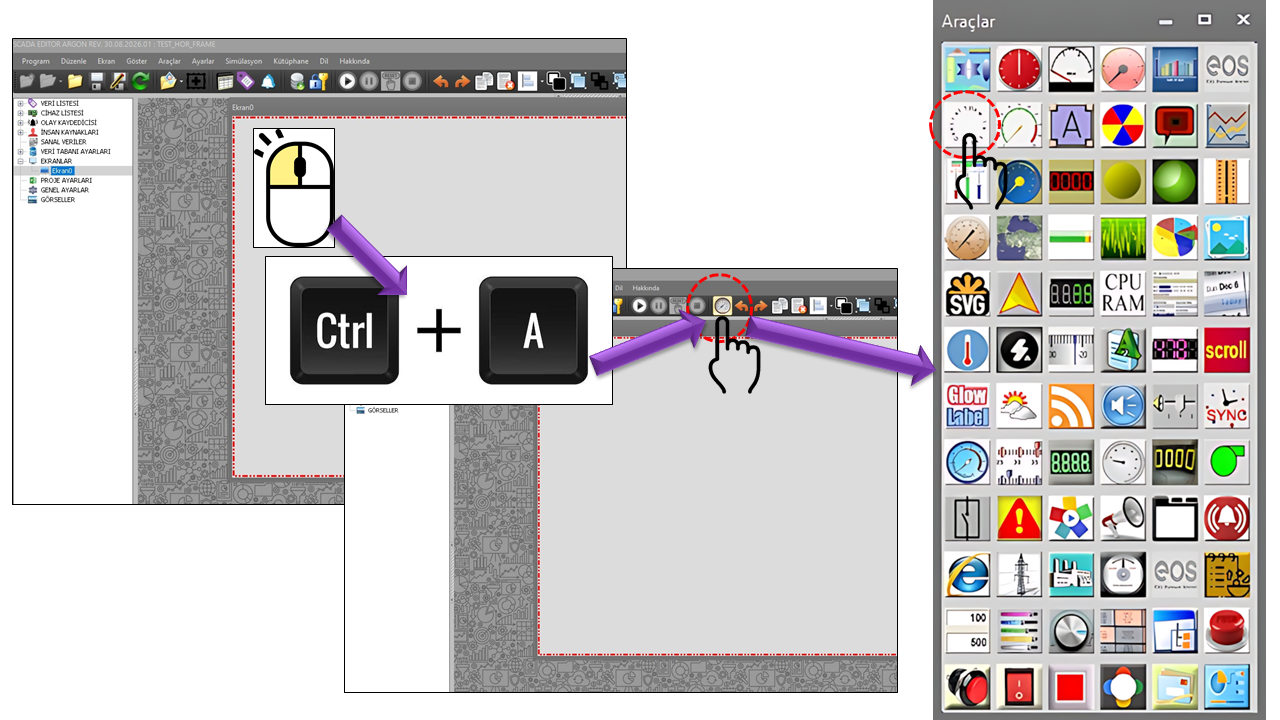
CUSTOMTEXT is a User Control that can be used to transform text-based information into a visual object on SCADA operator screens. In addition to fundamental visual properties such as text position, direction, format, rotation angle, and border style, the source code includes a TEXT Data States collection associated with data levels.
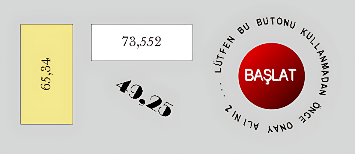
This structure makes it possible to configure the same screen object to display text with different meanings under different operating conditions. For example, different status messages and colors can be used at different levels of a process value. Blinking can be enabled at a particular level to attract the operator's attention.
Core concept: Rather than viewing CUSTOMTEXT as merely an "object that displays text," consider it a display layer that provides the textual and visual representation of SCADA data.
GaugeText defines the main text, while UCFont, UCForeColor, and UCBackColor determine its basic appearance.
TextAlign, TextDirection, TextOrientation, and RotationAngle determine the text's visual form.
The TEXTDataStates collection stores state properties such as thresholds, colors, and BlinkActive.
The main CUSTOMTEXT properties defined in the source code are listed below.
| Property | EOS Turkish Equivalent | Default | Purpose | Typical Use |
|---|---|---|---|---|
UCType |
Control Type | CUSTOMTEXT |
Defines the type of the user control. | Creating the Custom-Shaped Text control. |
UpdateInterval |
Update Interval | 1000 ms |
Specifies the control's update cycle. | On screens where SCADA data is refreshed periodically. |
DecimalPoint |
Decimal Places | 0 |
Specifies the number of decimal places used when displaying numerical data as text. | When numerical SCADA values are displayed within text. |
UCBackColor |
Control Background Color | Gray |
Specifies the control's default background color. | Defining the visual background of the text area. |
UCForeColor |
Control Text Color | Yellow |
Specifies the control's default text color. | On screens where text must stand out against the background. |
UCFont |
Control Font | Arial Narrow, 8.25 pt |
Specifies the control's default font. | Adjusting the size and typography of text. |
| Property | EOS Turkish Equivalent | Default | Purpose | Typical Use |
|---|---|---|---|---|
TextAlign |
Text Alignment | Middlecenter |
Specifies how the text is aligned within the control area. | Headings, status messages, values, or descriptive text. |
GaugeText |
Gauge Text | TEXT |
Defines the main text to be displayed. | Static text or the control's primary text content. |
TextDirection |
Text Direction | Clockwise |
Specifies the direction in which the text is arranged. | Circular or direction-oriented text layouts. |
TextOrientation |
Text Orientation | Rotate |
Specifies the text's geometric presentation style. | Circular, arc-shaped, or rotated text designs. |
RotationAngle |
Rotation Angle | 0 |
Specifies the text's rotation angle. | Angled headings and custom screen layouts. |
BorderStyle |
Border Style | None |
Specifies how the control border is displayed. | On screens where the text object's boundary must be visible or hidden. |
TEXTDataStates |
Text Data States | new TEXT_STATE_COLLECTION[0] |
A collection that stores different text and appearance properties according to data levels. | Text displays based on states, levels, or thresholds. |
Terminology note: The dictionary uses "Text Direction" as the Turkish equivalent for both TextDirection and TextOrientation. Although these are separate technical properties, they share the same Turkish translation.
The GNKonum enumeration defines nine basic positions for text within the control area.
| Technical Value | English Description | Typical Use |
|---|---|---|
Topleft |
Top Left | Headings and corner information |
Topcenter |
Top Center | Top heading |
Topright |
Top Right | Status or identification information |
Middleleft |
Middle Left | Side descriptions |
Middlecenter |
Middle Center | Main value or status |
Middleright |
Middle Right | Value and unit placement |
Bottomleft |
Bottom Left | Bottom description |
Bottomcenter |
Bottom Center | Bottom heading or status |
Bottomright |
Bottom Right | Identification or auxiliary information |
| Enum | Value | English Description |
|---|---|---|
GNMetinSekli |
Circle |
Circular |
GNMetinSekli |
Arc |
Arc |
GNMetinSekli |
Rotate |
Rotated |
GNSaatYonu |
Clockwise |
Clockwise |
GNSaatYonu |
Anticlockwise |
Counterclockwise |
One of CUSTOMTEXT's greatest strengths is its TEXT_STATE_COLLECTION (TEXT STATE) collection.
The source code defines fields for background color, text color,
threshold, and blinking behavior for each state record.
| Property | Default | Meaning in the Source Code |
|---|---|---|
LevelBackColor |
White |
Stores the background color for the level data value. |
LevelForeColor |
Black |
Stores the text color for the level data value. |
LevelThreshold |
10 |
Stores the threshold value for the level data. |
BlinkActive |
false |
Specifies whether blinking is enabled for the relevant level. |
The following example is conceptual. Since the source code does not show which algorithm is used to select thresholds, it is provided only to illustrate state design.
| Level | Example Threshold | Example Text | Background Color | Text Color | Blinking |
|---|---|---|---|---|---|
| Normal | 10 |
READY | White | Black | No |
| Warning | 50 |
WARNING | Yellow | Black | No |
| Alarm | 80 |
HIGH ALARM | Red | White | Yes |
Visual presentation of operating states such as RUNNING, STOPPED, AVAILABLE, and FAULT.
Displaying power, load, or generation values together with text.
Representing values such as temperature, pressure, level, and flow rate with different text and appearances at critical levels.
Directing the operator's attention to a specific condition through state-dependent text, colors, and blinking.
Displaying the status of pumps, valves, motors, breakers, generators, and auxiliary systems using concise text.
Creating specialized SCADA screens with circular, arc-shaped, or rotated text.
Industrial HMI comparison: The multistate indicator approach in Rockwell FactoryTalk View allows different captions, colors, and images to be displayed according to process conditions.
Siemens WinCC text lists can associate specific values or value ranges with text. The TEXT_STATE_COLLECTION structure in CUSTOMTEXT implements a similar state-based display concept using EOS SCADA's own text and visual properties.
The strength of CUSTOMTEXT lies in its ability to use text as part of the screen's visual composition rather than merely as a label. Circular or arc-shaped text can be used as annotations around equipment symbols. Rotated text can provide compact information in vertical or angled areas.
GNKonum options.| Scenario | Example Text | Shape | State-Based Approach |
|---|---|---|---|
| Generator Operating Status | GENERATOR ONLINE |
Rotate | Different colors for operating levels |
| Pump Status | PUMP RUNNING |
Circle | Normal / warning / fault |
| Tank Level | LEVEL 82% |
Arc | Different appearances based on thresholds |
| Breaker Status | BREAKER CLOSED |
Rotate | Open / closed status text |
| Turbine Load | LOAD 74 MW |
Arc | Text and colors based on load level |
UCType = CUSTOMTEXTUCBackColor, UCForeColor, UCFontGaugeTextTextAlignTextOrientation and TextDirectionRotationAngleBorderStyleTEXTDataStatesLevelThreshold, LevelBackColor, LevelForeColor, BlinkActive| Structure | Content Defined in the Source |
|---|---|
CUSTOMTEXT |
User Control type |
GNKonum |
Nine text alignment positions |
GNSaatYonu |
Clockwise / counterclockwise |
GNMetinSekli |
Circle / Arc / Rotated |
GNCerceveTuru |
None / Single Fixed / Fixed 3D |
TEXT_STATE_COLLECTION |
Level background color, level text color, level threshold, blinking enabled |
CUSTOMTEXT — CUSTOM-SHAPED TEXT turns text information into an active part of the visual design on EOS SCADA screens. Different presentations, such as plain text, rotated text, circular text, and arc-shaped text, can be combined with alignment, direction, and border properties.
More importantly, the TEXT Data States structure is designed to allow a single control to use different visual behaviors at different data levels. This feature provides a visual answer to the question "What is the value?" as well as "What state is this value in?" on SCADA screens.
Summary: CUSTOMTEXT can be viewed as a flexible display control that combines text + shape + direction + alignment + data level + visual state in a single SCADA object.

Free Software Download Center
Software for industrial data collection, monitoring, and analysis.

Technical Support
Software documentation, sample code, and practical technical information.
You can contact us regarding EOS software, technical documentation, or industrial data communication.