Shadow
ShadowState, ShadowColor, and ShadowOffset determine whether a shadow is used, its color, and its position.
EOS SCADA • GLABEL • GLOWING LABEL • USER CONTROL
GLOWING LABEL (GLABEL) is a text-based user control designed to display text and live process data on SCADA screens as animated text enhanced with visual effects such as colors, gradients, shadows, feathering, glow, and pulsing, rather than as static text.
One of the control's strongest features is its ability to display SCADA data using different text and colors according to threshold values. With a 2-, 3-, or 4-level structure, the same GLABEL object can display different text depending on the process value. In particular, 3-level text display allows three different operating states, such as normal, warning, and critical, to be represented within a single text area.

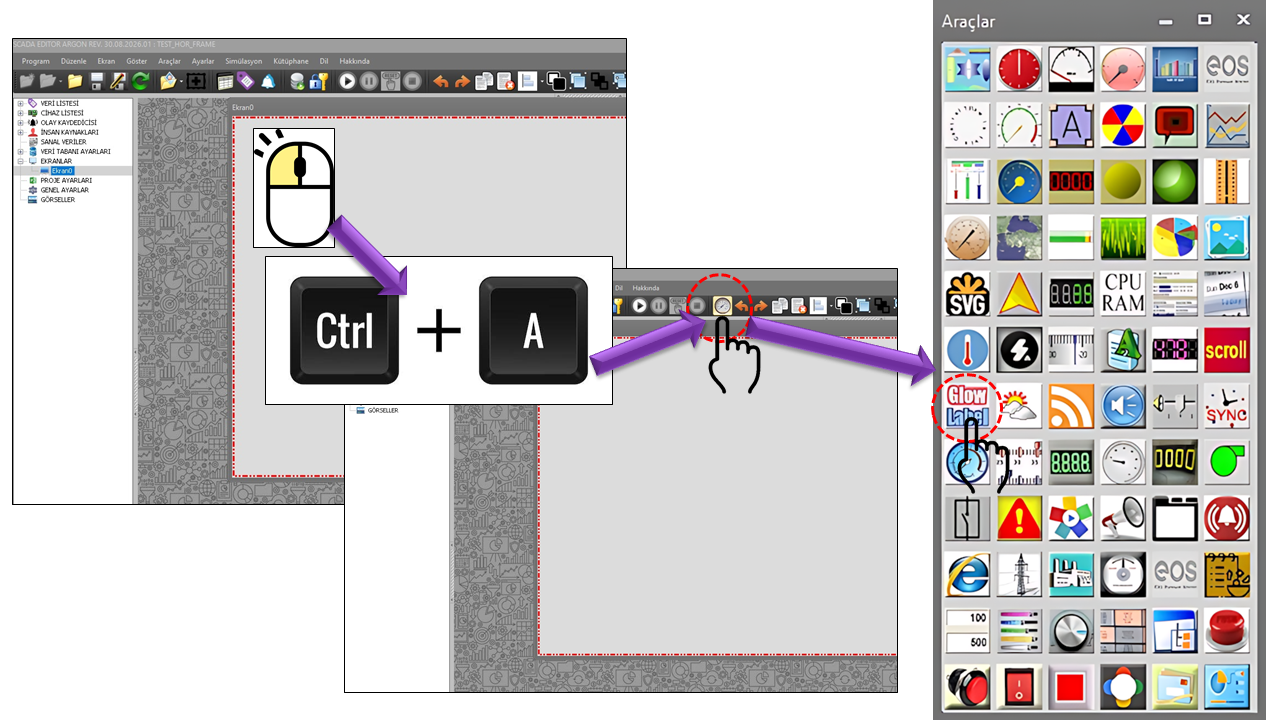
GLOWING LABEL • Live Data • Animated Text • Status-Based Display
GLABEL is one of EOS SCADA's text-oriented user controls. Its name is an abbreviation of GLOWING LABEL. Its primary purpose is to display text or a value received from SCADA in a readable, visually meaningful way that attracts the operator's attention.
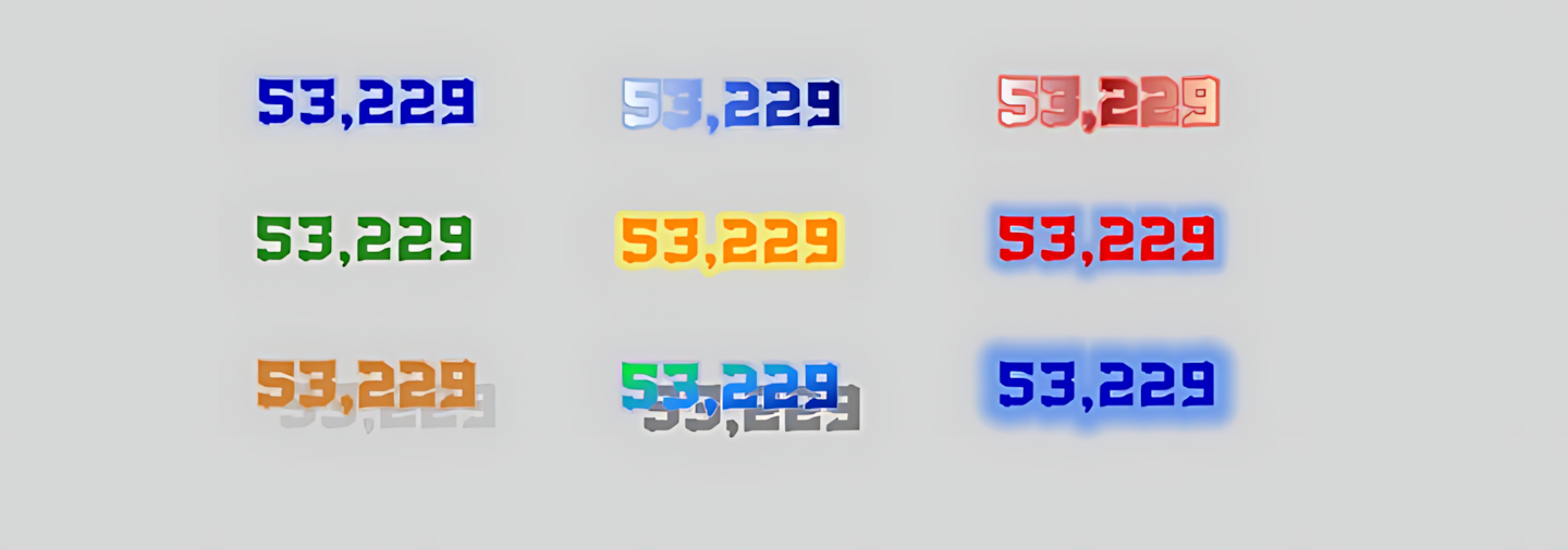
The control can be used to highlight content on the screen, such as headings, status messages, process values, equipment status, operating modes, warning messages, quality information, or centralized notifications.
Text + color + visual effects + threshold-based status can be combined in a single user control. This allows live SCADA data to be presented not merely as a number, but also as meaningful text and a visual status that conveys information to the operator.
The basic operating and appearance properties of the GLABEL user control are listed in the table below. The default values are taken from the supplied source code.
| Property | EOS Turkish Equivalent | Default | Purpose |
|---|---|---|---|
UCType |
Control Type | GLABEL |
Defines the type of the user control. |
UpdateInterval |
Update Interval | 1000 ms |
Specifies the control's update interval. |
DecimalPoint |
Decimal Places | 0 |
Specifies the number of decimal places used to display numeric data. |
UCBackColor |
Control Background Color | Transparent |
Specifies the control's background color. |
UCForeColor |
Control Text Color | MediumBlue |
Specifies the default text color. |
UCFont |
Control Font | Arial Narrow, 12 pt |
Specifies the font and size used for the text. |
AutoFit |
Auto Fit | false |
Determines whether the text is automatically fitted to the control area. |
TextAlign |
Text Alignment | Middlecenter |
Determines the position of the text within the control. |
LabelText |
Label Text | TEXT |
Specifies the default text to be displayed. |
The visual appearance of GLABEL text is determined by FillType. A solid fill uses a single color, while a gradient is created using the defined colors and blend values.
| Property | EOS Turkish Equivalent | Default | Description |
|---|---|---|---|
FillType |
Fill Type | Solid |
Determines whether the text fill is solid or gradient. |
FillTypeLinear |
Linear Fill Type | Horizontal |
Determines the direction of the gradient. |
ForeColorBlend1 |
Color Blend 1 | AliceBlue |
Specifies the first gradient color. |
ForeColorBlend2 |
Color Blend 2 | RoyalBlue |
Specifies the second gradient color. |
ForeColorBlend3 |
Color Blend 3 | Navy |
Specifies the third gradient color. |
BlendValue1 |
Blend Value 1 | 0 |
Specifies the position of the first color within the gradient. |
BlendValue2 |
Blend Value 2 | 0.5 |
Specifies the position of the second color within the gradient. |
BlendValue3 |
Blend Value 3 | 1 |
Specifies the position of the third color within the gradient. |
This is where GLABEL's GLOWING LABEL character comes to life. Text can be enhanced with shadows, soft transitions, glow effects, and pulse animations that change over time.
ShadowState, ShadowColor, and ShadowOffset determine whether a shadow is used, its color, and its position.
FeatherState and FeatherSize determine whether the feather effect is enabled and its size.
GlowState, GlowSize, and GlowColor determine the glow surrounding the text.
| Property | EOS Turkish Equivalent | Default | Purpose |
|---|---|---|---|
ShadowState |
Shadow State | false |
Enables the shadow effect. |
ShadowColor |
Shadow Color | Gray |
Specifies the shadow color. |
ShadowOffset |
Shadow Offset | 5, 5 |
Specifies the horizontal and vertical shadow offsets. |
BorderType |
Border Type | None |
Determines which sides of the text border are used. |
BorderWidth |
Border Width | 1 |
Specifies the border thickness. |
BorderColor |
Border Color | Black |
Specifies the border color. |
FeatherState |
Feather State | true |
Enables the feather effect. |
FeatherSize |
Feather Size | 100 |
Specifies the size of the feather effect. |
GlowState |
Glow State | true |
Enables the glow effect. |
GlowSize |
Glow Size | 8 |
Specifies the size of the glow area. |
GlowColor |
Glow Color | CornflowerBlue |
Specifies the glow color. |
PulseState |
Pulse State | false |
Enables the pulse animation. |
PulseSpeed |
Pulse Speed | 25 |
Specifies the speed of the pulse effect. |
On SCADA screens, animation should not be used for decoration; its purpose is to make a status easier to recognize. Continuously applying glow or pulse effects to a large number of GLABEL objects can increase visual clutter.
One of GLABEL's most important features is the ability to display different text and colors according to the value of SCADA data. By combining TextState and NumberOfLevels, a 2-, 3-, or 4-level status structure can be defined.
DefaultTextDefaultColor
Level1TextLevel1Color
Level2TextLevel2Color
Level3TextLevel3Color
Three-level display is a particularly notable use case for GLABEL. Three different ranges of a process value can be represented by three different text labels. For example, a measurement can be translated into "NORMAL," "WARNING," and "CRITICAL". Assigning a different color to each level also allows the text to function as a visual status code.
| Property | EOS Turkish Equivalent | Default | Description |
|---|---|---|---|
TextState |
Text State | false |
Enables value-dependent status text. |
NumberOfLevels |
Number of Levels | Twolevels |
Selects a 2-, 3-, or 4-level text status structure. |
DefaultText |
Default Text | "" |
Specifies the default text. |
Level1Text |
Level 1 Text | "" |
Specifies the text for level 1. |
Level2Text |
Level 2 Text | "" |
Specifies the text for level 2. |
Level3Text |
Level 3 Text | "" |
Specifies the text for level 3. |
Level1Threshold |
Level 1 Threshold | 50 |
Specifies the threshold for level 1. |
Level2Threshold |
Level 2 Threshold | 75 |
Specifies the threshold for level 2. |
Level3Threshold |
Level 3 Threshold | 100 |
Specifies the threshold for level 3. |
DefaultColor |
Default Color | DarkGray |
Specifies the default text color. |
Level1Color |
Level 1 Color | Lime |
Specifies the text color for level 1. |
Level2Color |
Level 2 Color | Yellow |
Specifies the text color for level 2. |
Level3Color |
Level 3 Color | Red |
Specifies the text color for level 3. |
| Status | Text | Color |
|---|---|---|
| Normal | NORMAL | Lime |
| Warning | WARNING | Yellow |
| Critical | CRITICAL | Red |
This example illustrates how the supplied threshold and color properties can be used on a SCADA screen; the supplied source code does not show the threshold-comparison algorithm.
The enumerations used in the source code are listed below with their English equivalents.
TextAlign — Text Alignment| Enumeration | English Equivalent |
|---|---|
Topleft |
Top Left |
Topcenter |
Top Center |
Topright |
Top Right |
Middleleft |
Middle Left |
Middlecenter |
Middle Center |
Middleright |
Middle Right |
Bottomleft |
Bottom Left |
Bottomcenter |
Bottom Center |
Bottomright |
Bottom Right |
FillType — Fill Type| Enumeration | English Equivalent |
|---|---|
Solid |
Solid |
GradientLinear |
Gradient |
FillTypeLinear — Linear Fill Type| Enumeration | English Equivalent |
|---|---|
Horizontal |
Horizontal |
Vertical |
Vertical |
Forwarddiagonal |
Forward Diagonal |
Backwarddiagonal |
Backward Diagonal |
BorderType — Border Type| Enumeration | English Equivalent |
|---|---|
None |
None |
All |
All |
Bottom |
Bottom |
Top |
Top |
Left |
Left |
Right |
Right |
Topbottom |
Top and Bottom |
Topleft |
Top and Left |
Topright |
Top and Right |
Topleftright |
Top, Left, and Right |
Topbottomright |
Top, Bottom, and Right |
Topbottomleft |
Top, Bottom, and Left |
Bottomleft |
Bottom and Left |
Bottomright |
Bottom and Right |
Bottomleftright |
Bottom, Left, and Right |
Leftright |
Left and Right |
NumberOfLevels — Number of Levels| Enumeration | English Equivalent |
|---|---|
Twolevels |
2 Levels |
Threelevels |
3 Levels |
Fourlevels |
4 Levels |
GLABEL can be used on screens where text needs to communicate a process status or live data quickly and clearly.
Displaying values such as pressure, temperature, level, flow rate, and power together with descriptive text.
Making statuses such as Running, Stopped, Standby, and Fault clearly visible.
Directing the operator's attention to a specific condition through threshold-based text and colors.
Displaying operating modes such as AUTOMATIC, MANUAL, REMOTE, and LOCAL.
Visually highlighting important operational messages.
Emphasizing unit, system, or subprocess headings with visual effects.
One of GLABEL's most powerful use cases is linking live SCADA data to a text status. This allows the operator to read what a value means operationally instead of seeing only a number such as "75."
GLOWING LABEL (GLABEL) is a user control that takes text beyond an ordinary text object on EOS SCADA screens by combining visual effects with status-based text display.
In particular, its 2-, 3-, and 4-level text structure makes it possible to convert live SCADA values into meaningful words for operators. The three-level configuration provides a powerful way to display three distinct operating conditions, such as Normal, Warning, and Critical, through a single text object.
Summary: GLABEL = Text + Live Data + Levels + Color + Gradient + Glow + Pulse.
Free Software Download Center
Software for industrial data collection, monitoring, and analysis.

Technical Support
Software documentation, sample code, and practical technical information.
You can contact us regarding EOS software, technical documentation, or industrial data communication.