Static Text
The control can display a heading, description, equipment name, direction, or informational text without being linked to a process value.
EOS SCADA • LABEL_GRADIENT • TEXT INDICATOR • USER CONTROL
SIMPLE INDICATOR (LABEL_GRADIENT) is a user control designed to display process or system data as text, with various text effects and appearance properties that change according to data states.
One of the control's strongest features is the ability to define different LED states based on the connected data value. A different background color, text color, threshold value, flashing behavior, and display text can be specified for each state. In addition, the control can be used as a static text indicator without being linked to any data state.

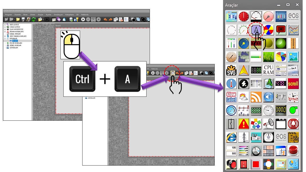
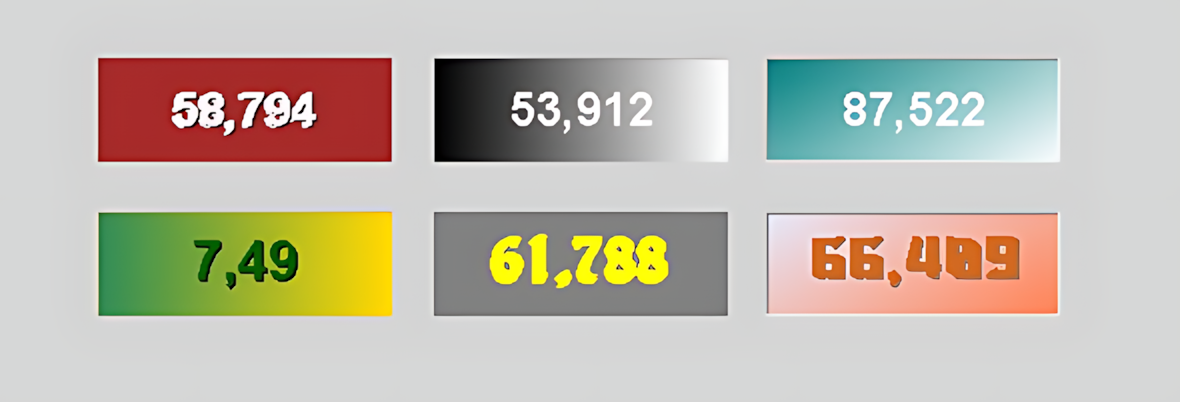
LABEL_GRADIENT can be used to enhance information presentation on SCADA screens with meaningful text and visual status indications rather than limiting it to numerical values. As an alternative to conventional text user controls, it provides richer typography and visual effects.
When a data source is connected, the data value is evaluated against predefined thresholds, and the corresponding LED Data State is activated. This allows the same control to display operating status, fault, ready, disabled, warning, or other project-specific states using different text and colors.
Single control → static text or connected data → threshold-based LED states → state-specific text and visual appearance.
LABEL_GRADIENT supports two basic modes of use. In the first mode, the control is configured to display a static text string directly. In the second mode, the control is connected to a data source and selects the appropriate appearance from the defined LED Data States according to the data value.
The control can display a heading, description, equipment name, direction, or informational text without being linked to a process value.
Different states can be selected according to the connected data value. Each state can have its own text and visual properties.
The LEDDataStates collection can be used to define different states based on threshold values.
By changing the background, text color, and blinking behavior according to the current state, the control can provide more prominent visual feedback to the operator.
When defining LED Data States, it is important to ensure that threshold values do not overlap and that every process state is clearly covered. For critical alarms and operating conditions, use meaningful status text rather than relying on color alone.
BASIC INDICATOR can be used in many SCADA screen designs because the same text control can display different visual states.
Display the status of a motor, pump, fan, valve, or other equipment as text, such as RUNNING / STOPPED / READY / FAULT.
Highlight conditions that require the operator's attention using different text and visual properties.
Instead of displaying a process value directly as a number, describe the range in which the value falls using meaningful text.
Display a static description, equipment name, section name, or operator instruction without a data connection.
Indicate with a short message that an operating condition has been met or that the expected operating state has been reached.
Create visual emphasis during a fault by using different text, colors, and blinking behavior.
The LabelType property determines the basic visual presentation of the text. This allows the same text content to be displayed according to different screen design styles.
This structure can be used to distinguish different levels of information on the same screen. Selecting an effect does not change the process information itself; it only configures the visual presentation of the text.
LED_STATE_COLLECTION is one of the core structures that enables the control to produce different appearances according to the connected data value. Threshold and display information can be defined separately for each state.
| Property | English Description | Explanation |
|---|---|---|
| LevelThreshold | Level Threshold | The threshold value that determines when the data value enters the corresponding state. |
| LevelText | Level Text | The text displayed for the corresponding data state. |
| LevelBackColor | Level Background Color | The background color used for the corresponding state. |
| LevelForeColor | Level Foreground Color | The text color used for the corresponding state. |
| BlinkActive | Blinking Enabled | Determines whether blinking behavior is enabled for the corresponding state. |
For example, the same control can display different text for different ranges of a data value, such as READY, RUNNING, WARNING, or FAULT. The conditions under which these messages are displayed are configured through LED Data States.
| Property | English Description | Default | Explanation |
|---|---|---|---|
| UCType | Control Type | LABEL_GRADIENT | Specifies the type of the user control. |
| UpdateInterval | Update Interval | 1000 ms | Defines the update interval of the control. |
| DecimalPoint | Decimal Places | 0 | Specifies the decimal display setting when numerical data is used. |
| UCBackColor | Control Background Color | Transparent | Defines the overall background color of the control. |
| UCForeColor | Control Foreground Color | Black | Defines the overall text color of the control. |
| UCFont | Control Font | Arial Narrow 8.25 Bold | Defines the overall font used by the control. |
| BlinkInterval | Blink Interval | 500 ms | Defines the time interval used when blinking is enabled. |
| AutoSize | Auto Size | false | Determines whether the control size is adjusted automatically to fit the text. |
| Property | English Description | Default | Explanation |
|---|---|---|---|
| LabelType | Label Type | Shadow | Determines whether the text uses the Simple, Gradient, or Shadow appearance. |
| TextAlign | Text Alignment | Middlecenter | Determines the position of the text within the control area. |
| LabelText | Label Text | TEXT | Defines the primary text displayed by the control. |
| BorderStyle | Border Style | None | Defines the border style around the control. |
| BorderStyle3D | 3D Border Style | Flat | Defines the appearance of the 3D border. |
When gradient properties are enabled, a directional color transition between two colors can be created in the text area. This can be used to emphasize headings and status messages visually.
| Property | English Description | Default | Explanation |
|---|---|---|---|
| DrawGradient | Draw Gradient | false | Determines whether the gradient appearance is drawn. |
| GradientAngle | Gradient Angle | 0 | Defines the angle of the gradient direction. |
| GradientMode | Gradient Mode | Forwarddiagonal | Defines whether the color transition is horizontal, vertical, or diagonal. |
| GradientColor1 | Gradient Color 1 | Black | Specifies the first gradient color. |
| GradientColor2 | Gradient Color 2 | White | Specifies the second gradient color. |
| Property | English Description | Default | Explanation |
|---|---|---|---|
| DrawShadow | Draw Shadow | false | Determines whether a shadow effect is drawn for the text. |
| ShadowColor | Shadow Color | Black | Defines the color of the shadow effect. |
| ShadowXOffset | Shadow X Offset | 1 | Defines the horizontal offset of the shadow. |
| ShadowYOffset | Shadow Y Offset | 1 | Defines the vertical offset of the shadow. |
| Value | Description |
|---|---|
| Simple | Simple |
| Gradient | Gradient |
| Shadow | Shadow |
| Value | Description |
|---|---|
| Raisedouter | Raised Outer |
| Raisedinner | Raised Inner |
| Raised | Raised |
| Sunkenouter | Sunken Outer |
| Sunkeninner | Sunken Inner |
| Sunken | Sunken |
| Etched | Etched |
| Bump | Bump |
| Adjust | Adjust |
| Flat | Flat |
| Value | Description |
|---|---|
| Horizontal | Horizontal |
| Vertical | Vertical |
| Forwarddiagonal | Forward Diagonal |
| Backwarddiagonal | Backward Diagonal |
| Value | Description |
|---|---|
| Topleft | Top Left |
| Topcenter | Top Center |
| Topright | Top Right |
| Middleleft | Middle Left |
| Middlecenter | Middle Center |
| Middleright | Middle Right |
| Bottomleft | Bottom Left |
| Bottomcenter | Bottom Center |
| Bottomright | Bottom Right |
Status messages should be clear and concise enough for operators to read at a glance.
Use color changes to reinforce status information rather than for decoration alone.
Blinking should be reserved for conditions requiring particular attention, while unnecessary visual movement on the screen should be minimized.
Using consistent text and visual conventions for similar states throughout a project makes interpretation easier for operators.
Explicitly identifying states with text, rather than relying only on color differences, is safer. For example, displaying the text FAULT alongside a red background makes the status clearer than using a red background alone.
The following example illustrates how a single control can display different text according to the data value. The value ranges are provided for illustration only; actual thresholds should be determined according to process requirements.
| Example State | Displayed Text | Visual Approach | Blinking |
|---|---|---|---|
| Standby | READY | Simple, unobtrusive appearance | Off |
| Operating | RUNNING | Distinctive status color | Off |
| Warning | WARNING | High-contrast appearance | Project-dependent |
| Fault | FAULT | Distinctive color and text | Enable if required |
BASIC INDICATOR (LABEL_GRADIENT) is a user control that makes text-based information presentation more flexible on SCADA screens. It offers an alternative to conventional text indicators through effects such as Simple, Gradient, and Shadow, while LED Data States allow different conditions of a connected data value to be represented using different text and visual properties.
Another important advantage of this control is that a data connection is not mandatory. Therefore, the same user control can serve as both a dynamic process status indicator and a static informational text display.
LABEL_GRADIENT = Text display + visual effects + data states + state-specific text.

Free Software Download Center
Software for industrial data collection, monitoring, and analysis.

Technical Support
Software documentation, sample code, and practical technical information.
You can contact us regarding EOS software, technical documentation, or industrial data communication.