Equipment Status
Can be used to display the operating and status information of pumps, fans, motors, valves, conveyors, and similar equipment using LEDs and text.
EOS SCADA • LB_LED • LED + TEXT STATUS INDICATOR • USER CONTROL
LB_LED combines an LED status indicator and text information, both widely used on SCADA screens, within a single user control. You can display only the LED, only the text, or both together. Using LED Data States, the LED and text properties can be changed according to the state of the connected data.

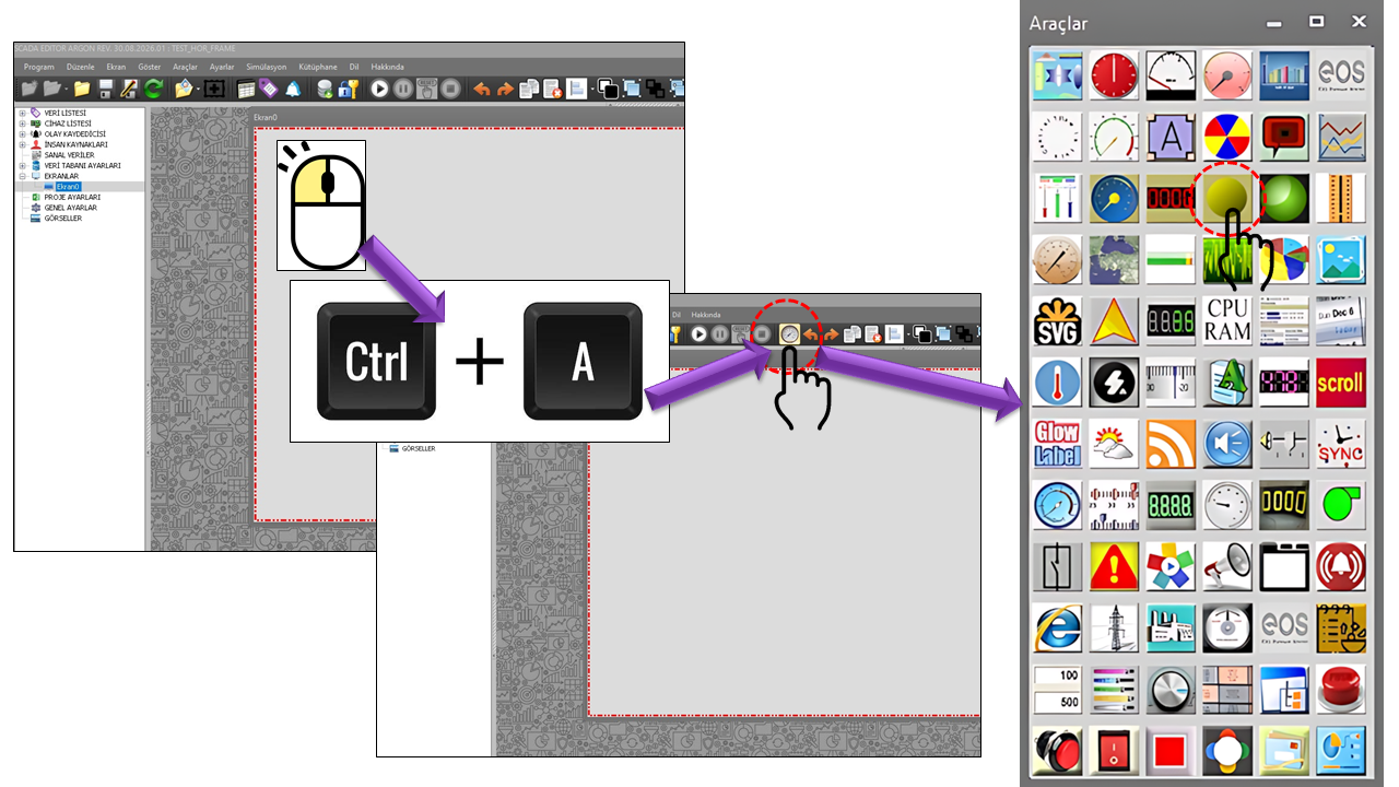
LB_LED is a practical user control that makes it easy to display equipment status, process status, communication information, or other status information on industrial SCADA screens using an LED-like visual indicator with optional text.
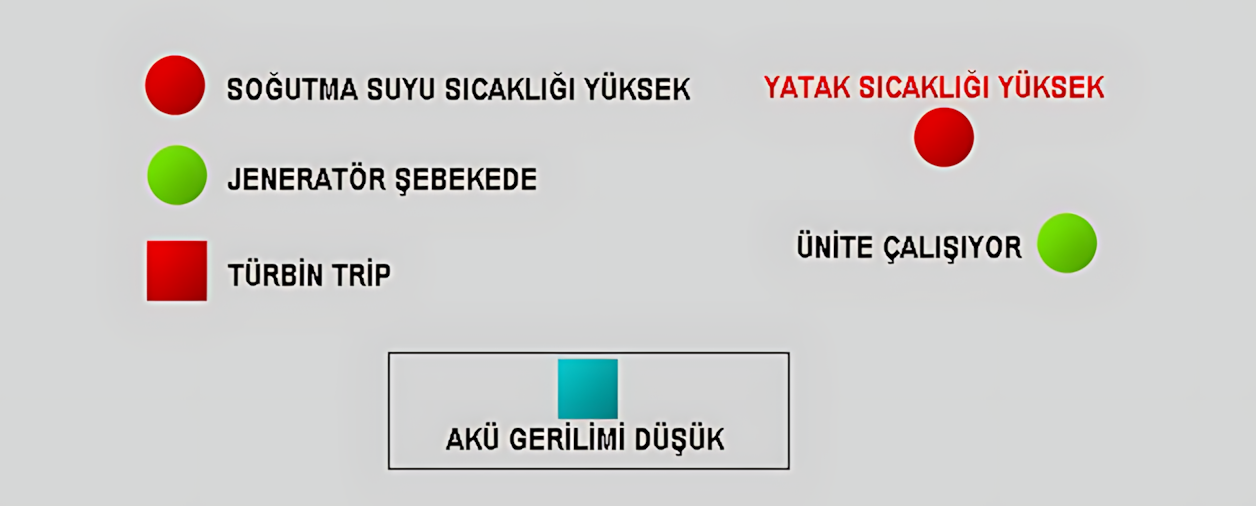
The most important feature of this control is that the LED and text can be configured separately. The user can create one of three combinations: LED only, plain text only, or LED + text. This allows the same control to be used both as a compact status indicator and as a descriptive status label.
One control • three usage modes: LED only, text only, or LED and text together.
The visual design of LB_LED aims to create the familiar status lamp + descriptive text combination on SCADA screens through a single control. The LED shape and text position can be adjusted to suit the project screen's requirements.

Using TextLocation, the text can be placed above, below, to the left, or to the right of the LED. This feature makes it easier to position the control, especially in areas with limited screen space.
LED-based status indicators are compact visual elements that help operators quickly recognize the status of equipment or process variables. In industrial HMI designs, status LEDs can be used to visually distinguish normal, warning, fault, running, and similar conditions.
Can be used to display the operating and status information of pumps, fans, motors, valves, conveyors, and similar equipment using LEDs and text.
Can be used to present device, channel, connection, or communication status with a compact LED indicator and descriptive text.
Can help highlight warning or fault conditions by using different visual properties and text according to the data status.
Can be used to compactly display the current status of a process step, production line, or auxiliary system.
Can be used to visually present the status of assets such as power supplies, generators, UPS units, auxiliary systems, or field equipment.
By supporting the LED's quick visual signal with text, the control can help operators immediately understand what the indicator represents.
LB_LED is not limited to a single usage mode. The role of the control on the screen can be determined by evaluating the DisplayLED and DisplayText properties together.
The LED is displayed, but the text is hidden. Suitable for compact status indicators and dense SCADA screens.
Plain text is displayed without showing the LED. The control can be used as a short status label.
The LED and text are displayed together. Visual status and descriptive information are presented through the same control.
One of LB_LED's strongest features is its LEDDataStates collection. This structure enables the control not only to display the connected data as a numerical value, but also to transform that value into visual and textual information representing a specific state.
When LED Data States are used, different LED colors, LED states, blinking behaviors, and status texts can be defined for different data ranges or conditions within the same control. This allows the operator to quickly understand the process state on the screen without having to read the raw data value.
Each record defined in LED_STATE_COLLECTION represents a specific data state on the screen. When the control evaluates the connected data, it identifies the appropriate state record and applies the visual properties defined in that record. As a result, a single LB_LED control can display different appearances depending on the operating condition.
This approach is particularly important in applications where the normal operation, warning, alarm, or other operating states of a piece of equipment must be displayed using the same screen element. Since what matters to the operator is not only the data value but also what that value means in terms of the process, LED Data States convey that meaning directly to the visual interface.
A LED_STATE_COLLECTION record can define multiple properties together to determine how a state is displayed on the screen. In particular, the following fields form the basis of state-based display:
One of the key advantages of LED Data States is that a numerical process value can be converted directly into status information that the operator can understand. For example, if the control is connected to data representing the status of a motor or other equipment, a descriptive text corresponding to that value can be displayed instead of showing only the value itself.
Suppose LED Data States are used for a motor. Different data states can be defined depending on the project design:
| State | LED Appearance | Text | Blinking |
|---|---|---|---|
| Normal | Normal operating color | RUNNING | No |
| Warning | Warning color | WARNING | Optional |
| Alarm | Alarm color | FAULT | Optional |
The colors, text, and blinking behaviors used in this example are not tied to a fixed color standard. They can be defined according to project requirements within LED_STATE_COLLECTION. This allows the same LED control to be used with different state displays for different processes.
An important aspect of LED Data States is that they do more than change the LED color. When the state changes, the text content and its visual properties can also change along with the LED's visual state. This provides the operator with both a quick visual signal and descriptive status information at the same time.
For example, in the normal state, the LED can remain continuously lit while displaying the text RUNNING beside it. When the data changes to another state, the LED color can change and the text can be updated to WARNING. In a more critical condition, a different color, different text, and, when necessary, blinking can be used.
The Blink Active property can be used when a particular data state needs to attract more attention than other states. This allows the operator to see not only the color change but also the LED's animated appearance.
This feature can be used on screens where alarm or critical conditions must not get lost among other continuously displayed information. However, blinking does not have to be used for every state; it can be enabled only for LED Data States where it is considered necessary from a design perspective.
Using too many combinations of colors, text, and blinking when creating LED Data States can reduce screen readability. Therefore, it is important to design states so that they are meaningful and easy to distinguish from one another.
In particular, the blinking feature provides more meaningful visual feedback when reserved for states that need to attract the operator's attention rather than being used continuously for every state.
Another advantage of the LED_STATE_COLLECTION structure is that the LED control is not restricted to a single fixed appearance. The control itself remains the same, while the mappings for data states can be changed according to project requirements.
For this reason, LB_LED can be used for motors, pumps, valves, fans, compressors, process equipment, or other monitoring points. When the use case changes, a different visual state model can be created by reorganizing the relevant LED Data States rather than changing the control's basic structure.
Rather than thinking of LB_LED merely as an "LED lamp," it is more appropriate to consider it a user control that forms the chain data → state → visual display → textual description.
This gives the operator both a quick visual signal and text explaining the current state. The LEDDataStates structure enables these two pieces of information to be managed in conjunction with the connected data.
LEDDataStates allows LB_LED to go beyond being a simple indicator that merely switches an LED on and off. Depending on the state of the connected data, the color, LED appearance, blinking behavior, text content, and text properties can all change together.
With this structure, a single LB_LED control can be transformed into a state-based visual display that allows operators to quickly recognize different process states.
DataSource is the set of options that determines which data source supplies data to LB_LED.
| Option | Description |
|---|---|
| Data | Uses the control's standard data source. |
| Live Database | Allows display using data from the live database. |
| Archive Database | Enables data from the archive database to be used for display. |
When text display is enabled, the control can also provide a short description of the LED status. DefaultText defines the default text, while UseColoredText determines whether colored text is used.
| Property | English Meaning | Description |
|---|---|---|
| DisplayText | Display Text | Determines whether the text section is displayed. |
| DefaultText | Default Text | Defines the text to be used in the default state. |
| UseColoredText | Use Colored Text | Enables the use of color in the text display. |
| TextLocation | Text Location | Determines the position of the text relative to the LED. |
| Option | Meaning |
|---|---|
| Top | The text is displayed above the LED. |
| Bottom | The text is displayed below the LED. |
| Left | The text is displayed to the left of the LED. |
| Right | The text is displayed to the right of the LED. |
| Property | English Meaning | Description |
|---|---|---|
| LEDShape | LED Shape | Determines whether the LED is displayed as a circle or rectangle. |
| DefaultLEDColor | Default LED Color | Defines the base color used when no different appearance is applied by an LED data state. |
| DisplayLED | Display LED | Determines whether the LED section is displayed. |
| BlinkInterval | Blink Interval | Determines the time interval for the blinking behavior. |
| Option | Description |
|---|---|
| Circle | Compact, classic LED appearance. |
| Rectangle | A rectangular LED appearance resembling a panel or status cell. |
On screens where the LED and text are used together, it is important for the control's size to be consistent with other screen elements. ButtonWidth and ButtonHeight define the control's visual area, while the border properties adjust the outline around the control.
| Property | English Meaning | Description |
|---|---|---|
| ButtonWidth | Button Width | Determines the width of the control. |
| ButtonHeight | Button Height | Determines the height of the control. |
| DisplayBorder | Display Border | Determines whether the border around the control is displayed. |
| BorderThickness | Border Thickness | Determines the thickness of the border line. |
| BorderColor | Border Color | Determines the border color. |
FastResponseMode is an option that requires particular attention when using LB_LED. It is intended for scenarios in which certain critical indicators need to respond visually more quickly to changes in status.
Fast Response Mode should not be enabled for every LB_LED control. Especially on SCADA screens containing many LB_LED controls, enabling this option unnecessarily across the board can increase system resource usage and negatively affect overall SCADA performance. Therefore, it is recommended only for controls where a fast visual response is genuinely necessary.
Identify the requirement first → use Fast Response Mode only if genuinely necessary → do not make it the default for large numbers of controls.
| Property | English Meaning | Value / Description |
|---|---|---|
| UCType | Control Type | LB_LED |
| UpdateInterval | Update Interval | 1000 ms |
| DecimalPoint | Decimal Places | 0 |
| UCBackColor | Control Background Color | Transparent |
| UCForeColor | Control Foreground Color | Black |
| UCFont | Control Font | Arial Narrow, 8.25 Bold |
| BlinkInterval | Blink Interval | 500 ms |
| FastResponseMode | Fast Response Mode | False |
The LED Data States collection transforms LB_LED from a simple light indicator into a data-driven status communication component.
| Property | English Meaning | Description |
|---|---|---|
| LevelThreshold | Level Threshold | Defines the data threshold for the relevant LED data state. |
| LevelBackColor | Level Background Color | Determines the background color to be used for the state. |
| LevelForeColor | Level Foreground Color | Determines the text color for the status text. |
| BlinkActive | Blink Active | Enables the blinking behavior for the relevant state. |
| LevelText | Level Text | Defines the text to be displayed for the relevant data state. |
Position the LED as the primary, quickly recognizable status indicator and use the text to explain the state.
Keep text used alongside the LED concise and operationally meaningful.
Distinguish only the states that are genuinely meaningful to the operator rather than defining too many visual states.
Use Fast Response Mode only for controls that require it, and take the total number of controls on the screen into account.
LB_LED provides a practical way to create the frequently used LED lamp and text combination on SCADA screens under a single user control. The LED only, text only, or LED + text options allow it to be adapted to different screen designs.
The control's main strength, however, is its LED Data States collection. Changing the appearance of the LED and text according to the state of the connected data, and allowing different status texts to be displayed, transforms LB_LED from a simple visual element into a more flexible status communication control.
The data state changes → the LED appearance changes → the text changes → the operator recognizes the state at a glance.

Free Software Download Center
Software for industrial data collection, monitoring, and analysis.

Technical Support
Software documentation, sample code, and practical technical information.
You can contact us regarding EOS software, technical documentation, or industrial data communication.