01 · Title Area
The upper area displays the screen specified by TitleScreenID. The height and border style of the title screen can also be configured.
EOS SCADA • PANELPC_NAV • LOCAL SCADA NAVIGATION FOR TOUCHSCREENS
PANEL PC NAVIGATOR (PANELPC_NAV) is an EOS SCADA-specific navigation user control designed for SCADA applications running on local controllers, particularly on compact touchscreen Panel PCs. Instead of treating different process screens as independent screens that must be opened individually, it brings them together under a single navigation framework.
Because Panel PC screens have limited display space, it is important that navigation can be accessed when needed rather than remaining permanently visible and occupying screen space. PANELPC_NAV therefore manages the navigation pane so that it can be opened when required and automatically hidden when no longer in use. This preserves as much of the process screen as possible for the main workspace.

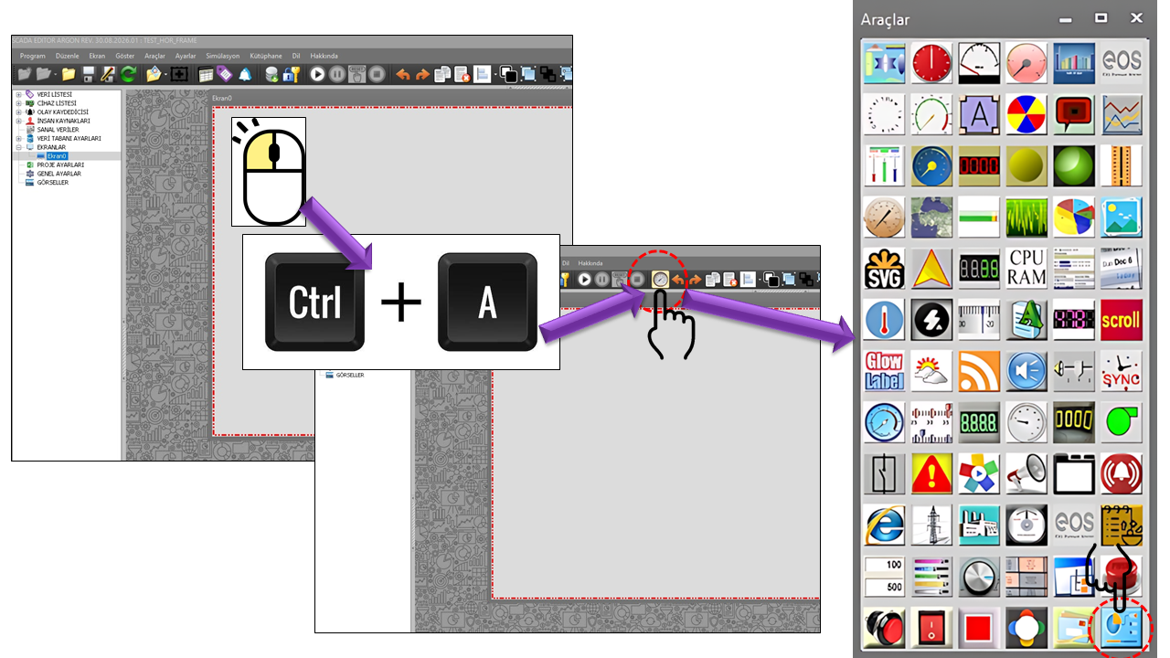
PANELPC_NAV should not be considered a small navigation button placed in a corner of the screen in the traditional sense. This control is designed as a Panel PC screen architecture that manages the entire screen area allocated to it. Navigation nodes are linked to screens prepared in the local controller's SCADA system; when the operator selects a node through the navigator, the corresponding screen is displayed in the central screen area of PANELPC_NAV.
Therefore, no other user controls should be placed inside the screen created for PANELPC_NAV. The title, navigator, and workspace where the selected screen is displayed are created internally by PANELPC_NAV. The actual process screens should be designed as separate screens that open beneath this main structure.
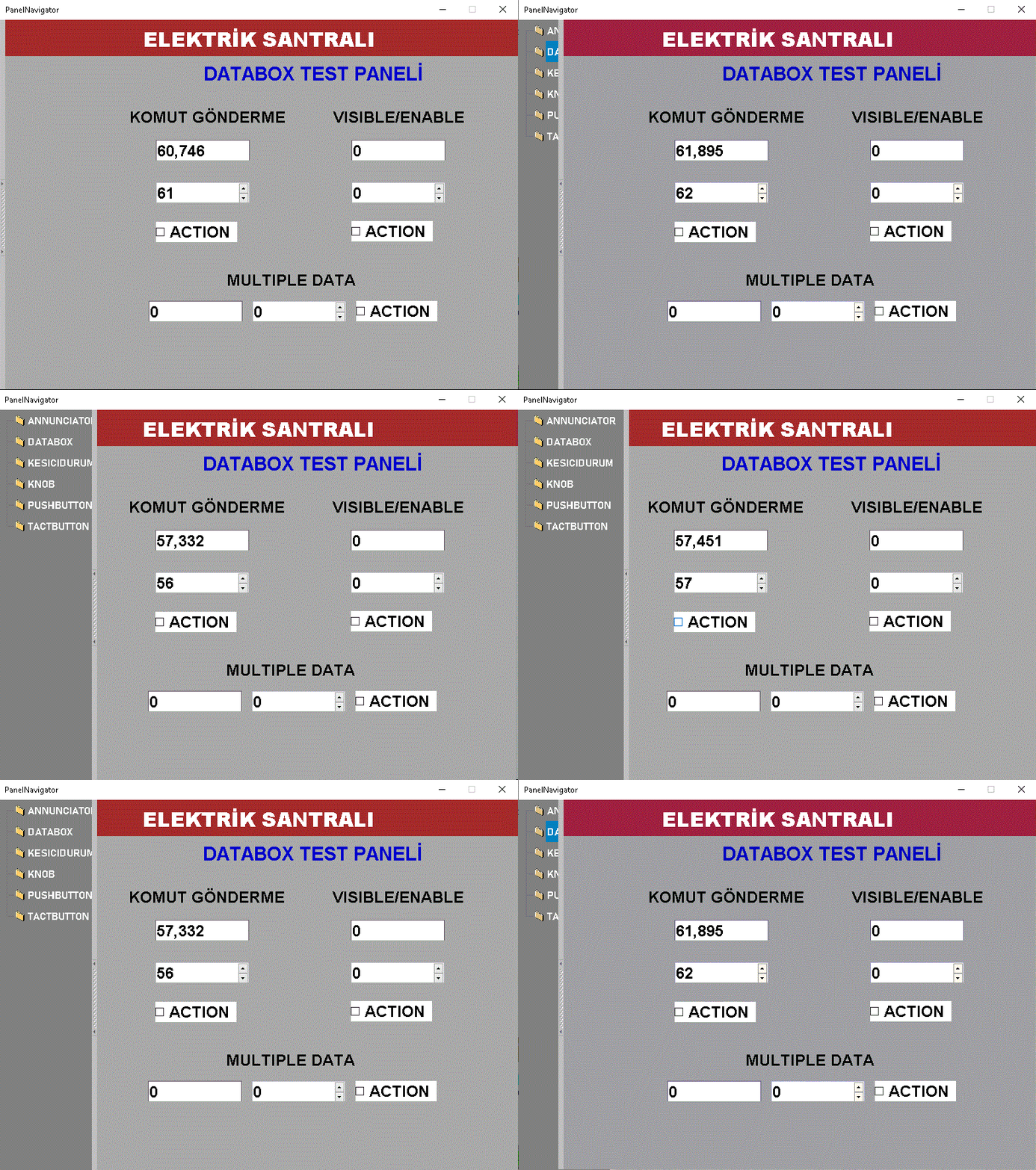
The fundamental design idea behind PANELPC_NAV is to make navigation available when needed rather than continuously consuming the limited space of a touchscreen Panel PC. This allows the operator to access navigation when switching between screens, while keeping the workspace as large as possible when viewing a process screen.
Only the PANELPC_NAV user control should be present on the screen designated for PANELPC_NAV. No other user controls should be placed on this main navigation screen. The control creates the title, navigator, and selected-screen area internally and allocates the screen space according to this structure.
PANELPC_NAV divides its workspace into three main areas. These areas allow navigation and process visualization to be used together on a small Panel PC screen. During design, particular attention should be paid to the space occupied by the title area and the navigator area.
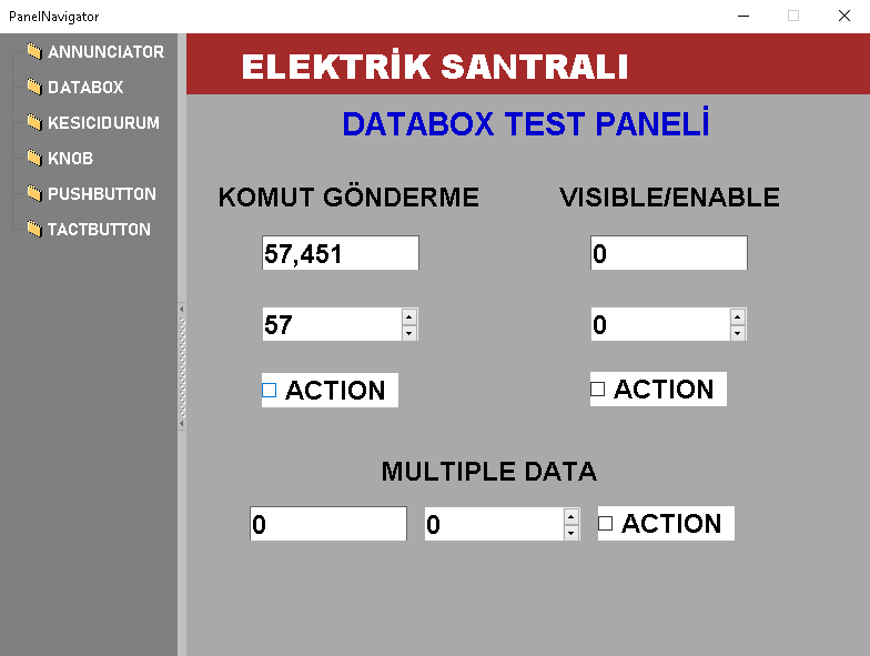
The title screen displayed using the specified TitleScreenID.
TreeView or ToolStrip nodes.
The central workspace where local controller SCADA screens selected in the navigator are displayed.
The upper area displays the screen specified by TitleScreenID. The height and border style of the title screen can also be configured.
This area contains the screen nodes. Its layout can be configured as TreeView or ToolStrip. Each node can be linked to a specific SCADA screen.
This is the central workspace where screens selected in the navigator are displayed. The actual process screens open here, and the operator interacts with the process through this area.
One of the most important considerations in a project using PANELPC_NAV is to treat the navigation screen and the process screens opened beneath it as separate elements. The PANELPC_NAV screen is a main shell. No other user controls should be added to this screen. In contrast, process screens opened through the navigator should be designed with the areas occupied by the title and navigator taken into account.
Since the navigation panel and title area occupy specific portions of the screen, user controls on process screens opened through the navigator should be positioned accordingly. Do not place user controls in areas that may be covered by the navigation interface.
The fundamental element of the navigation structure in PANELPC_NAV is the NAVIGATION_NODE_COLLECTION class. Each node can be configured with properties such as its title, icon, color, target screen, parent node, and opening behavior. This structure makes it possible to create hierarchical local SCADA navigation rather than a simple list of screens.
NodeID identifies the navigation node.
ScreenID specifies the SCADA screen to open when the node is selected.
ParentNodeID specifies the parent node in the hierarchical navigation structure.
NodeTitle defines the node text displayed to the operator in the navigator.
A visual icon can be assigned to a navigation node using NodeIcon.
ScreenSwitchDuration specifies the transition interval that can be used in automatic switching scenarios.
Since PANELPC_NAV is designed for touchscreen Panel PC use cases, it is important to configure the project with Panel PC Mode. In the SCADA Editor, navigate to Project Settings → Panel PC Settings and set Enable Panel PC Mode to True.
When Panel PC Mode is enabled, the user interface operates according to a touchscreen use case, reducing the operator's dependence on a mouse.
Screen buttons and navigation on the Panel PC can be designed for direct touch interaction.
The on-screen keyboard can open automatically in user controls where setpoints are entered. This reduces the need for a physical keyboard.
In touchscreen projects using PANELPC_NAV, the Enable Panel PC Mode setting must be checked during the project design phase. For detailed information on enabling this setting and touchscreen behavior, use the page below.
How to Enable Panel PC ModeThe table below lists the properties and default values defined in the source code provided for PANELPC_NAV. The descriptions are based directly on the intended use of these properties.
| Property | English Equivalent | Default | Description |
|---|---|---|---|
UCType |
Control Type | PANELPC_NAV | Specifies the type of user control. |
UCName |
Control Name | — | The name assigned to the control. |
UpdateInterval |
Update Interval | 1000 | The control's update interval. |
DecimalPoint |
Decimal Places | 0 | The decimal-place setting used for numerical formatting. |
UCBackColor |
Control Background Color | Gray | The control's primary background color. |
UCForeColor |
Control Text Color | Black | The control's general text color. |
UCFont |
Control Font | Bahnschrift 12 Bold | The control's primary font. |
GROUPID |
Group ID | "" | The control's group identifier. |
NavigationNodes |
Navigation Nodes | Collection | The collection of nodes in the navigation structure. |
ScreenBorderStyle |
Screen Border Style | Fixedsingle | Determines the border style of the central screen area. |
TitleScreenID |
Title Screen ID | "" | Specifies the screen to be displayed in the title area. |
TitlePanelHeight |
Title Panel Height | 0 | Determines the height of the title area. |
TitleBorderStyle |
Title Border Style | None | Determines the border style of the title area. |
HideNavPanel |
Hide Navigation Panel | true | Determines the automatic hiding behavior of the navigation panel. |
NavHideInterval |
Navigation Hide Interval | 10000 | The time interval used before the navigation panel is hidden. |
SeperatorColor |
Separator Color | Silver | Determines the color of the separator area. |
SeperatorWidth |
Separator Width | 8 | Determines the width of the separator area. |
DefaultScreen |
Default Screen | "" | Determines the screen displayed at startup. |
NavigationType |
Navigation Type | Treeview | Determines whether navigation uses TreeView, ToolStrip, or Automatic Switching. |
NavigationPanelSize |
Navigation Panel Size | 120 × 240 | Determines the size of the navigation panel. |
NavigationBorderStyle |
Navigation Border Style | None | The border style of the navigation panel. |
TreeViewNodeHeight |
TreeView Node Height | 35 | Determines the height of TreeView nodes. |
TreeViewNodeMargin |
TreeView Node Margin | 19 | Controls the visual spacing between TreeView nodes. |
DisplayIcon |
Display Icon | true | Determines whether icons are displayed on navigation nodes. |
IconSize |
Icon Size | 16 × 16 | Determines the size of navigation icons. |
ToolStripTextAngle |
ToolStrip Text Angle | Horizontal | Determines the orientation of ToolStrip text. |
ToolStripOrientetion |
ToolStrip Orientation | Table | Determines the layout of the ToolStrip. |
ToolStripDisplayStyle |
ToolStrip Display Style | Imageandtext | Determines whether the ToolStrip displays text, images, or both. |
TextImageRelation |
Text-Image Relationship | Imagebeforetext | Determines the relative positioning of text and images. |
ToolStripAutoSize |
ToolStrip Auto Size | false | Determines whether the ToolStrip is automatically resized. |
ToolStripSize |
ToolStrip Size | 300 × 16 | Determines the size of the ToolStrip. |
UseSeparator |
Use Separator | false | Determines whether separators are used between ToolStrip nodes. |
ImageAlignment |
Image Alignment | Middleleft | Determines the alignment of navigation images. |
TextAlignment |
Text Alignment | Middleleft | Determines the alignment of navigation text. |
Each navigation node is an independent NAVIGATION_NODE_COLLECTION record that carries its own screen link and visual properties. This structure makes navigation more than just a menu list; it defines the relationships between screens.
| Property | English Equivalent | Default | Description |
|---|---|---|---|
NodeID |
Node ID | "" | The unique identifier of the navigation node. |
NodeIcon |
Node Icon | 0 | The icon information used for the node. |
NodeTitle |
Node Title | NODE TITLE | The node title displayed to the operator in the navigator. |
NodeBackColor |
Node Background Color | Gray | The node's background color. |
NodeForeColor |
Node Text Color | White | The color of the node text. |
ScreenID |
Screen ID | "" | The target screen linked to the node. |
ParentNodeID |
Parent Node ID | "" | Specifies the parent node in the hierarchical structure. |
DisplayType |
Display Type | Fixed | Determines the node's screen-opening behavior. |
DisplayHeaderScreen |
Display Header Screen | true | Determines whether the title screen is displayed in the relevant structure. |
DisplayAlarmScreen |
Display Alarm Screen | false | Determines the alarm screen display behavior. |
DisplayAsNavNode |
Display as Navigation Node | true | Determines whether the node is displayed in the navigator. |
ScreenSwitchDuration |
Screen Switching Duration | 10000 | The screen transition interval that can be used in automatic switching scenarios. |
TagPrefix |
Tag Prefix | "" | The tag prefix used in the relevant screen or parameter structure. |
TagSuffix |
Tag Suffix | "" | The tag suffix used in the relevant screen or parameter structure. |
ScreenSuffix |
Screen Suffix | "" | The suffix information used for the screen ID. |
NodeParameters |
Node Parameters | Collection | A collection of parameters that can be passed along with the node. |
Parameters that can be used in navigation nodes are defined through PARAMETER_COLLECTION. Each parameter contains a name and its associated tag information.
| Property | English Equivalent | Default | Description |
|---|---|---|---|
ParameterName |
Parameter Name | PR | Determines the name of the parameter. |
ConnectedTag |
Connected Tag | "" | Specifies the tag associated with the parameter. |
The PANELPC_NAV source code contains several option sets for navigation appearance, orientation, ToolStrip layout, and border style. The tables below are based on the values provided in the source code.
| Value | English Equivalent | Description |
|---|---|---|
None |
None | No border is used. |
Fixedsingle |
Fixed Single | A single fixed border is used. |
Fixed3d |
Fixed 3D | A fixed three-dimensional border appearance is used. |
| Value | English Equivalent | Description |
|---|---|---|
Toolstrip |
ToolStrip | Displays nodes in a ToolStrip layout. |
Treeview |
Tree View | Displays nodes in a hierarchical tree structure. |
Autoswitch |
Automatic Switching | Creates an automatic screen-switching scenario. |
| Value | English Equivalent |
|---|---|
Horizontal |
Horizontal |
Vertical |
Vertical |
| Value | English Equivalent |
|---|---|
Vertical270 |
Vertical 270 Degrees |
Vertical90 |
Vertical 90 Degrees |
Horizontal |
Horizontal |
| Value | English Equivalent |
|---|---|
Table |
Table |
Flow |
Flow |
Verticalstackwithoverflow |
Vertical Stack with Overflow |
Horizontalstackwithoverflow |
Horizontal Stack with Overflow |
| Value | English Equivalent |
|---|---|
None |
None |
Text |
Text |
Image |
Image |
Imageandtext |
Image and Text |
| Value | English Equivalent |
|---|---|
Overlay |
Overlay |
Imageabovetext |
Image Above Text |
Textaboveimage |
Text Above Image |
Imagebeforetext |
Image Before Text |
Textbeforeimage |
Text Before Image |
| Value | English Equivalent |
|---|---|
Topleft |
Top Left |
Topcenter |
Top Center |
Topright |
Top Right |
Middleleft |
Middle Left |
Middlecenter |
Middle Center |
Middleright |
Middle Right |
Bottomleft |
Bottom Left |
Bottomcenter |
Bottom Center |
Bottomright |
Bottom Right |
The source code shows the MNAcilisTuru type and its default value, Fixed; however, the complete set of options for this type is not included in the provided source. Therefore, no options absent from the source have been assumed here.
The success of a local SCADA application designed with PANELPC_NAV depends not only on linking nodes to the correct screens, but also on designing those screens according to the navigation architecture. Screen space must be carefully planned on small Panel PC displays.
Create a clean screen layout that makes the most of the central screen area when the navigator is hidden.
Design buttons, selection controls, and input fields for finger operation on Panel PCs, ensuring they are sufficiently large and spaced apart.
If there are many screens, organize navigation into a clear hierarchy using ParentNodeID relationships.
Ensure that text, icons, and buttons are sized for easy recognition by the operator on small screens.
Leave sufficient space around input fields because the on-screen keyboard may appear during data entry.
Structure the navigation tree according to the operating logic of a specific local controller, machine, or process area.
The screen containing PANELPC_NAV and the process screens opened through navigation have different design responsibilities. The main PANELPC_NAV screen should contain only the navigation control, while process screens should be designed individually to fit the workspace remaining after the title and navigation areas are accounted for.
PANELPC_NAV is a specialized EOS SCADA user control that brings together SCADA screens prepared for local controllers under a single navigation structure on small touchscreen Panel PC displays. It manages the title, navigator, and central screen area within a single structure, while enabling efficient use of the workspace by hiding the navigation panel when needed.
The most important design rule is clear: Only PANELPC_NAV should be present on the screen allocated to PANELPC_NAV. Process screens opened through the navigator must be designed with the areas occupied by the title and navigation regions taken into account.
When used together with the Navigation Design Tool in the SCADA Editor and Panel PC Mode, it enables integrated design of touchscreen local SCADA applications in terms of screens, navigation, and user interaction.

Free Software Download Center
Software for industrial data collection, monitoring, and analysis.

Technical Support
Software documentation, sample code, and practical technical information.
You can contact us regarding EOS software, technical documentation, or industrial data communication.