
Free Software Download Center
Software for industrial data collection, monitoring, and analysis.
TABCONTROL • ORGANIZING SCADA SCREENS UNDER TAB PAGES
TABCONTROL (TAB CONTROL) is designed to organize prepared SCADA screens under tab pages within a single user control, allowing operators to display the screen they need by selecting the corresponding tab. Its basic structure is based on the Windows Forms TabControl approach.
Each tab is treated as a TABPAGE. Properties such as the tab page title, color, border style, background image, and label can be configured independently. This allows different screen contents, such as process displays, alarms, trends, reports, maintenance, and equipment groups, to be organized within a structured user interface on a single SCADA screen.

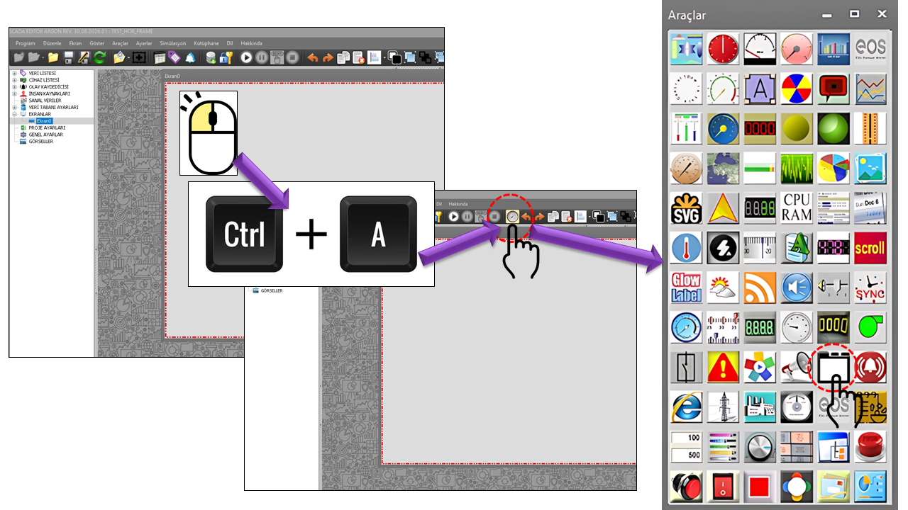
Windows Forms TabControl is a control used to manage a related group of tab pages. Microsoft documentation states that the TabPages property contains the individual tabs within the control and that each tab is represented by a TabPage object. Tabs can be used to organize multiple pages, property pages, and different groups of controls.
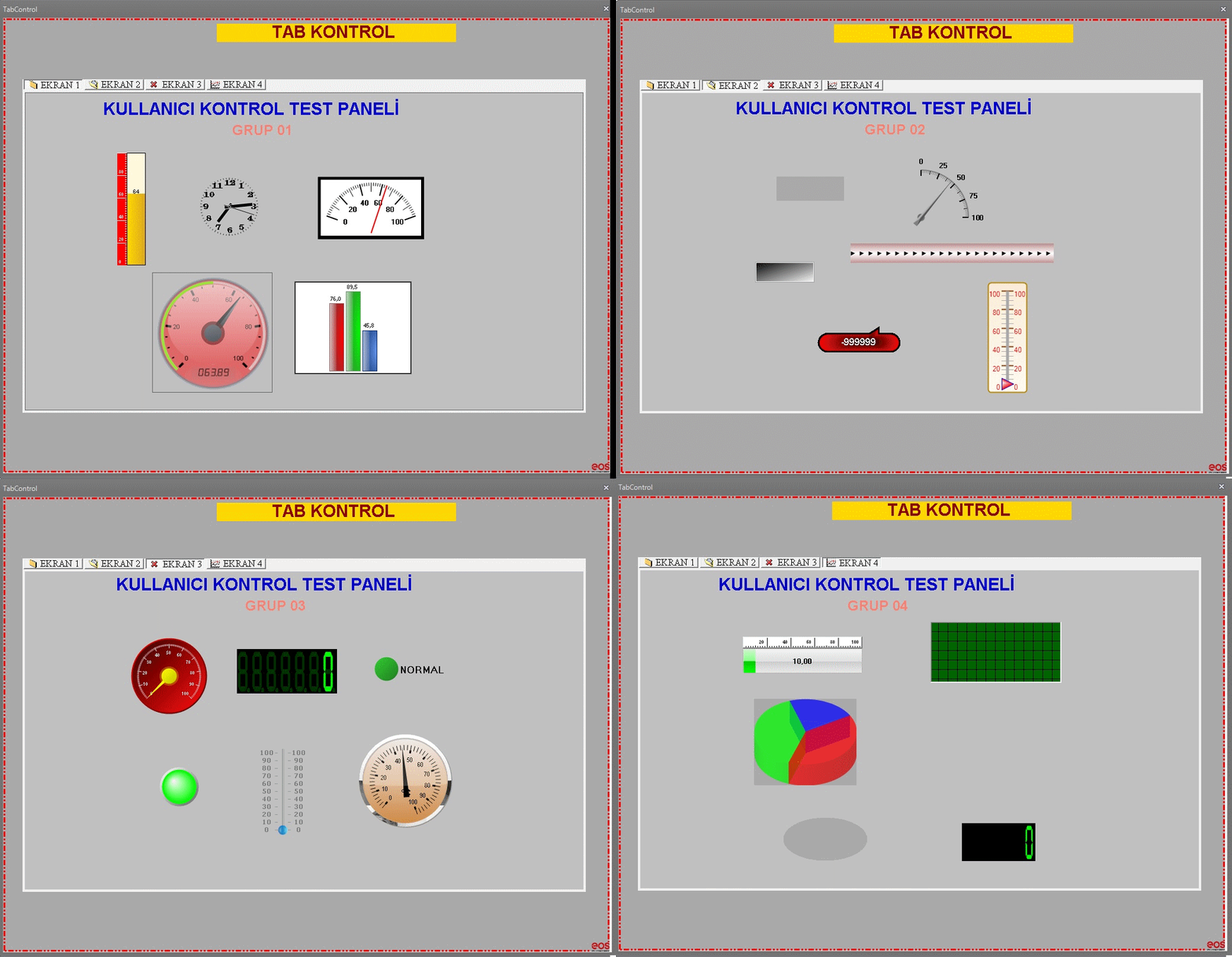
A TABCONTROL can contain multiple tab pages. A SCADA screen and its associated user controls can be placed inside each tab page.
This user control can only be used at one level. A second TABCONTROL or another tab structure must not be created inside a TABCONTROL tab page. This rule is a fundamental structural limitation of the control's design.
The most important usage rule for TABCONTROL is that its tab structure must be single-level. The purpose is to combine SCADA screens into a horizontal or vertical group of tabs, display the relevant screen within each tab page, and avoid directing users into a second level of tab hierarchy.
The control's tab structure is defined through the TABPAGE_COLLECTION[] _TabpageItems collection. Each collection item corresponds to the TABPAGE_COLLECTION class, which holds the properties of the tab page displayed to the user. In Windows Forms, the basic TabControl structure is likewise built using the TabPages collection and TabPage objects.
| Property | Value in Source Code | Description |
|---|---|---|
| Tab Page Text | TabpageText = "TEXT" |
Specifies the title displayed on the tab. |
| Tab Page Border Style | TabpageBorderStyle = None |
Specifies the border appearance of the tab page. |
| Tab Page Color | TabpageColor = Transparent |
Specifies the background color of the tab page. |
| Tab Page Background Image | TabpageBackgroundImage = "" |
Specifies the background image to be used for the tab page. |
| Tab Page Tag | TabpageTag = "" |
Stores tag information that can be associated with the tab page. |
| Screen ID | ScreenID = "" |
The screen identification field associated with the tab page. |
In Windows Forms, a tab title can be specified using TabPage.Text;
the order of tabs in the collection also affects the order in which they appear on the screen.
Tab Appearance determines how tab headers are drawn in the user interface. The source code provides three options.
| Option Set | Source Value | Description |
|---|---|---|
| Normal | Normal |
Uses the standard tab appearance. |
| Buttons | Buttons |
Displays tabs with a button-like appearance. |
| Flat Buttons | Flatbuttons |
Provides a flatter button appearance. |
Tab Alignment is used to determine the position of tab headers on the TABCONTROL. Windows Forms TabControl also supports positioning tabs at the top, bottom, left, or right.
| Option Set | Source Value | Usage |
|---|---|---|
| Top | Top |
Tabs are positioned at the top. |
| Bottom | Bottom |
Tabs are positioned at the bottom. |
| Left | Left |
Tabs are positioned on the left. |
| Right | Right |
Tabs are positioned on the right. |
TABCONTROL includes properties that determine not only where tabs appear, but also how tab headers respond to user interaction and adapt to the available space.
| Property | Source Value | Description |
|---|---|---|
| Multiline | Multiline = false |
Determines whether tabs can span multiple rows when necessary. |
| Hot Track | HotTrack = false |
Controls whether a visual highlight is applied when the pointer moves over a tab. |
| Show Tooltips | ShowToolTips = false |
Determines whether tooltips are displayed over tabs. |
| Size Mode | SizeMode = Normal |
Determines the width and sizing behavior of tabs. |
| Tab Item Size | TabItemSize = 75 × 18 |
Defines the dimensions of a tab item when fixed sizing is used. |
| Use Icons | UseIcons = false |
Determines whether icons are used on tabs. |
| Draw Mode | DrawMode = Normal |
Determines whether tabs are rendered normally or drawn by the user. |
| Padding | Padding = (0, 0) |
Specifies the additional spacing inside a tab header. |
Windows Forms documentation defines SizeMode as the property that determines how tabs are sized
and ItemSize as the property that specifies the dimensions of tab items. It also states that
SizeMode must be set to Fixed to change the width of ItemSize.
| Option Set | Source Value | Description |
|---|---|---|
| Normal | Normal |
The standard tab-sizing behavior. |
| Fill to Right | Filltoright |
Intended to fill the available width toward the right of the tab row. |
| Fixed | Fixed |
Creates tabs using the specified fixed dimensions. |
The following properties define the basic operating and visual settings of the TABCONTROL user control. The initial values from the source code have been preserved.
| Property | Source Value | Description |
|---|---|---|
| Control Type | UCType = TABCONTROL |
Specifies the type of the user control. |
| Update Interval | UpdateInterval = 1000 |
Defines the control's update cycle in milliseconds. |
| Decimal Places | DecimalPoint = 0 |
Specifies the decimal-place setting used for numerical displays. |
| Control Background Color | UCBackColor = Transparent |
Specifies the background color of the control. |
| Control Text Color | UCForeColor = Black |
Specifies the text color of the control. |
| Control Font | UCFont = Times New Roman, 12 |
Specifies the default font of the control. |
| Tab Tag | TabTag = 18839686 |
The tab tag field of the control. |
| Tab Page Items | TabpageItems |
The collection of tab pages created under the control. |
The enumerated options used in TABCONTROL can be summarized using the Option Sets below. These values are taken directly from the enum definitions in the supplied source code.
| Set | Options |
|---|---|
GNTabGorunus |
Normal • Buttons • Flat Buttons |
GNBasitKonum |
Top • Bottom • Left • Right |
GNBoyutModu |
Normal • Fill to Right • Fixed |
GNCizimModu |
Normal • Owner Draw |
The primary purpose of TABCONTROL is to organize different screen contents belonging to the same working area under a tab-based layout. For example, the following structure can be created within a single-level TABCONTROL:
Main process operation screens and their associated user controls.
Alarm lists, alarm indicators, and operator notifications.
Graphical monitoring of historical and current data.
Equipment maintenance, status, and auxiliary system screens.
When creating a TABCONTROL, planning the tab structure first and then defining the tab pages and the SCADA screens to be displayed on those pages leads to a more organized result.
Windows Forms TabControl is designed to manage a group of related tab pages. Microsoft documentation
states that tabs are stored in the TabPages collection, that each tab is a TabPage
object, and that the selected tab can also be changed programmatically.
According to the supplied source code, this user control uses the Windows Forms approach to combine SCADA screens under tabs. It is therefore important to distinguish between the implementation of these features in the control's own source code and the general behavior of the Windows Forms infrastructure.
TABCONTROL is a tab control designed to organize multiple SCADA screens within an interface that is more structured, easier to understand, and more accessible to operators. Its tab appearance, alignment, sizing, tooltips, icon usage, drawing mode, and tab page properties make it possible to organize different screen groups under a single control.
Most important rule: TABCONTROL must be used at only one level. A TABCONTROL can contain tab pages, but a second TABCONTROL or nested tab structure must not be created inside those tab pages.
Free Software Download Center
Software for industrial data collection, monitoring, and analysis.

Technical Support
Software documentation, sample code, and practical technical information.
You can contact us regarding EOS software, technical documentation, or industrial data communication.