
Free Software Download Center
Software for industrial data collection, monitoring, and analysis.
EOS SCADA • ADVANCED_PB • SCALED INDICATOR • USER CONTROL
SCALED INDICATOR (ADVANCED_PB) is an advanced graphical indicator control designed to present analog process values to operators in a clear, fast, and reliable manner. It can be used to monitor analog values such as level, pressure, flow rate, temperature, power, load ratio, and similar process variables.
The control combines features such as different indicator shapes, fill methods, color and gradient options, pattern or image fills, scale, numerical value, unit, label, and limit display. The scale can be configured independently of the linear indicator, allowing the same control to be adapted to different process visualization requirements.

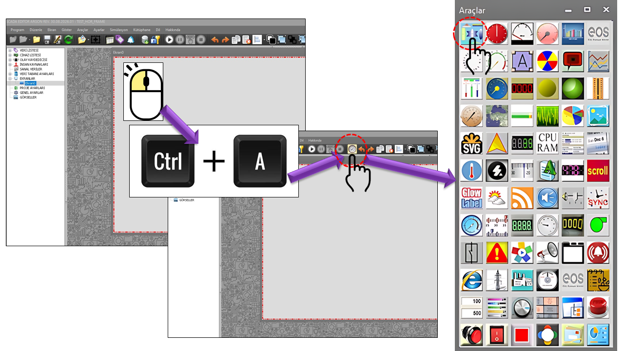
SCALED INDICATOR is an advanced user control used in EOS SCADA as the ADVANCED_PB User Control type to display process values graphically.
Rather than displaying only the numerical value of a process variable, the control can be used to represent that value visually on a graphical indicator. Visual elements such as the fill level, colors, patterns, ruler, value information, and label can be configured independently.
The ADVANCED_PB control is designed particularly for SCADA screens where operators need to recognize process values quickly. The position of a value within a specified lower and upper limit can be monitored directly through the indicator's fill level and visual representation.
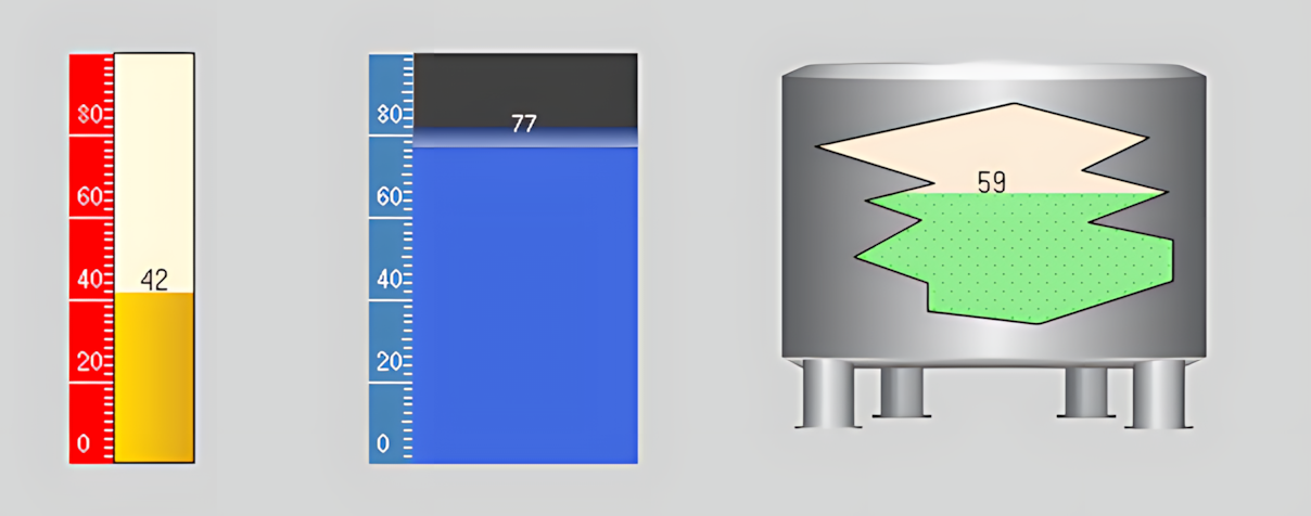
The appearance and behavior of the SCALED INDICATOR can be configured in detail using properties such as indicator shape, fill method, fill pattern, gauge fill type, colors, borders, ruler, value display, fill image, label, limits, and slope. An AuthorizationLevel can also be assigned to define the authorization required to use the control.
This page describes the configurable properties defined in the source code of the ADVANCED_PB control, including their default values and ENUM values, using their technical names. The English technical names of ENUM values from the EOS SCADA source code are preserved, with their corresponding English meanings provided separately.
Key concept: The SCALED INDICATOR is more than a fill bar. It is an EOS SCADA user control in which the indicator shape, ruler, value, label, limit, visual fill, slope, Action Event, and AuthorizationLevel can be configured together.
Configuration of the SCALED INDICATOR can be approached in stages: first, define the basic control properties; then configure the indicator appearance, ruler, value and label information, limits, and finally authorization and event properties.
The basic operating and appearance properties of the SCALED INDICATOR control are defined by the general parameters below.
Property table: Each row includes the technical property name, its EOS English equivalent, default value, purpose, and typical application.
| Property | EOS English Equivalent | Default | Purpose | Typical Application |
|---|---|---|---|---|
UCType |
Control Type | ADVANCED_PB |
Defines the User Control type within EOS SCADA. | Basic setting used to identify the control type and ADVANCED_PB structure. |
UpdateInterval |
Update Interval | 1000 ms |
Defines how frequently the control is updated. | SCADA screens where values are refreshed periodically. |
DecimalPoint |
Decimal Places | 0 |
Defines the number of decimal places used to display numerical values. | Numerical process values such as pressure, temperature, flow rate, and power. |
UCBackColor |
Control Background Color | Transparent |
Defines the control's background color. | Maintaining visual consistency between the indicator and the SCADA screen. |
UCForeColor |
Control Foreground Color | Black |
Defines the control's primary foreground color. | Adjusting the overall appearance of text and control elements. |
UCFont |
Control Font | Tahoma, 8 pt |
Defines the control's font settings. | Adjusting the readability of text displayed on the control. |
This group defines the control's basic visual structure. The indicator's appearance is created by combining shape, fill, pattern, color, and border settings.
| Property | EOS English Equivalent | Default | Purpose | Typical Application |
|---|---|---|---|---|
GaugeShape |
Indicator Shape | Rectangle |
Defines the geometric shape of the indicator area. | Selecting a suitable indicator geometry for different process screens. |
FillMethod |
Fill Method | Bottomtotop |
Defines the direction or method used to fill the indicator according to the value. | Vertical or direction-dependent level indicators. |
FreeSpaceColor |
Unfilled Area Color | Cornsilk |
Defines the color of the indicator area outside the filled portion. | Indicators where the filled and unfilled areas need to be visually distinguished. |
FillPattern |
Fill Pattern | Wave |
Defines the pattern used for the indicator fill. | Screens where the filled area needs to be distinguished by its pattern. |
GaugeFillType |
Indicator Fill Type | Horizontal |
Defines the visual fill type used by the indicator. | Horizontal, vertical, gradient, image-based, or hatched displays. |
GaugeColor1 |
Indicator Color 1 | Goldenrod |
Defines the first color used for the indicator fill. | Single-color or multicolor indicator designs. |
GaugeColor2 |
Indicator Color 2 | Gold |
Defines the second color used for the indicator fill. | Two-color or gradient displays. |
UseBorder |
Use Border | true |
Determines whether the indicator border is displayed. | Visually emphasizing the boundaries of the indicator. |
3DBorder |
Use 3D Border | false |
Determines whether a 3D appearance is applied to the indicator border. | Indicator designs that use a 3D visual style. |
3DDepth |
Use 3D Depth | false |
Determines whether 3D depth is used for the indicator. | Designs that use a three-dimensional visual appearance. |
3DDepthValue |
3D Depth Value | 10 |
Defines the amount of 3D depth. | Adjusting visual depth when 3D depth is enabled. |
GaugeBorderColor |
Indicator Border Color | Black |
Defines the color of the indicator border. | Screens where the indicator boundary must stand out from the background. |
GaugeBorderWidth |
Indicator Border Width | 1 |
Defines the width of the indicator border. | Adjusting border thickness to suit the visual design. |
The GaugeShape property defines the geometric shape of the
indicator. ENUM values are listed using their technical names from the
source code.
| ENUM Value | English Description |
|---|---|
Rectangle |
Rectangle |
Roundedrectangle |
Rounded Rectangle |
Ellipse |
Ellipse |
Triangle |
Triangle |
Magendavid |
Star of David |
Snake |
Snake |
Parallelogram |
Parallelogram |
Trapezoid |
Trapezoid |
Cutout |
Cutout |
FillMethod determines the direction in which the indicator fills
as the value changes.
| ENUM Value | English Description |
|---|---|
Normal |
Normal |
Reverse |
Reverse |
Toptobottom |
Top to Bottom |
Bottomtotop |
Bottom to Top |
FillPattern defines the pattern used for the indicator fill.
| ENUM Value | English Description |
|---|---|
Horizontal |
Horizontal |
Vertical |
Vertical |
ForwardDiagonal |
Forward Diagonal |
BackwardDiagonal |
Backward Diagonal |
LargeGrid |
Large Grid |
DiagonalCross |
Diagonal Cross |
Percent05 |
5 Percent |
Percent10 |
10 Percent |
Percent20 |
20 Percent |
Percent25 |
25 Percent |
Percent30 |
30 Percent |
Percent40 |
40 Percent |
Percent50 |
50 Percent |
Percent60 |
60 Percent |
Percent70 |
70 Percent |
Percent75 |
75 Percent |
Percent80 |
80 Percent |
Percent90 |
90 Percent |
LightDownwardDiagonal |
Light Downward Diagonal |
LightUpwardDiagonal |
Light Upward Diagonal |
DarkDownwardDiagonal |
Dark Downward Diagonal |
DarkUpwardDiagonal |
Dark Upward Diagonal |
SmallConfetti |
Small Confetti |
LargeConfetti |
Large Confetti |
Zigzag |
Zigzag |
Weave |
Weave |
Wave |
Wave |
DiagonalBrick |
Diagonal Brick |
HorizontalBrick |
Horizontal Brick |
Plaid |
Plaid |
DottedGrid |
Dotted Grid |
DottedDiamond |
Dotted Diamond |
SolidDiamond |
Solid Diamond |
OutlinedDiamond |
Outlined Diamond |
SmallCheckerBoard |
Small Checkerboard |
LargeCheckerBoard |
Large Checkerboard |
SmallGrid |
Small Grid |
Shingle |
Shingle |
Trellis |
Trellis |
Sphere |
Sphere |
Cross |
Cross |
DarkHorizontal |
Dark Horizontal |
DarkVertical |
Dark Vertical |
DashedDownwardDiagonal |
Dashed Downward Diagonal |
DashedUpwardDiagonal |
Dashed Upward Diagonal |
DashedHorizontal |
Dashed Horizontal |
DashedVertical |
Dashed Vertical |
Min |
Min |
Max |
Max |
NarrowHorizontal |
Narrow Horizontal |
NarrowVertical |
Narrow Vertical |
WideDownwardDiagonal |
Wide Downward Diagonal |
WideUpwardDiagonal |
Wide Upward Diagonal |
| ENUM Value | English Description |
|---|---|
Horizontal |
Horizontal |
Vertical |
Vertical |
Gradient3d |
3D Gradient |
Image |
Image |
Hatch |
Hatch |
The ruler provides a visual scale for the indicator's value range. This group includes settings for major intervals, minor grid divisions, multipliers, formatting, and appearance.
| Property | EOS English Equivalent | Default | Purpose | Typical Application |
|---|---|---|---|---|
UseRuler |
Use Ruler | true |
Determines whether a ruler is displayed on the indicator. | Indicators where the value range needs to be read against a scale. |
MidlineFactor |
Midline Factor | 4 |
Defines the ruler setting associated with the midline. | Configuring the visual scale layout of the ruler. |
MajorRange |
Major Interval | 20 |
Defines the major interval value on the ruler. | Arranging the major scale markings. |
NumberOfMinorGrids |
Number of Minor Grid Divisions | 10 |
Defines the number of minor grid divisions between major intervals. | When a more detailed scale is required. |
ValueMultiplier |
Value Multiplier | 1 |
Defines the multiplier applied to the displayed value. | Adjusting the display scale of a value. |
LabelFormat |
Label Format | "" |
Defines the formatting of ruler labels. | Displaying scale values in a specific text format. |
RulerWidth |
Ruler Width | 16 |
Defines the width of the ruler area. | Adjusting the visual proportions between the indicator and ruler. |
RulerBorder |
Ruler Border Style | Flat |
Defines the visual style of the ruler border. | Matching the ruler's appearance to the indicator design. |
RulerFillColor |
Ruler Fill Color | Red |
Defines the fill color of the ruler area. | Visually distinguishing the ruler on the indicator. |
RulerTextColor |
Ruler Text Color | White |
Defines the color of text displayed on the ruler. | Improving the readability of scale values. |
RulerFont |
Ruler Font | Arial Narrow, 6.75 pt |
Defines the font used for ruler text. | Adjusting the size and appearance of scale labels. |
| ENUM Value | English Description |
|---|---|
Raisedouter |
Raised Outer |
Raisedinner |
Raised Inner |
Raised |
Raised |
Sunkenouter |
Sunken Outer |
Sunkeninner |
Sunken Inner |
Sunken |
Sunken |
Etched |
Etched |
Bump |
Bump |
Adjust |
Adjust |
Flat |
Flat |
These properties control how the process value is displayed and formatted on the indicator.
| Property | EOS English Equivalent | Default | Purpose | Typical Application |
|---|---|---|---|---|
ShowValue |
Show Value | true |
Determines whether the numerical value is displayed on the indicator. | Screens where operators need to see the current numerical value directly. |
ValueForeColor |
Value Foreground Color | Black |
Defines the foreground color of the displayed numerical value. | Adjusting the readability and visual consistency of value information. |
ValueFont |
Value Font | Arial Narrow, 6.75 pt |
Defines the font settings for the numerical value. | Adjusting the readability of the current process value. |
AutoLocation |
Automatic Positioning | false |
Defines whether automatic positioning is used for the value display. | Positioning the value text on the indicator. |
ValueBackColor |
Value Background Color | Transparent |
Defines the background color of the value text. | Designs where value information needs to stand out from the background. |
UnitText |
Unit Text | "" |
Defines the unit text associated with the displayed process value. | Displaying units such as %, bar, °C, MW, and m³/h alongside the value. |
UCFillingMethod defines the method used for filling the control.
Property: UCFillingMethod
EOS English equivalent: Control Fill Method
ENUM type used: PBDoldurmaYontemi
Normal (Normal)Reverse (Reverse)Toptobottom (Top to Bottom)Bottomtotop (Bottom to Top)When FitToShape is enabled, the fill image can be scaled to fit the shape of the control.
| Property | EOS English Equivalent | Default | Purpose | Typical Application |
|---|---|---|---|---|
FillImageName |
Fill Image | "" |
Defines the name of the image used for the fill. | Special indicator designs that use image-based displays. |
FitToShape |
Fit to Shape | false |
Defines whether the fill image is fitted to the control's shape. | When an image-filled indicator needs to match the shape of the control. |
| Property | EOS English Equivalent | Default | Purpose | Typical Application |
|---|---|---|---|---|
ShowLabel |
Show Label | false |
Determines whether the indicator label is displayed. | Displaying the name of a tank, valve, measurement point, or piece of equipment alongside the indicator. |
LabelLocation |
Label Position | Lefttop |
Defines the position of the label on the indicator. | Placing the label at a suitable location within the indicator area. |
LabelText |
Label Text | "" |
Defines the label text displayed on the indicator. | Displaying the name of equipment or a process variable. |
LabelWidth |
Label Width | 28 |
Defines the width of the label area. | Adjusting the layout of short or long labels. |
LabelColor |
Label Color | Black |
Defines the color of the label text. | Distinguishing the label from the background. |
LabelFont |
Label Font | Arial Narrow, 8.25 pt, Bold |
Defines the font settings for the label text. | Adjusting label readability and visual hierarchy. |
| ENUM Value | English Description |
|---|---|
Lefttop |
Top Left |
Rightbottom |
Bottom Right |
Default value range: 0–100
| Property | EOS English Equivalent | Default | Purpose | Typical Application |
|---|---|---|---|---|
BottomLimit |
Lower Limit | 0 |
Defines the lower boundary of the indicator's value range. | Defining the lower reference point for a process variable on the indicator. |
UpperLimit |
Upper Limit | 100 |
Defines the upper boundary of the indicator's value range. | Defining the upper reference point for a process variable on the indicator. |
The slope direction and slope size allow the visual geometry of the indicator to be modified.
| Property | EOS English Equivalent | Default | Purpose | Typical Application |
|---|---|---|---|---|
SlopeDirection |
Slope Direction | Left |
Defines the direction of the slope in the indicator geometry. | Configuring sloped indicator shapes. |
SlopeSize |
Slope Size | 0 |
Defines the size of the slope in the indicator geometry. | Adjusting the slanted appearance of the indicator shape. |
Property: ActionEvent
Type: SINGLE_EVENT[]
This field represents the Action Event data used by the User Control.
AuthorizationLevel defines the authorization level required to
use the control.
| ENUM Value | English Description |
|---|---|
None |
None |
Monitor |
Monitoring |
Operation |
Operation |
Engineering |
Engineering |
Superuser |
Superuser |
Default value: Monitor (Monitoring)
The following examples show how the properties described in this document can be combined in practical configurations.
Example configuration for a vertical level indicator with a range of 0–100:
GaugeShape    = Rectangle
FillMethod    = Bottomtotop
GaugeFillType = Vertical
BottomLimit   = 0
UpperLimit    = 100
ShowValue     = true
UnitText      = "%"
ShowLabel     = true
LabelText = "TANK-01"Example in which the numerical value is displayed together with its unit:
GaugeShape    = Ellipse
GaugeFillType = Gradient3d
ShowValue     = true
UnitText = "bar"Example of defining the authorization level required to use the control:
AuthorizationLevel = Monitor| Group | Key Properties |
|---|---|
| General |
UCType,
UCName,
UpdateInterval,
DecimalPoint
|
| Indicator Settings |
GaugeShape,
FillMethod,
FillPattern,
GaugeFillType
|
| Ruler Settings |
UseRuler,
MidlineFactor,
MajorRange,
NumberOfMinorGrids
|
| Value Settings |
ShowValue,
ValueForeColor,
ValueFont,
AutoLocation
|
| Label Settings |
ShowLabel,
LabelLocation,
LabelText,
LabelWidth
|
| Limit Settings |
BottomLimit,
UpperLimit
|
| Slope |
SlopeDirection,
SlopeSize
|
| Authorization | AuthorizationLevel |
SCALED INDICATOR (ADVANCED_PB) is an advanced User Control in EOS SCADA used to display process values graphically and configurable through a wide range of visual parameters.
The ability to configure the indicator shape, fill method, fill pattern, colors, ruler, value display, image, label, limits, slope, and authorization independently allows the control to be adapted to different use cases across various SCADA screens.
Documentation standard: The property names on this page are the technical names used in the EOS SCADA source code. ENUM values are preserved using their English technical names, with their English descriptions provided separately. EOS English terminology is used for the corresponding labels in the EOS user interface.
Free Software Download Center
Software for industrial data collection, monitoring, and analysis.

Technical Support
Software documentation, sample code, and practical technical information.
You can contact us regarding EOS software, technical documentation, or industrial data communication.