Prepare the Value
Depending on the selected DATABOX type, the user enters text, adjusts a numerical value, or selects/deselects the checkbox.
EOS SCADA • DATABOX • DATA INPUT BOX • USER CONTROL
DATA INPUT BOX (DATABOX) is a data-entry-oriented user control that allows a value entered or selected by the user on an EOS SCADA screen to be sent to the controller.
The control can be used in three different modes: Text Box (Textbox), Numeric Up-Down Box (Numericupdown), and Check Box (Checkbox). After preparing the value, the user writes it to the controller by selecting the APPLY command from the context menu opened with the right mouse button.

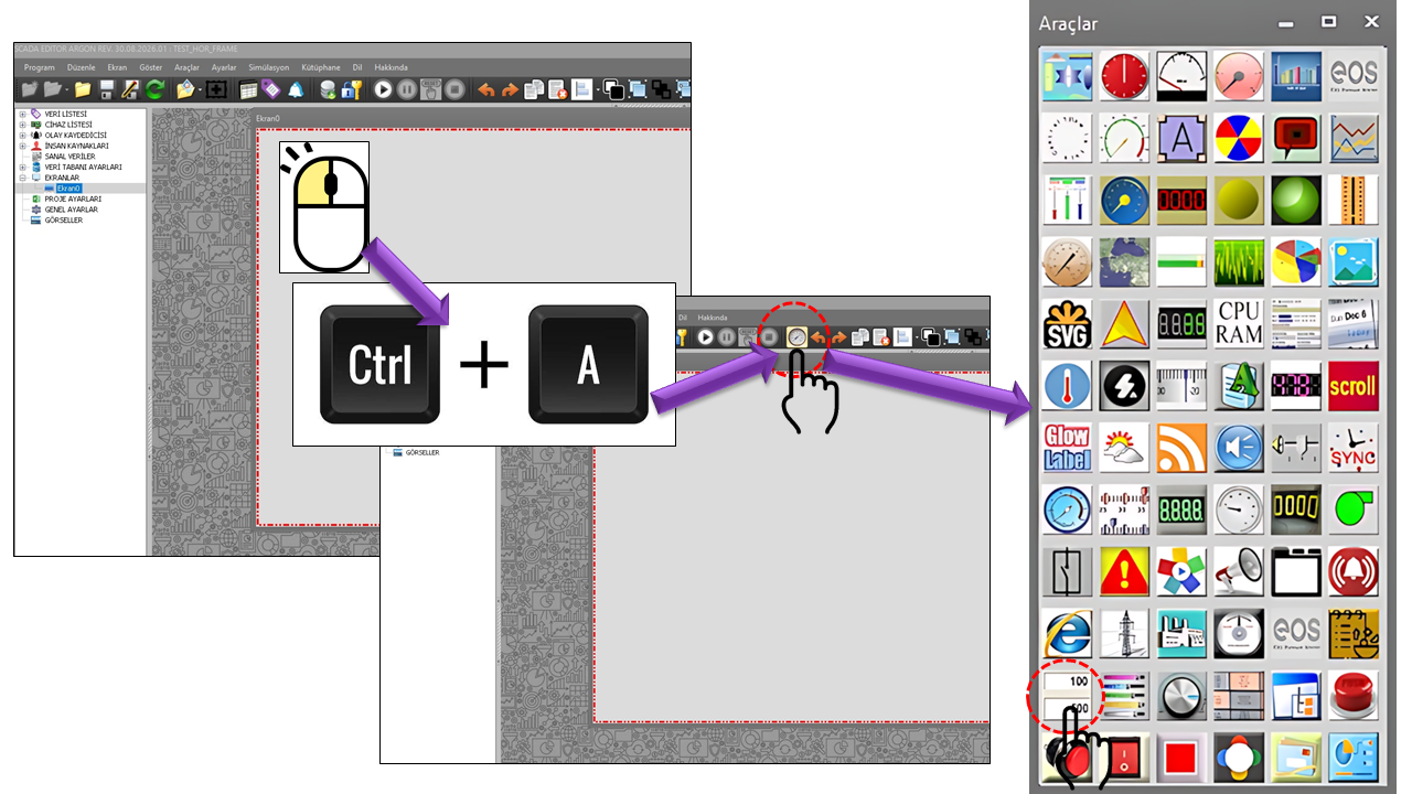
Unlike a conventional data display control, the DATA ENTRY BOX (DATABOX) is a user control whose primary purpose is to send data from the SCADA system to the controller. The operator enters or selects a value in the control and sends it to the controller using the APPLY command.
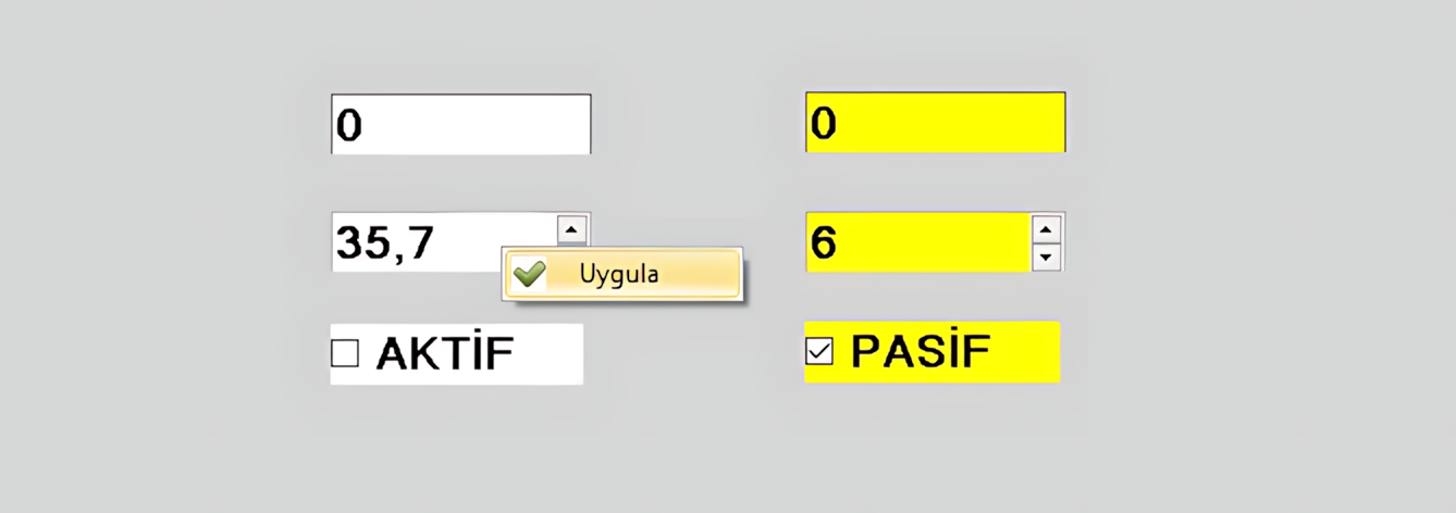
This control can be used in scenarios such as changing a process setpoint, entering a numerical parameter, sending a text-based command or value, or transferring a digital 0/1 signal to the controller. The supported data format depends on the selected DATABOX type.
Because the DATA ENTRY BOX (DATABOX) is a data-writing control,
the AuthorizationLevel property is particularly important.
Allowing a user to send data to a controller can have operational consequences
beyond simply changing a value on the screen.
Therefore, the authorization level must be configured deliberately on screens
where DATABOX is used.
The basic DATABOX workflow can be divided into two main stages: preparing the value and applying the value. The data is written to the controller when the user explicitly selects the APPLY command.
Depending on the selected DATABOX type, the user enters text, adjusts a numerical value, or selects/deselects the checkbox.
For numerical inputs in particular, configured properties such as minimum, maximum, multiplier, and increment must be considered.
The user right-clicks the control to open its context menu.
When the APPLY command is selected from the context menu, the prepared data is sent to the controller.
Core operation: Changing the value in the control and writing that value to the controller are separate operations.
RIGHT-CLICK → APPLY → WRITE TO CONTROLLER
This design allows the user to prepare a value first and then initiate the write operation explicitly with a command.
The DBVeriKutusuTuru enum defines three different operating modes
for DATABOX. Each type addresses a different data-entry requirement.
This DATABOX type allows users to enter data in a free-form text field. The user types the required value into the text area.
The entered data is sent to the controller when the user selects APPLY from the context menu opened by right-clicking.
Usage: Free-form text or suitable data representations accepted by the controller.
This DATABOX type allows users to change a numerical value using the up and down buttons.
The value can be adjusted within the configured Minimum Value, Maximum Value, and Increment settings.
Usage: Numerical controller data such as setpoints, limits, parameters, operating points, and similar values.
This DATABOX type produces a two-state value when the user selects or clears the checkbox.
The Checkbox sends only 0 and 1 values. It should therefore be used for digital data.
Usage: 0/1-based digital control data such as On/Off, Enabled/Disabled, Start/Permit, and similar states.
| Enum Value | English Equivalent | Operating Mode | Suitable Data |
|---|---|---|---|
Textbox |
Text Box | Free-form data entry | Text / suitable controller data representation |
Numericupdown |
Numeric Up-Down Box | Adjusting a numerical value using up/down buttons | Numerical data |
Checkbox |
Checkbox | Checked / unchecked | Digital data only: 0–1 |
The following properties are general settings directly defined in the supplied DATA ENTRY BOX (DATABOX) source code. The English equivalents follow the corresponding EOS SCADA terminology.
| Property | English Equivalent | Default | Description |
|---|---|---|---|
UCType |
Control Type | DATABOX |
Defines the type of the DATABOX user control. |
UpdateInterval |
Update Interval | 1000 ms |
Defines the control's update interval. |
DecimalPoint |
Decimal Places | 0 |
Specifies the number of decimal places used to display numerical values. |
Increment |
Increment | 1 |
Defines the step by which the value changes when using the up/down buttons for numerical input. |
UCBackColor |
Control Background Color | Transparent |
Defines the control's background color. |
UCForeColor |
Control Foreground Color | Black |
Defines the control's general text/foreground color. |
UCFont |
Control Font | Arial Narrow, 8.25 pt, Regular |
Defines the font used for text displayed on the control. |
When used for numerical input, the DATA ENTRY BOX (DATABOX) provides the Minimum Value, Maximum Value, Multiplier, and Increment properties to control the value range and the scaling factor applied to the value.
| Property | English Equivalent | Default | Usage |
|---|---|---|---|
MinValue |
Minimum Value | 0 |
Defines the lower limit for numerical input. |
MaxValue |
Maximum Value | 100 |
Defines the upper limit for numerical input. |
Increment |
Increment | 1 |
Defines the step by which the Numericupdown value changes with each up/down action. |
Multiplier |
Multiplier | 1 |
Defines the multiplier used in DATABOX data operations. |
DecimalPoint |
Decimal Places | 0 |
Defines the number of decimal places displayed for the numerical value. |
For example, with a DATABOX configured as MinValue = 0,
MaxValue = 100, and Increment = 5, the user can
change the value in steps of 5. After preparing the desired value, the user
initiates the write operation by selecting APPLY from the
right-click context menu.
This example illustrates how the default values provided in the source code can be used. The actual value range and engineering limits accepted by the controller depend on the project design.
The TextAlignment property defines the horizontal alignment of text
or numerical input within the DATA ENTRY BOX (DATABOX). The source code defines
three options using the GNHizalama enum.
| Enum Value | English Equivalent | Visual Alignment |
|---|---|---|
Center |
Center | Text is centered in the field |
Left |
Left | Text is aligned to the left of the field |
Right |
Right | Text is aligned to the right of the field |
The HeaderText property is used to define the heading displayed
for the DATA ENTRY BOX (DATABOX) control. The default value in the source code
is an empty string.
| Property | English Equivalent | Default | Description |
|---|---|---|---|
HeaderText |
Header Text | "" |
Defines the heading or descriptive text displayed to the user by DATABOX. |
TextAlignment |
Text Alignment | Left |
Defines the alignment of the input text or control text. |
The most important difference between DATABOX and other display controls is that user interaction ultimately results in a write operation. The user first prepares the value in the control. The write operation is then initiated using the APPLY command in the context menu opened by right-clicking.
The value displayed in DATABOX and the value stored in the controller should not be treated as the same thing. The user can prepare a value in the input field; it is sent to the controller only when the APPLY command initiates the write operation.
The Checkbox type is a specialized way of using DATABOX. The user selects or clears the checkbox to choose between two states.
The Checkbox can send only 0–1 values. It should therefore be used for digital data, not for analog or arbitrary numerical values.
In practice, the two checkbox states can correspond to a two-state variable on the controller side.
| Checkbox State | Data Sent | Typical Meaning |
|---|---|---|
| Checked | 1 |
A digital state such as Enabled / On / Permit / Start, depending on the project definition. |
| Unchecked | 0 |
A digital state such as Disabled / Off / Do Not Permit / Stop, depending on the project definition. |
The state names above are illustrative examples. The actual meaning of the 0 and 1 values on the controller side is determined by the engineering definition of the relevant tag/process variable.
DATABOX is not only an input control for sending data. The Fast Graph feature can also be enabled to let users review values received from the controller over a recent period.
When the UseFastGraph property is set to true,
a mini button appears at the bottom of DATABOX.
When the user clicks this button, a graph showing the values recorded
for the data appears.
The user can examine the recent changes in the relevant data through this graph. When the mouse wheel is scrolled, the graph disappears automatically.
| Property | English Equivalent | Default | Description |
|---|---|---|---|
UseFastGraph |
Use Fast Graph | false |
Determines whether the Fast Graph mini button and its associated graph function are enabled. |
FastGraphTimeInterval |
Fast Graph Time Interval | Last30minutes |
Defines the time range to be examined in the Fast Graph. |
UseFastGraph = true.
The GNZamanAraligi enum defines the time intervals available
for the Fast Graph.
| Enum Value | English Equivalent | Graph Coverage |
|---|---|---|
Last10minutes |
Last 10 Minutes | Data from the last 10 minutes. |
Last30minutes |
Last 30 Minutes | Data from the last 30 minutes. |
Last1hour |
Last 1 Hour | Data from the last hour. |
Last3hours |
Last 3 Hours | Data from the last 3 hours. |
Last6hours |
Last 6 Hours | Data from the last 6 hours. |
Last12hours |
Last 12 Hours | Data from the last 12 hours. |
Last1day |
Last 1 Day | Data from the last day. |
Since the default value in the source code is Last30minutes,
the initial time range is the last 30 minutes when
Fast Graph is enabled.
Use involving commands: For DATABOX configurations that can send commands, the user's authorization level must be set to match the operational purpose of the control.
| Enum Option | English Equivalent |
|---|---|
None |
No Authorization |
Monitor |
Monitoring |
Operation |
Operation |
Engineering |
Engineering |
Superuser |
Superuser |
The default value for DATABOX in the source code is defined as:
GNYetkiSeviyesi.Monitor.
DATABOX is intended for screens where operators need not only to monitor a process or equipment parameter but also to send a new value to the controller within the scope of their authorization.
Preparing a numerical setpoint to be sent to the controller for a pump, fan, motor, or process equipment.
Setting a process target temperature using Numericupdown and sending it to the controller with the APPLY command.
Numerically setting the speed or RPM value to be sent to the controller for rotating machinery.
Preparing a 0/1-based digital value with Checkbox and writing it to the controller using APPLY.
Sending data through Textbox in applications where the controller accepts text-based data.
Operator screens where data-writing operations must be performed under controlled conditions using authorization levels.
DATABOX should not be designed merely as a display control whose only purpose is to show the current value. Its design should focus on user input, validation, the APPLY command, and authorization.
| Design Consideration | Recommended Approach | Reason |
|---|---|---|
| Data Type | Select Textbox, Numericupdown, or Checkbox according to the requirement. | To prevent users from sending the wrong type of data. |
| Numerical Range | Configure minimum and maximum values deliberately. | To keep numerical input within the intended operating range. |
| APPLY | Keep the write operation as an explicit user action. | To separate value preparation from writing to the controller. |
| Authorization | Set AuthorizationLevel according to the project's security model. | To control permission to write data to the controller. |
| Checkbox | Use only for 0/1 digital variables. | Because the control produces two-state data. |
| Fast Graph | Enable UseFastGraph when required. | To allow examination of the recent history of the value being written or monitored. |
| Source Structure | English Equivalent | Role |
|---|---|---|
DBVeriKutusuTuru |
DataBox Type | Defines the Textbox, Numericupdown, and Checkbox operating modes. |
GNHizalama |
Text Alignment | Defines the Center, Left, and Right alignment options. |
GNZamanAraligi |
Fast Graph Time Interval | Defines Fast Graph time ranges from 10 minutes to 1 day. |
AuthorizationLevel |
Authorization Level | A security setting associated with DATABOX's data-writing permissions. |
UseFastGraph |
Use Fast Graph | Determines whether the mini graph command is available. |
Multiplier |
Multiplier | Defines the multiplier used in data operations. |
Source limitations: The technical explanations on this page are based on the supplied DATABOX source code and descriptions of its operating behavior. The controller's physical communication protocol, the internal implementation details of the write command, and the validation algorithm are not specified in the provided source excerpt and have therefore not been assumed here.
DATABOX serves a different purpose from other EOS SCADA user controls. Its primary purpose is not to display a value visually, but to send user-defined data to the controller.
The three input types support this purpose in different ways: Textbox provides free-form data entry, Numericupdown provides controlled numerical input, and Checkbox provides 0/1 digital input.
Explicitly performing the write operation through the APPLY command is a fundamental part of operator interaction with the control. Combined with authorization through AuthorizationLevel and optional Fast Graph support, DATABOX becomes a comprehensive SCADA user control that can both send data to the controller and examine the recent history of the values being sent or monitored.
EOS SCADA design principle: On screens using DATABOX, the concepts of “changing a value” and “writing a value to the controller” must be visually and functionally separated. Users must clearly understand which data they are sending, what the APPLY operation does, and what authorization level is required to perform the operation.
Free Software Download Center
Software for industrial data collection, monitoring, and analysis.

Technical Support
Software documentation, sample code, and practical technical information.
You can contact us regarding EOS software, technical documentation, or industrial data communication.