
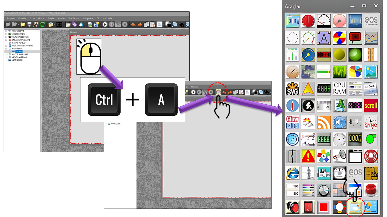
What Is the PICTURE BUTTON?

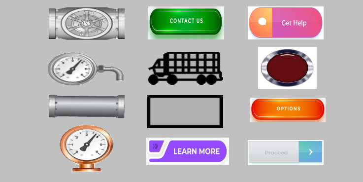
With the picture button approach, instead of requiring the operator to read text alone, an image representing the function of the command can also be displayed on the button surface. For example, symbols representing start, stop, open, close, pumps, valves, or equipment can make the button's visual meaning clearer.


Two different operating types are defined in the source code of the PICTURE BUTTON: Pushpicturebox and Tactpicturebox. These two options are fundamental properties that determine how user interaction is transmitted to the controller.

Difference Between a Visual Button and a Command Button

An image may simply provide information to the user. However, depending on its configuration, the PICTURE BUTTON is a user control that issues commands. Therefore, just as important as the button's appearance is which value it can send to the controller, when it sends it, and which user authorization level is required.

Two Basic Operating Modes: TACT and PUSH

The fundamental difference between the two PICTURE BUTTON modes is when the OFF value is sent. This distinction is especially important for control operations involving motors, pumps, valves, resets, triggers, and similar functions.

TACT / Tactpicturebox

Momentary Button

The ON value is sent for as long as the button is held down. When the operator moves away from/releases the button, the OFF value is sent.

PRESSED β†’ ON
HELD DOWN β†’ ON
RELEASED β†’ OFF

In the default logic example, this behavior can be understood as 1 β†’ pressed and 0 β†’ released. However, different command values can be configured for ON and OFF in an actual application.

PUSH / Pushpicturebox

Pulse Button

When the button is pressed, the ON value is sent first. Then, according to the configured timing or transition logic, the OFF value is sent automatically. Holding the button down does not maintain the ON state continuously as it does in TACT mode.

PRESSED β†’ ON
DEFINED DURATION / PULSE COMMAND
β†’ OFF

This approach is particularly useful in applications where a one-time trigger/pulse is required by equipment or a controller program.

VERY IMPORTANT: TACT and PUSH are not the same. In TACT mode, the ON command remains active while the user holds down the button. In PUSH mode, the OFF command follows the ON command automatically. The mode must not be selected without knowing which behavior the controller-side program expects.


Comparison of TACT and PUSH

START EQUIPMENT PICTURE BUTTON

Property TACT / Momentary PUSH / Pulse
When the button is pressed The ON value is sent The ON value is sent
While the button is held down The ON state is maintained The pulsed command cycle continues; the transition to OFF occurs automatically
When the button is released The OFF value is sent The OFF value is part of the cycle, independently of the user's release action
Basic operating characteristic A command that remains active while held down One-time pulse/trigger
From the controller's perspective The ON/OFF state is linked to the user's action An ON-then-OFF command sequence is generated

Recommended English Terminology

For Tactpicturebox in the source code, the terms "Momentary Button" or, more explicitly, "Hold-to-Activate Button" may be used. For Pushpicturebox, "Pulse Button" or "Pulse Command Button" may be appropriate. To preserve the original source-code names in technical documentation, the clearest approach is to present TACT / Tactpicturebox and PUSH / Pushpicturebox together with their English equivalents.

Command Flow Logic

Operator Interaction Presses the button
β†’
PICTURE BUTTON Applies the operating mode
β†’
Controller Receives the command value
Step TACT / Momentary PUSH / Pulse
1. Press ON ON
2. Continued interaction ON Pulse cycle
3. OFF When the user releases the button After the defined operation/pulse duration
4. Result ON/OFF behavior that follows the user's physical button action One-time ON β†’ OFF command sequence

Image and Button Appearance

The most distinctive feature of the PICTURE BUTTON is that the button surface can convey meaning through an image. Separate image files are defined in the source code for the default and pressed states. This allows the normal and interactive states of the button to be visually distinguished.

Default Image

DefaultImageFile

The image used when the button is in its normal state.
Pressed Image

PressedImageFile

The image used when the button is in its interactive state.
Property English Equivalent Purpose
DefaultImageFile Default Image File Specifies the image used in the normal button state.
PressedImageFile Pressed Image File Specifies the image used when the button is pressed or in its interactive state.
DefaultText Default Text Specifies the text displayed in the normal state.
PressedText Pressed Text Specifies the text displayed in the pressed state.
DefaultButtonColor Default Button Color Specifies the button color in the normal state.
PressedButtonColor Pressed Button Color Specifies the button color in the pressed state.
DefaultTextColor Default Text Color Specifies the text color in the normal state.
PressedTextColor Pressed Text Color Specifies the text color in the pressed state.

General and Visual Properties

Property English Equivalent Default Description
UCType Control Type RESΔ°MLΔ° BUTON Defines the type of user control.
UpdateInterval Update Interval 1000 Defines the general update interval of the control.
DecimalPoint Decimal Places 0 Specifies the decimal places used for numeric displays.
UCBackColor Control Background Color Transparent The general background color of the control.
UCForeColor Control Foreground/Text Color Black The general foreground/text color of the control.
UCFont Control Font Arial Narrow 8.25 The primary font used by the control.
ButtonType Button Type Pushpicturebox Determines the TACT/Tactpicturebox or PUSH/Pushpicturebox operating mode.
Opacity Opacity 100 Defines the transparency level of the button.
TransparentBackground Transparent Background false Determines whether the button background is transparent.

Authorization β€” A Critical Security Layer

Since the PICTURE BUTTON can send commands to a user control, the Authorization Level property is particularly important for this control. An operator's ability to see the button on the screen must not be treated as equivalent to being authorized to use it to send commands to the controller.

No AuthorizationNone
MonitoringMonitor
OperationOperation
EngineeringEngineering
SuperuserSuperuser
Enum Option English Equivalent General Meaning in Use
None No Authorization For users who do not have permission to issue commands through the control.
Monitor Monitoring Represents monitoring-level user permissions.
Operation Operation Represents operation-level user permissions.
Engineering Engineering Represents engineering-level user permissions.
Superuser Superuser Represents the highest user authorization level.

Authorization Must Always Be Considered Alongside the Operation

An appropriate authorization level must be defined for PICTURE BUTTON controls that issue start, stop, open, close, reset, or other controller commands. The authorization level should be treated as part of the command-issuing mechanism, not merely as a visual label.

Logic of ON and OFF Command Values

For TACT and PUSH behavior, 1 = ON and 0 = OFF can be used as an example. However, the values sent to the controller in an actual application are not limited to these examples. The user-defined ON/OFF command values must be compatible with the data structure expected on the controller side.

TACT: PRESS β†’ ON | RELEASE β†’ OFF
PUSH: PRESS β†’ ON | PULSE DURATION β†’ OFF

Compatibility with the Controller Program

Before selecting a button mode, determine which command sequence the controller-side logic expects. For example, if a PLC program expects a short trigger, the PUSH approach may be appropriate. If the command is intended to remain active for as long as the user holds down the button, the TACT approach may be considered. The selection must be based on the actual command logic of the controller application.

Applications on SCADA Screens

Starting Equipment

With appropriate authorization, a visually meaningful button can be used to issue start commands for pumps, fans, or similar equipment.

Stopping Equipment

It can help clearly communicate the stop function through the image and text displayed on the button.

Pulse Triggering

PUSH mode can be used for triggering operations that require a short ON β†’ OFF command sequence on the controller side.

Hold-to-Activate Control

TACT mode can be considered for user interactions in which the command remains active while the operator holds down the button.

Valve and Process Control

Images, text, and status indicators can be used together for process commands such as opening and closing.

Authorized Operations

At critical control points, the Authorization Level can be used to restrict access to users with an appropriate profile.

Important Note About Emergency Stops

In general industrial HMI applications, software buttons should not replace emergency-stop functions. Rockwell Automation documentation also states that push-button objects should not be used for emergency-stop purposes and that emergency-stop functions should be implemented using hardwired circuits.

When Should Each Mode Be Used?

Requirement Mode to Consider Reason
ON while the operator holds the button down TACT The OFF command is generated when the button is released.
One-time trigger PUSH The OFF command automatically becomes part of the cycle after the ON command.
The controller expects a short pulse PUSH The command is converted into pulsed behavior.
Command duration depends on user interaction TACT The ON state is linked to the button being held down.
Critical process command Authorization + correct mode Both who issues the command and how it behaves must be controlled.

Technical Specifications Summary

Property Value
UCType RESΔ°MLΔ° BUTON
ButtonType Pushpicturebox / Tactpicturebox
Opacity 100
TransparentBackground false
DefaultImageFile Default Image File
PressedImageFile Pressed Image File
DefaultText Default Text
PressedText Pressed Text
DefaultButtonColor Default Button Color β€” Red
PressedButtonColor Pressed Button Color β€” Lime
DefaultTextColor Default Text Color β€” Black
PressedTextColor Pressed Text Color β€” Black
AuthorizationLevel Monitor

Conclusion

The PICTURE BUTTON is not merely a visual element that changes the appearance of a button on a SCADA screen; when configured appropriately, it is a user control that sends commands to the controller. Image, text, and color options help the operator recognize the command quickly, while the TACT and PUSH modes determine its timing.

Therefore, three elements must be considered together when designing a PICTURE BUTTON: visual meaning + command behavior + authorization. Selecting a mode without properly understanding the difference between TACT and PUSH may lead to unexpected command behavior on the controller side.

The Core PICTURE BUTTON Approach

Communicate through an image β†’ select the correct operating mode β†’ define ON/OFF behavior β†’ assign the appropriate Authorization Level β†’ use the controller command safely.