75%
1. RECTANGLE
Can be used for general-purpose information areas, status boxes, and presenting process values together with text.
EOS SCADA • SHAPE USER CONTROL • GRAPHICAL DISPLAY INTEGRATED WITH DATA
SHAPE INDICATOR (SHAPE) allows you to create distinctive and meaningful visual areas on SCADA screens using various geometric shapes instead of relying solely on standard indicators. These shapes can be combined with text and SCADA data to present process information in a more visual format.
In addition to shapes such as rectangles, squares, ovals, circles, rounded shapes, triangles, and arrows, the control can be extensively configured using properties such as direction, text, borders, shading, hatching, and gradients.

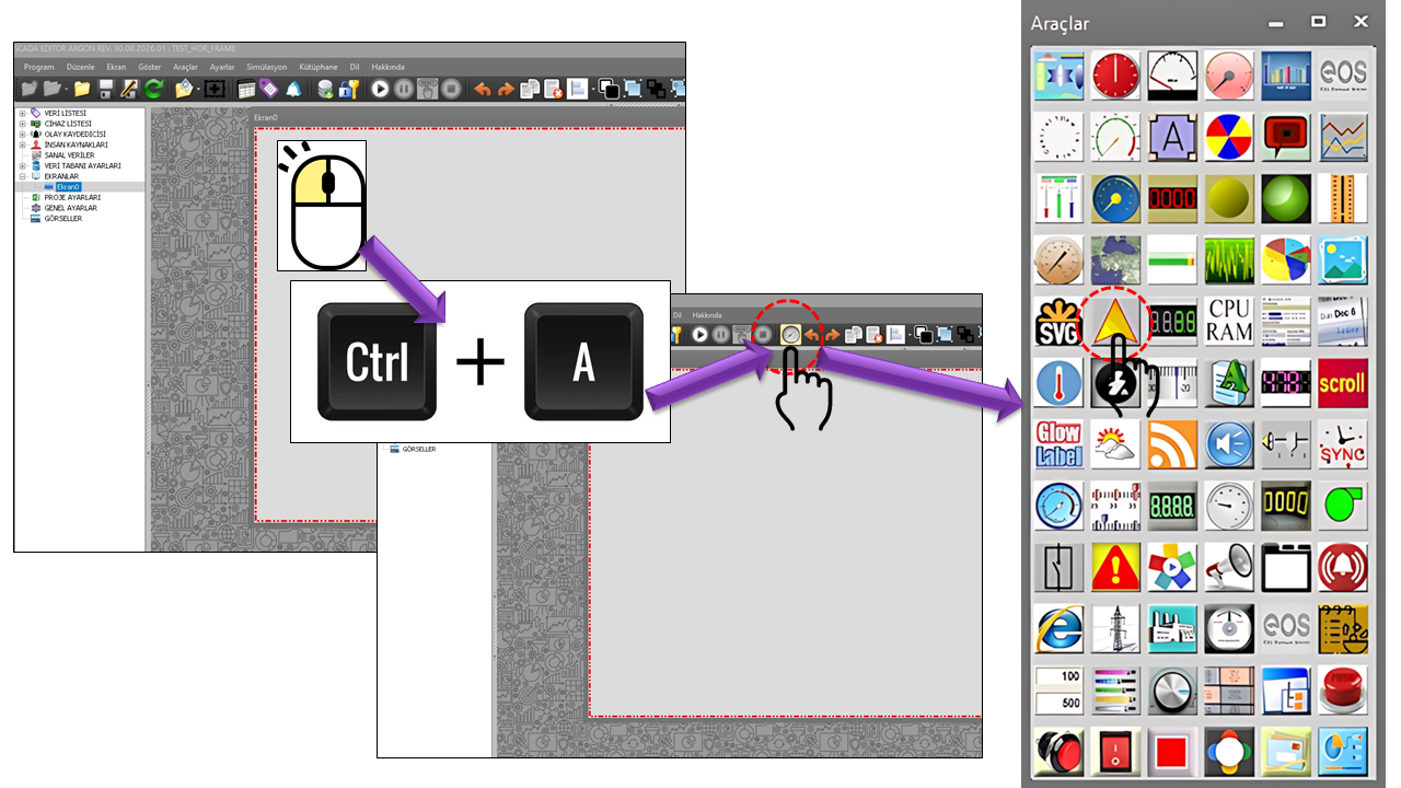
SHAPE INDICATOR (SHAPE) is a user control designed to create different geometric shapes on SCADA screens and use them to visually present process information. Its main strength lies in its ability to create shapes suited to the screen design without being limited to a single, fixed display format.
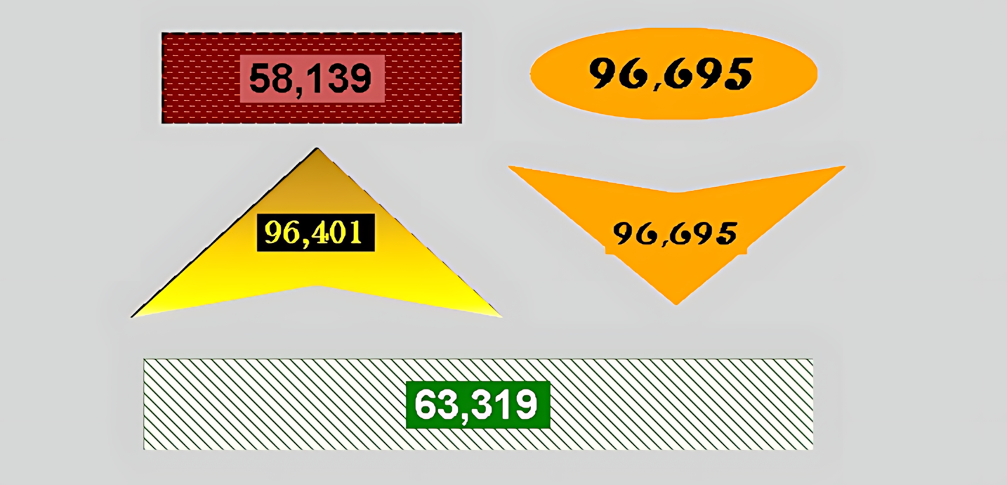
A shape can be used together with its own text, direction, border, shading, hatch fill, and color gradients. This transforms a shape from a merely decorative graphic element into a visual component that can convey a process status, a measurement value, or information intended for the operator.
Core idea: SHAPE allows “data + shape + text + visual styling” to be combined within a single control on the SCADA screen.
One of the most notable features of the SHAPE INDICATOR (SHAPE) control is the ability to select different geometric forms within the same user control. The shapes below represent the CSSekiller options in the source code.
Can be used for general-purpose information areas, status boxes, and presenting process values together with text.
A suitable geometric form for compact status indicators, equipment statuses, or information blocks with fixed dimensions.
Creates a rounded horizontal appearance. It can be preferred for visually presenting temperature, pressure, flow rate, or similar values.
Provides a compact, centralized presentation of data. It can be used to highlight a status, ratio, fill level, or a single important value.
Gives a classic rectangle a softer visual character and can be used in status and information cards.
Softens the corners while preserving the compactness of a square. It can be used for small, clearly defined data areas.
Provides a distinct visual option for representing direction, warnings, status, or values that require attention.
Helps visually communicate concepts such as flow direction, movement, transfer, or directional information.
One of the features that makes the SHAPE INDICATOR (SHAPE) powerful on SCADA screens is that process information can be presented together with a shape, rather than merely drawing the shape itself. The operator can monitor a value, status, or explanatory information within the same visual area through text displayed inside or alongside the shape.
SCADA Data → SHAPE → Shape + Text + Visual Styling → Information the operator can quickly interpret
In addition to its geometry, the shape's direction and the text displayed on it determine how the control is used. ShapeDirection allows the top, bottom, left, or right direction to be selected. ShapeText defines the text to be displayed on the shape.
The shape's appearance can be configured using the BorderColor, BorderStyle, BorderLineStyle, BorderWidth, and DisplayBorder properties. In addition, CurveMode and Curvature can be used to change the shape's corner and curvature characteristics.
ShapeShading lets you select a flat, shaded, or 3D-shaded appearance for the shape. HatchFillStyle allows the fill appearance to be changed using a wide range of hatch and pattern options.
The SHAPE INDICATOR (SHAPE) can create two-color or directional color transitions using the CenterColor, SurroundColor, and GradientMode properties. Multiple gradient elements can also be defined through GRADIENT_COLLECTION, with a gradient position and color specified for each element.
| Property | Turkish Equivalent | Default | Description |
|---|---|---|---|
| UCType | Control Type | SHAPE | Specifies the type of user control. |
| UCName | Control Name | - | Specifies the name assigned to the control. |
| UpdateInterval | Update Interval | 1000 | Determines the control's update interval. |
| DecimalPoint | Decimal Places | 0 | Determines the number of decimal places used to display numeric data. |
| UCBackColor | Control Background Color | White | Determines the control's background color. |
| UCForeColor | Control Foreground Color | Black | Determines the color of the text displayed on the control. |
| UCFont | Control Font | Arial Narrow 12 Bold | Determines the font used for control text. |
| GROUPID | Group ID | "" | Specifies the control's group ID. |
| Property | Turkish Equivalent | Default | Description |
|---|---|---|---|
| ShapeType | Shape Type | Rectangle | Determines the geometric shape used by the control. |
| ShapeDirection | Shape Direction | Top | Determines the direction of the shape. |
| ShapeText | Shape Text | "" | Defines the text to be displayed on the shape. |
| ShapeShading | Shape Shading | Flat | Determines the flat, shaded, or 3D-shaded appearance. |
| HatchFillStyle | Hatch Fill Style | DashedHorizontal | Determines the hatch or pattern used for the shape's fill. |
| CenterColor | Center Color | Red | Determines the center color of the gradient. |
| SurroundColor | Surround Color | Cyan | Determines the surrounding color of the gradient. |
| GradientMode | Gradient Mode | Vertical | Determines the gradient direction. |
| GradientItems | Gradient Items | Collection | A collection of elements containing gradient positions and colors. |
| Property | Turkish Equivalent | Default | Description |
|---|---|---|---|
| BorderColor | Border Color | Red | Determines the shape's border color. |
| BorderStyle | Border Style | None | Determines the border's display style. |
| BorderLineStyle | Border Line Style | Solid | Determines whether the border line is solid, dashed, or dotted. |
| BorderWidth | Border Width | 3 | Determines the width of the border line. |
| DisplayBorder | Display Border | true | Determines whether the shape's border is displayed. |
| CurveMode | Curve Mode | None | Determines which corners or edges of the shape are curved. |
| Curvature | Curvature | 0.1 | Determines the amount of curvature applied. |
The available options for ShapeType are listed below:
| Technical Value | English Description |
|---|---|
| Rectangle | Rectangle |
| Square | Square |
| Oval | Oval |
| Circle | Circle |
| Rnded_rectangle | Rounded Rectangle |
| Rnded_square | Rounded Square |
| Triangle | Triangle |
| Arrow | Arrow |
| Technical Value | English Description |
|---|---|
| Top | Top |
| Bottom | Bottom |
| Left | Left |
| Right | Right |
| Option | Values |
|---|---|
| BorderStyle | None · Single Fixed · Fixed 3D |
| BorderLineStyle | Solid · Dash · Dot · Dash Dot · Dash Dot Dot · Custom |
| ShapeShading | Flat · Shaded · 3D Shaded |
| Technical Value | English Description |
|---|---|
| Horizontal | Horizontal |
| Vertical | Vertical |
| ForwardDiagonal | Forward Diagonal |
| BackwardDiagonal | Backward Diagonal |
CurveMode supports numerous combinations of corners. These options are used to curve specific corners of a shape or multiple corners together.
| Technical Value | English Description |
|---|---|
| None | None |
| All | All |
| Bottomleft | Bottom Left |
| Bottomright | Bottom Right |
| Bottomright_bottomleft | Bottom Right and Bottom Left |
| Bottomright_topleft | Bottom Right and Top Left |
| Bottomright_topleft_bottomleft | Bottom Right, Top Left, and Bottom Left |
| Bottomright_topleft_topright | Bottom Right, Top Left, and Top Right |
| Bottomright_topright | Bottom Right and Top Right |
| Bottomright_topright_bottomleft | Bottom Right, Top Right, and Bottom Left |
| Topleft | Top Left |
| Topleft_bottomleft | Top Left and Bottom Left |
| Topleft_topright | Top Left and Top Right |
| Topleft_topright_bottomleft | Top Left, Top Right, and Bottom Left |
| Topright | Top Right |
| Topright_bottomleft | Top Right and Bottom Left |
HatchFillStyle provides a very extensive collection of patterns. The options below correspond to the definitions in the source code.
A circle or square can display the equipment's operating status and a short description within the same visual area.
A temperature, pressure, flow rate, or similar measurement value can be displayed inside an oval or rounded rectangle.
An arrow can be used to visually indicate the direction of flow in a process line or a transfer movement.
Gradient, hatch, border, and curvature properties can be combined to create distinctive SCADA screens that differ from standard indicators.
Regarding data binding: The provided SHAPE source code explicitly demonstrates shape, text, and visual formatting properties. The page describes use together with SCADA data as a use case; however, the supplied source code excerpt does not separately specify which particular property or mechanism is used for data binding. Therefore, no specific data-binding property name has been assumed here.
UpdateInterval defaults to 1000 ms. DecimalPoint determines the number of decimal places used in numeric displays. The visual structure can be formatted independently using ShapeType, ShapeDirection, ShapeText, border, shading, hatch, and gradient properties.
SHAPE is a flexible user control that enriches the visual design of SCADA screens and incorporates different geometric forms into the presentation of process information. The options rectangle, square, oval, circle, rounded rectangle, rounded square, triangle, and arrow can be used together with text, direction, border, shading, hatch, and gradient properties.
This structure makes it possible to create a visual shape that conveys or explains a value, rather than displaying only a numeric value to the operator. Particularly in custom SCADA screen designs, SHAPE provides a powerful graphical element that can be used alongside standard display components.
Free Software Download Center
Software for industrial data collection, monitoring, and analysis.
Technical Support
Software documentation, sample code, and practical technical information.
You can contact us regarding EOS software, technical documentation, or industrial data communication.