Free Software Download Center
Software for industrial data collection, monitoring, and analysis.
EOS SCADA • STND_BUTTON • COMMAND CONTROL
STANDARD BUTTON (STND_BUTTON) is the EOS SCADA adaptation of the standard Windows Forms Button control. Although its appearance and usage resemble a familiar Windows button, its primary role within SCADA is to convert user interaction into a command sent to a controller.
The control's most important feature is its two operating modes: TACT (Touch / Press and Hold) and PUSH (Momentary / Pulse). The user actions that trigger the ON and OFF values differ between these two modes. This distinction must be configured carefully, especially on screens that send commands to real equipment.

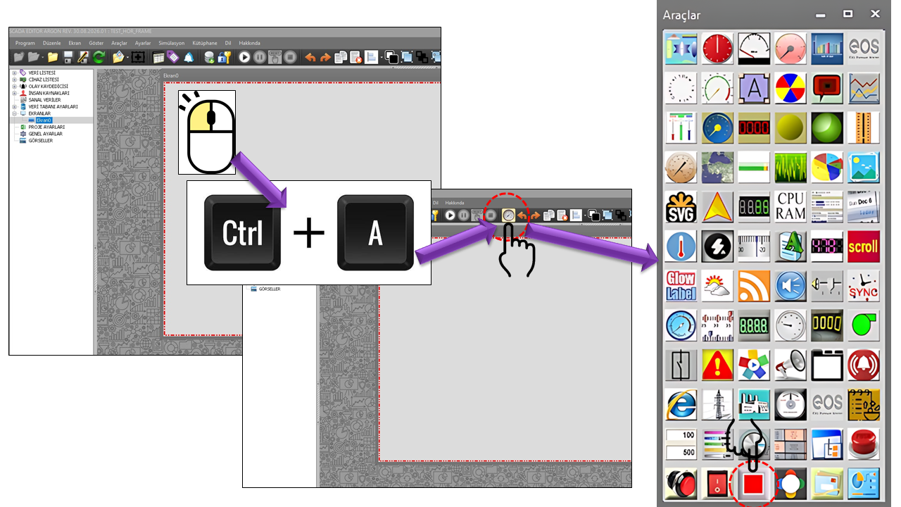
The STANDARD BUTTON is a user control that allows an operator to initiate a command through a visual button on an EOS SCADA screen. Its source structure indicates a control design based on the text, image, appearance, and user interaction features of the Windows Forms Button control. The Windows Forms Button control is designed to initiate an action when clicked and can be visually configured using properties such as text and images.
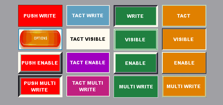
In EOS SCADA, however, this visual interaction can be used directly to write data or commands to a controller, giving it a more critical operational role than an ordinary desktop button. Therefore, AuthorizationLevel should be considered not merely a visual property, but one of the fundamental elements for the safe use of a user control that sends commands.
If STND_BUTTON is connected to a real controller, user interaction with the button can affect the process. Therefore, the ON/OFF values, operating mode, and authorization level must be verified before commissioning. In particular, an incorrect configuration of the difference between TACT and PUSH may cause the command duration and the timing of the OFF command to differ from expectations.
The most important setting of STND_BUTTON is the ButtonType
property. The source code defines two options under the
STDugmeTuru enumeration: Push and
Tact. Consistent with earlier EOS terminology, this
documentation uses the names TACT / Momentary (Hold-to-Press)
and PUSH / Pulse.
As long as the operator holds down the button, the control sends the value representing the ON state. When the operator releases the button, the value representing the OFF state is sent.
When the operator clicks the button, the value representing the ON state is sent first. The value representing the OFF state is then sent after a defined interval. Continuing to hold the button does not change the OFF command timing; the basic behavior is a single ON → OFF command sequence.
TACT links the duration for which the button is held to the ON duration of the command. Releasing the button generates the OFF command. PUSH converts the user's action into a single command pulse: ON on click, followed by OFF after the defined interval. Consequently, the two modes can produce entirely different control behaviors even when they use the same physical button appearance.
| Stage | TACT / Momentary | PUSH / Pulse |
|---|---|---|
| The operator presses the button | ON value is sent | ON value is sent |
| The operator holds the button | ON state is maintained | The defined pulse cycle for sending OFF continues |
| The operator releases the button | OFF value is sent | Basic behavior remains unchanged; OFF is sent after the defined interval |
| Command structure | Depends on the user's press/release action | ON → defined interval → OFF |
The basic properties of the STND_BUTTON control are configured using the parameters below. Property names are presented using their technical names from the source code, while their Turkish equivalents follow the EOS terminology dictionary.
| Property | EOS Turkish Equivalent | Default | What Does It Do? | Where Is It Used? |
|---|---|---|---|---|
UCType |
Control Type | STND_BUTTON |
Defines the type of the control within EOS SCADA. | All screens where the standard button control is selected. |
UpdateInterval |
Update Interval | 1000 |
Determines the update interval of the control. | When the data associated with the button is evaluated periodically. |
DecimalPoint |
Decimal Places | 0 |
Determines the decimal-place setting used for numerical data display. | Configurations in which the control is associated with numerical data. |
UCBackColor |
Control Background Color | Transparent |
Determines the basic background color of the control. | For overall visual consistency on the SCADA screen. |
UCForeColor |
Control Foreground Color | Black |
Determines the basic text color of the control. | For the appearance of the button text. |
UCFont |
Control Font | Arial Narrow, 8.25f |
Determines the font used by the control. | For adjusting the readability of button text. |
| Property | EOS Turkish Equivalent | Default | Description |
|---|---|---|---|
ButtonType |
Button Type | Push |
Selects whether the button operates in TACT/Momentary or PUSH/Pulse mode. |
DefaultImageFile |
Default Image File | "" |
Specifies the image file used in the button's default state. |
ActiveImageFile |
Active Image File | "" |
Specifies the image file used for the button's active appearance. |
DefaultText |
Default Text | PUSH |
Determines the text displayed in the button's default state. |
ActiveText |
Active Text | PUSH |
Determines the text displayed in the button's active state. |
DefaultButtonColor |
Default Button Color | Red |
Determines the button color in its default state. |
ActiveButtonColor |
Active Button Color | Lime |
Determines the button color in its active state. |
DefaultTextColor |
Default Text Color | Black |
Determines the text color in the default state. |
ActiveTextColor |
Active Text Color | Black |
Determines the text color in the active state. |
STND_BUTTON can be configured with different visual styles and border
formats, in accordance with the Windows Forms Button approach.
On Windows, settings similar to FlatStyle allow the button
to use flat, standard, or popup-style appearances. Microsoft documentation
also describes the appearance behavior of styles such as Flat
and Popup.
| Property | EOS Turkish Equivalent | Default | Description |
|---|---|---|---|
FlatStyle |
Flat Style | Standard |
Determines the basic visual style of the button. |
FlatBorderStyle |
Flat Border Style | Solid |
Determines the line style of the button border. |
FlatBorderColor |
Flat Border Color | Black |
Determines the border color. |
Flat3DColor |
Flat 3D Color | Gainsboro |
Determines the color used for the three-dimensional visual border effect. |
FlatMouseDownBackColor |
Flat Mouse-Down Background Color | Transparent |
Determines the background color used when the mouse button is pressed over the button. |
FlatMouseOverBackColor |
Flat Mouse-Over Background Color | Transparent |
Determines the background color used when the mouse pointer moves over the button. |
FlatBorderSize |
Flat Border Size | 1 |
Determines the border size. |
| Enumeration | English Equivalent | Operating Principle |
|---|---|---|
Push |
Push / Pulse | The ON value is sent, followed by the OFF value after the defined interval. |
Tact |
Momentary / Hold-to-Press | The ON value is sent while pressed, and the OFF value is sent when released. |
| Enumeration | English Equivalent |
|---|---|
Flat |
Flat |
Popup |
Popup |
Standard |
Standard |
System |
System |
| Enumeration | English Equivalent |
|---|---|
Dashed |
Dashed |
Dotted |
Dotted |
Inset |
Inset |
None |
None |
Outset |
Outset |
Solid |
Solid |
AuthorizationLevel determines the authorization level
required to use the control. The source code defines the options
None, Monitor, Operation,
Engineering, and Superuser. Since this control
sends commands, its authorization configuration is particularly important.
| Enumeration | English Equivalent | Meaning for STND_BUTTON |
|---|---|---|
None |
No Authorization | The level at which the user is not authorized to use the control. |
Monitor |
Monitoring | The default authorization level in the source code; in a real project, it should be assessed together with the command authorization policy. |
Operation |
Operation | An authorization level that can be defined for operational use. |
Engineering |
Engineering | An authorization level that can be defined for engineering-level users. |
Superuser |
Superuser | Defined as the highest user authorization level. |
STND_BUTTON is not a monitoring indicator; it is a user control intended to send commands. Therefore, the operations that a user who can access the on-screen button is allowed to perform must be considered as part of the project's security policy. In addition to selecting the correct authorization level, it is important to verify the ON/OFF values and the connected controller variable.
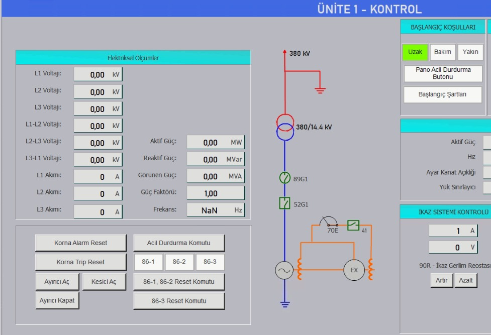
Can be used on a command screen for a motor or fan. TACT may be considered for applications where the operator's hold action is linked to ON/OFF behavior, while PUSH may be used for short trigger commands.
For operations requiring a one-time trigger, such as starting a process cycle, PUSH / Pulse mode can be used with its ON → delay → OFF sequence.
TACT / Momentary mode may be considered for applications where the ON state must continue for as long as the operator physically holds down the button.
Can be used to let operators issue auxiliary commands to a controller through a visible and clearly identifiable button on the SCADA screen.
The difference between the two modes can be seen most clearly in the command flow:
| Mode | When Is ON Sent? | When Is OFF Sent? | Basic Usage Concept |
|---|---|---|---|
| TACT / Momentary | When the button is pressed | When the button is released | The hold duration is linked to the ON duration of the command. |
| PUSH / Pulse | When the button is clicked | After the defined interval | Generates a single ON → OFF pulse. |
It is recommended that the command flow be verified in a controlled manner before connecting STND_BUTTON to real equipment. In Windows Forms, clicking a button is a user interaction event. Since this interaction in EOS SCADA is converted into a controller write operation, it is important to distinguish visual testing from process testing. Windows Forms documentation states that Button supports initiating actions through clicks and handling various keyboard and mouse interactions.
| Topic | Key Property | Summary |
|---|---|---|
| Control type | UCType |
STND_BUTTON |
| Operating mode | ButtonType |
TACT / Momentary or PUSH / Pulse |
| ON/OFF behavior | Mode-dependent | TACT: press/release; PUSH: ON → interval → OFF |
| Visual state | Default / Active | Text, images, and colors can be configured independently. |
| Visual style | FlatStyle |
Flat, Popup, Standard, System |
| Border | FlatBorderStyle |
Dashed, Dotted, Inset, None, Outset, Solid |
| Security | AuthorizationLevel |
None, Monitor, Operation, Engineering, Superuser |
Conclusion: Although STND_BUTTON looks like a familiar Windows Forms button, its primary value within EOS SCADA is its ability to convert user interaction into a command directed to a controller. In particular, the behavioral difference between TACT and PUSH and the AuthorizationLevel setting are fundamental to using the control correctly and safely.
Free Software Download Center
Software for industrial data collection, monitoring, and analysis.

Technical Support
Software documentation, sample code, and practical technical information.
You can contact us regarding EOS software, technical documentation, or industrial data communication.