
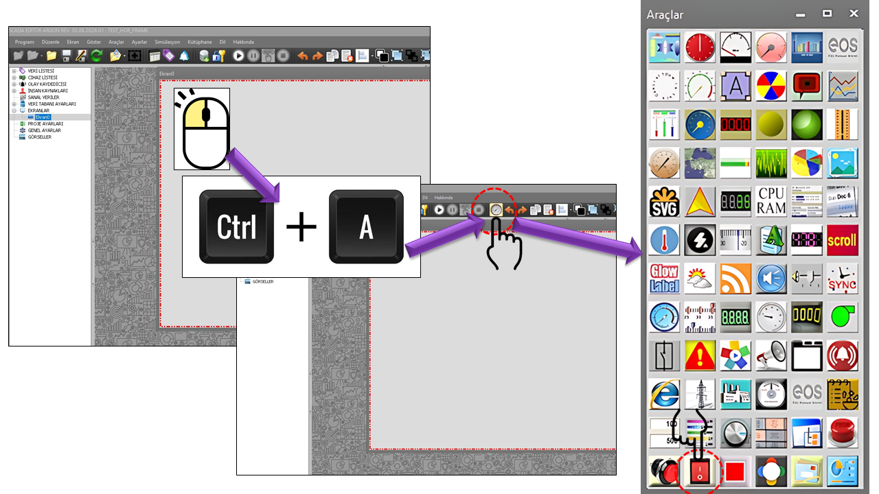
About SWITCH BUTTON

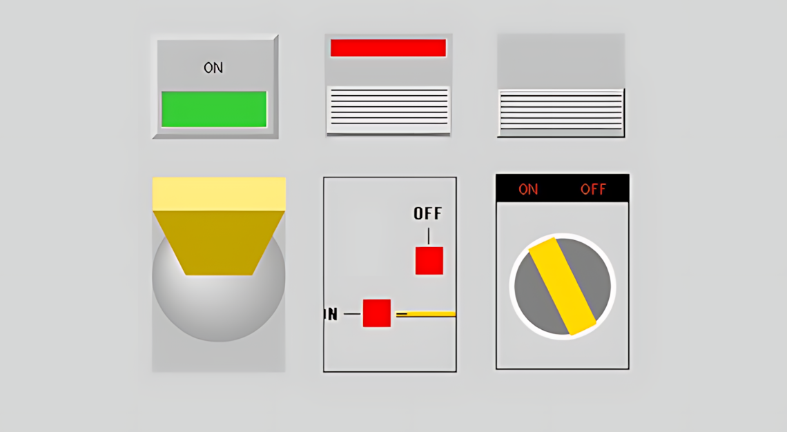
SWITCH_BUTTON allows the operator to perform a command or change a state on a SCADA screen through a visual interface that gives the impression of using a physical switch. The SBSwitchTuru enumeration in the source code defines six different switch appearances.


An important characteristic of these six appearances is that they change the visual interaction model presented to the operator rather than the fundamental command logic of the control. The electrical details of a physical field toggle, rocker, or rotary switch should not be assumed to be identical to the command-writing behavior of this user control within SCADA. Here, these names primarily describe the visual and interactive design language. General switch terminology also describes the physical characteristics of these switch types in a similar way.

One Control, Six Different Visual Styles

With SWITCH_BUTTON, a switch appearance suited to the operator screen design can be selected. The same command function can therefore be represented with different visual characteristics, such as a lever, rocker, LED, rotary, or panel-style switch. Especially in control panels, the switch shape is an important visual element that helps the operator identify the control at a glance.

Six Switch Types

The following six types are defined directly by the SBSwitchTuru enumeration in the source code. Treating each type as a distinct visual style is one of the key strengths of SWITCH_BUTTON.

1. TOGGLE SWITCH

Switchtoggle

Visually represents the idea of moving a lever from one position to another. Toggle switches are generally associated with switching between two positions and maintaining the selected state.

SCADA application: Presenting two-state commands, such as On/Off, Enabled/Disabled, or other permitted two-state operations, using a clearly identifiable switch appearance.


2. LED SWITCH

Switchled

This visual type emphasizes the switch state with a light indicator. The DefaultColor, SwitchedColor, OnStateText, and OffStateText properties in the source code can also help distinguish the state through color and text.

SCADA application: Highlighting the status of a motor, pump, or permissive command through a lighted interface.

3. LEVER SWITCH

Switchlever

This switch appearance emphasizes the position of an elongated lever or handle. It allows the operator to perceive the switch position in a way similar to a physical control lever.

SCADA application: Representing a machine operating permissive, process mode, or two-state operating command through the lever position.

4. ROCKER SWITCH

Switchrocker

Represents a switch with an actuator that rocks to either side around a central axis. The defining characteristic of physical rocker switches is likewise an actuator that pivots between two sides.

SCADA application: Presenting two-state field commands through a wide, easily recognizable interface that resembles a panel-mounted switch.

5. ROTARY SWITCH

Switchrotary

Visually represents the idea of turning a central knob. In general rotary-switch terminology, rotation is used to select different positions or options; in the SWITCH_BUTTON source code, this appearance is one of the visual types of the same switch control.

SCADA application: Screens where the operator needs to recognize a switch command through a rotary-control appearance.

6. PANEL SWITCH

Switchpanel

This is a compact switch appearance perceived together with its surrounding housing and status indicator, as if mounted on a panel. Panel-style switches are commonly used in industrial applications and control panels.

SCADA application: Creating compact, clearly identifiable switches with status text on screens where a control-panel aesthetic is desired.

Operating Principle

From a SCADA perspective, the basic operating flow of SWITCH_BUTTON is based on associating the operator's interaction with the visual switch with the command to be sent to the controller. The source code defines LevelThreshold = 0.5 as the threshold used for two-state visual evaluation. However, because the supplied source excerpt does not separately show which physical data point receives the command or which command values are written, this section explains only the visual and threshold behavior supported by the source code.

1. OPERATORInteracts with the switch appearance.
2. STATEThe control's two-state visual logic is evaluated.
3. COMMANDThe operation to be sent to the controller is executed.
4. VISUAL FEEDBACKColor, text, and switch appearance reflect the state.

A User Control That Sends Commands to the Controller

SWITCH_BUTTON should not be considered a monitoring indicator. Since operator interaction may trigger an operation on the controller, incorrect use can affect process behavior. Therefore, the connected data point, the meaning of the command, and user permissions must be carefully verified before commissioning. Particularly for critical equipment, the actual field state must not be assumed to have been definitively confirmed merely by looking at the switch's visual state.

General and Visual Settings

Property EOS Turkish Equivalent Default Description
UCType Control Type SWITCH_BUTTON Defines the user control as type SWITCH_BUTTON.
UpdateInterval Update Interval 1000 Determines the control's update interval.
DecimalPoint Decimal Places 0 General numeric display setting for the control.
UCBackColor Control Background Color Transparent Determines the control's background color.
UCForeColor Control Text Color Black Determines the control's general text color.
UCFont Control Font Arial Narrow, 8.25 pt Determines the control's general font.
LevelThreshold Level Threshold 0.5 The threshold value used for two-state visual evaluation.
DefaultColor Default Color Red Determines the visual color of the switch in its default state.
SwitchedColor Switched Color Lime Determines the color used when the switch is in the switched state.
CursorColor Cursor Color Silver Determines the color of the switch's moving or position-indicating visual component.
ButtonColor Button Color Gold Determines the primary color of the switch button or actuator.
CursorThickness Cursor Thickness 40 Determines the thickness of the cursor graphic.
DisplayBoder Display Border false The technical property name from the source code is preserved; this setting determines whether the border around the switch is displayed.
BorderColor Border Color Black Determines the border color when the border is displayed.
BorderThickness Border Thickness 1 Determines the border thickness.
BorderStyle Border Style Flat Determines the visual style of the border.

State Text

The switch state can be communicated not only through color or shape but also directly through text. The source code defines ON and OFF as the default text values.

Property EOS Turkish Equivalent Default Description
OnStateText On-State Text ON The text displayed when the switch is active or in the switched state.
OffStateText Off-State Text OFF The text displayed when the switch is in its default or inactive position.

Choosing Text for the Operator Interface

Technical screens can use ON / OFF, or short status labels consistent with the process terminology can be selected. It is important that operators can understand the text at a glance.

Rotation Options

The GNAciBilgisi enumeration determines the on-screen orientation of the switch using four fixed angles. This allows the same switch appearance to be used in layouts suited to either horizontal or vertical placement.

Technical Value Option Description
Zerodegrees 0 Degrees Default orientation.
Ninthydegrees 90 Degrees Rotates the switch appearance by 90 degrees.
HundredEightydegrees 180 Degrees Rotates the switch appearance by 180 degrees.
Twohundredseventhydegrees 270 Degrees Rotates the switch appearance by 270 degrees.

Border Options

The SBKenarSekli enumeration determines how the visual frame surrounding the switch is drawn. These options can be used particularly to enhance the panel appearance and make the switch boundaries more distinct on the screen.

Technical Value Option
None None
Raisedouter Raised Outer
Raisedinner Raised Inner
Raised Raised
Sunkenouter Sunken Outer
Sunkeninner Sunken Inner
Sunken Sunken
Roundedsides Rounded Sides
Etched Etched
Bump Bump
Adjust Adjust
Flat Flat

Authorization and Safe Operation

Authorization for SWITCH_BUTTON is not merely an interface detail. Since it is a user control that sends commands to a controller, it must be clearly defined which users are permitted to perform which operational actions. The default AuthorizationLevel value in the source code is specified as Monitor.

Authorization Level Is Particularly Important

The presence of a command-sending control on a screen must not imply that every user can execute that command. Authorization levels for controlling critical equipment such as pumps, valves, motors, circuit breakers, generators, and similar components must be considered as part of the project's security approach.

Technical Value Option Meaning
None No Authorization A level at which command execution is not authorized.
Monitor Monitoring Monitoring-level access.
Operation Operation The authorization level used for operational actions.
Engineering Engineering The authorization level used for engineering operations.
Superuser Superuser The highest authorization level.

Example Use Cases

Starting / Stopping a Motor

On a screen where a motor command is represented by a two-state switch, an LED or Rocker appearance can be used. SwitchedColor can distinguish the active state from the default state using DefaultColor; the state can also be displayed using OnStateText / OffStateText.

Starting a Pump

A Lever or Toggle appearance can be selected for pump control so that the operator perceives the command as a physical lever or toggle switch. The selected visual appearance must be distinguished from the actual pump feedback state.

Electrical Control Screen

The Panel appearance can be used to present two-state commands, such as those for circuit breakers, disconnectors, or permissives, within a compact control-panel design. For critical operations, AuthorizationLevel must always be evaluated together with the project's authorization structure.

Quick Reference

Topic Source Code Turkish Equivalent Default
Control UCType Control Type SWITCH_BUTTON
Switch Type ButtonType Button Type Switchled / LED Switch
Rotation Rotation Rotation 0 Degrees
Default Color DefaultColor Default Color Red
Switched Color SwitchedColor Switched Color Lime
Cursor CursorColor Cursor Color Silver
Button ButtonColor Button Color Gold
On State OnStateText On-State Text ON
Off State OffStateText Off-State Text OFF
Authorization AuthorizationLevel Authorization Level Monitor

Conclusion

SWITCH_BUTTON provides significant flexibility in SCADA screen design by presenting a single command control through six different visual switch styles. The Toggle, LED, Lever, Rocker, Rotary, and Panel types each evoke a different kind of physical control for the operator.

Color, state text, cursor thickness, rotation angle, and border options allow the control's visual character to be configured in detail, while AuthorizationLevel enables command permissions to be controlled. The most important point is that this control is not merely a visual indicator; it is a user control that sends commands to a controller. Therefore, data connections, command meaning, and authorization must be considered as carefully as the visual design.

Design Summary

When the right switch appearance + a clear state indicator + an appropriate authorization level + a verified command connection are considered together, SWITCH_BUTTON can serve as a powerful and intuitive SCADA interface element for operator controls.