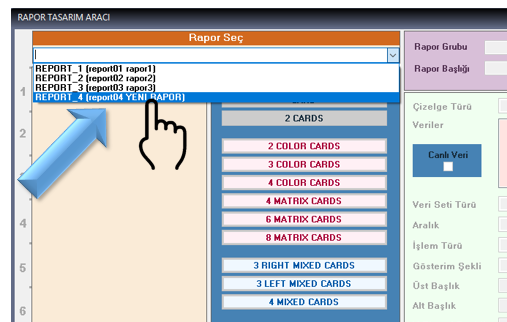
1. Report Selection Panel
Lists previously created reports. Existing reports can be selected, viewed, and edited here.
REPORTDESIGNER • REPORTS • CARDS • CHARTS • ALARMS • LIVE DATA
In today's industrial facilities, data-driven decision-making is not limited to real-time monitoring. Transforming historical process data, events, and alarms into meaningful, reliable, and visually effective reports is an important requirement for accurately evaluating operational, maintenance, performance, and management processes.
Developed to address this need, ReportDesigner is an advanced Web Report Design Software that enables users to design reports for the LIVE DASH web reporting environment flexibly, quickly, and in a controlled manner. Events, alarms, and process data collected by LIVE EVENTS can be transformed into graphics, tables, gauges, and analytical components tailored to organizational requirements and made accessible through the web environment.

ReportDesigner was developed to enable events, alarms, and measurement data collected by LIVE EVENTS to be reported through LIVE DASH. Users can create the overall report structure, add different card types, define the data source and display properties for each card, and publish the completed report through the LIVE DASH WEB interface.
Key operations that can be performed with ReportDesigner:
The fundamental approach of ReportDesigner is to treat a report not as a single monolithic object, but as a modular structure consisting of cards with independent responsibilities. This allows detailed trend charts, alarm analyses, tables, and real-time indicator cards to be used together within the same report.
The ReportDesigner report design tool is located in the same program folder as LIVE EVENTS. To run the tool, the user only needs to execute the ReportDesigner.exe application file located in the relevant folder.
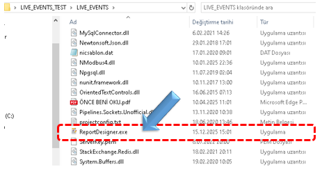
When the application starts, the interface for designing reports to be used in the LIVE DASH web reporting environment is opened. The user can immediately start creating a new report or editing an existing report.
The report design screen consists of panels that separate different tasks. This structure makes it easier to create reports in a controlled manner and subsequently modify the same report.
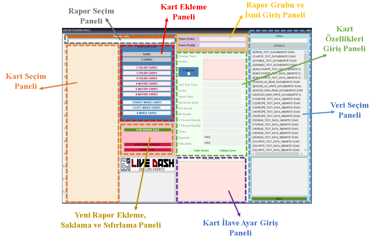
Lists previously created reports. Existing reports can be selected, viewed, and edited here.
Used to create a new report, save an existing report, and reset the cards in a report.
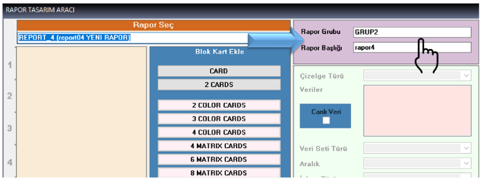
Defines the group in which the report will appear and the name under which it will be displayed in LIVE DASH.
Allows table, chart, gauge, and similar card components to be selected and added to the report.
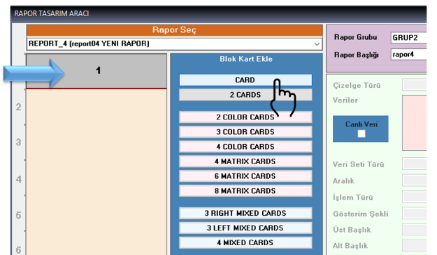
Visually lists the cards contained in the report. Selecting a card allows its properties to be edited and provides quick navigation between cards.
Defines chart type, data set, operation type, display mode, titles, and other fundamental card properties.
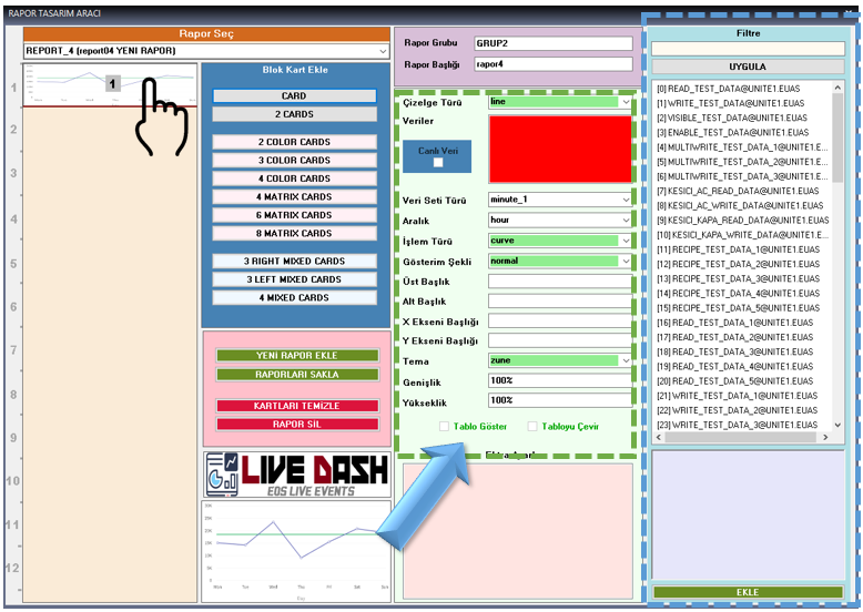
Selects the SCADA data to be used by the card. Archived project data can be listed and filtered.
Provides configuration of advanced chart parameters, thresholds, scales, and gauge color levels.
LIVE DASH reports consist of vertically arranged standard card areas. Each card operates as an independent information area within the report and can have its own data source, calculation method, and visual settings.
Used to display data in graphical or tabular form. Suitable for comparing multiple data sets, time-based analysis, and monitoring trends.
Used to highlight individual data values and display them quickly and clearly. Particularly suitable for making current or summary values visible on management and operational screens.
Depending on the data value, a Color Card can use indicators such as circular, linear, thermometer, and colored LED, as well as numeric LED and standard numerical display options. Color Cards also support live data updates.
The following sequence provides a controlled and complete workflow for creating a new report.
Result: The saved report becomes ready for use in the LIVE DASH WEB interface. Before saving the report, it is important that the validation status of all cards is green to prevent incomplete or incorrect configurations.
An added card is selected from the numbered sub-card areas in the Card Selection Panel. The properties of the selected sub-card are displayed in the relevant panels. The card's behavior within the report is determined by the following fundamental parameters.
| Property | Description |
|---|---|
| Chart Type | Determines whether the card operates as a chart, table, or gauge. |
| Data Set Type | Determines whether data is retrieved on a second or minute basis: second_1 or minute_1. |
| Interval | Determines the time interval over which data is evaluated, such as second, minute, hour, day, month, or year. |
| Operation Type | Defines the mathematical or logical operation applied to the data set. |
| Display Mode | Determines whether data is presented as a chart, summation, combined view, or alarm analysis. |
| Main Title | The main title of the card. A short expression summarizing the card content is recommended. |
| Subtitle | A more detailed description supporting the main title. |
| X Axis | Defines what the horizontal axis represents, such as time, hour, or second. |
| Y Axis | Defines what the vertical axis represents, such as power (MW) or production (MWs). |
| Theme | Determines the card's color palette and overall visual appearance. |
| Width / Height | Determines the horizontal and vertical dimensions of the card. Values can be entered as percentages or pixels. |
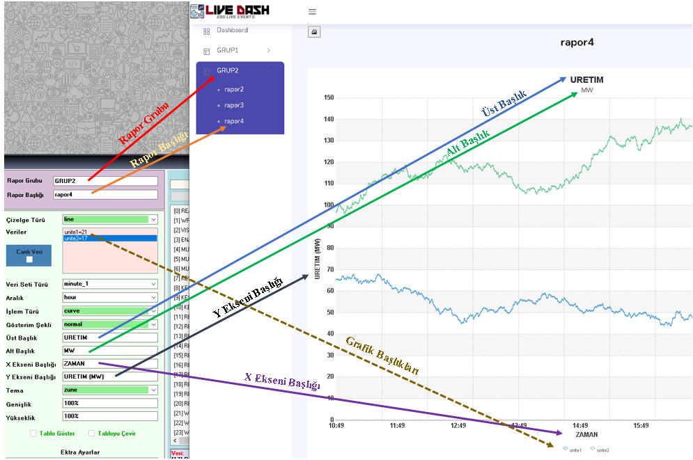
The chart type directly determines the purpose for which a card is used. ReportDesigner provides numerous display options for different data types and analysis requirements.
Available chart types include zoomline, zoomlinedy, line, logline, spline, scatter, zoomscatter, kagi, column3d, column2d, logcolumn2d, bar3d, bar2d, area2d, splinearea2d, pie2d, pie3d, doughnut2d, doughnut3d, tabulator, and various 3D visualizations.
Available options include alarmlist, funnel2d, funnel3d, pyramid2d, pyramid3d, radar, marimekko, pareto2d, pareto3d, radial, timeline, heatmap, sankey, chord, and various column/pie visualizations.
Available displays include singledata, 7segmentdisplay, 14segmentdisplay, 16segmentdisplay, cylinder, lineargauge, angulargauge, halfangular, bulb, and thermometer.
Data Set Type determines the resolution at which data is retrieved from the database. When second_1 is selected, one day's data consists of 86,400 data points; when minute_1 is selected, it consists of 1,440 data points.
Performance Note: As the number of data points increases, report generation time and daily data volume also increase. Therefore, using minute_1 in reports provides a more balanced solution in terms of processing time and storage size for most scenarios.
The Interval parameter determines the time period over which data is evaluated: second, minute, hour, day, month, year. This selection is particularly important for integral calculations. For example, hour corresponds to hourly integral evaluation, while day corresponds to daily integral evaluation.
Operation Type determines the mathematical or logical operation applied to the selected data set. Available options may vary according to the chart type.
| Operation | Meaning |
|---|---|
| curve | Standard line chart. |
| integral | Integral value of the data. |
| counter | Evaluation of the counter value when the SCADA data has counter characteristics. |
| maximum | Highest value within the selected time interval. |
| minimum | Lowest value within the selected time interval. |
| recent / last | Most recent value within the selected time interval. |
| average | Average value within the selected time interval. |
| uptime | Total device operating time based on exceeding the defined threshold. |
| downtime | Total device downtime based on remaining below the defined threshold. |
| dayint | Daily integral value of the data. |
Display Mode determines how selected data is presented on the card. The same data can provide different analytical perspectives through different display options.
SCADA and standard charts:
ALARM lists: The options showtop1, showtop5, showtop10, showtop20, showtop30, showtop50, and showall can be used to display the most frequently occurring alarms or all alarms.
For ALARM analysis, relational analysis options such as location2level, location2group, location2type, group2type, group2level, type2level, type2group, level2type, and level2group can be used.
For Timeline, inalarms presents incoming alarms, inoutalarms presents incoming and outgoing alarms in a Gantt-like time display, while events presents events on a timeline.
Card readability depends not only on selecting the correct data, but also on labeling the data correctly and presenting it at an appropriate size on the screen.
When entering a percentage value, the % character must be added at the end, for example 100%.
Allows the tabular equivalent of graphical data, especially hourly or daily integrals, to also be displayed in the report.
Changes the row and column arrangement in cards where table display is enabled, presenting the same data from a different perspective.
In charts that require data selection, the operation is performed through the Data Selection Panel. Archived project data is listed, and the list can be narrowed by entering keywords in the filter field at the top of the panel.
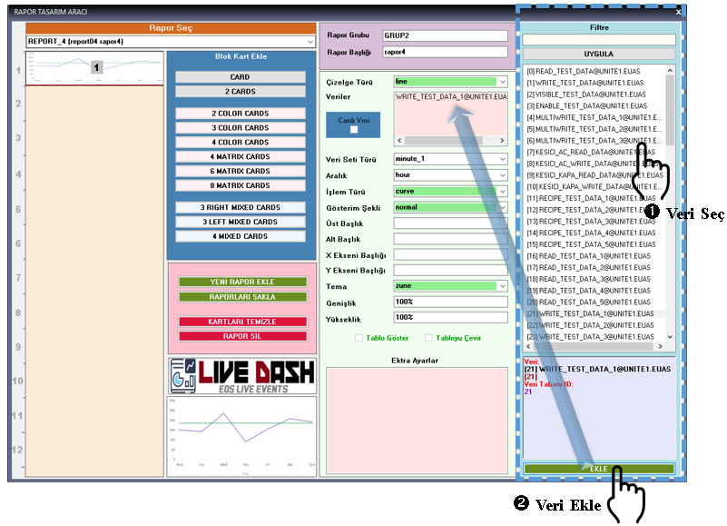
By clicking a data item in the data list, the user can view its details below the list. The selected data is added to the active card's data list using the ADD button. The data definition is associated with the database definition number, ColID.
Important: The data definition format must be preserved as Data Definition = Database Definition Number (ColID). For example, production=55 or unit1=21. For the reporting system to work correctly, the ColID to the right of the equals sign must not be changed.
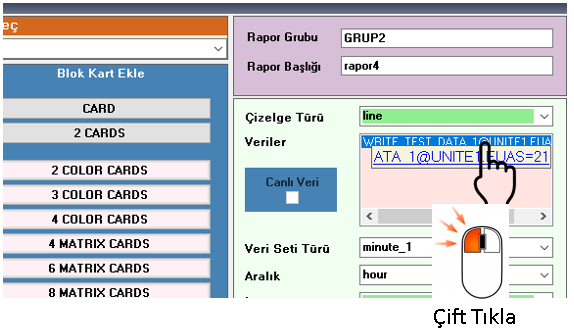 When long automatic definitions need to be adjusted, double-click the data brought into the
card settings to open the quick editing area. Only the definition before the equals
sign may be changed. The format must always be preserved.
When long automatic definitions need to be adjusted, double-click the data brought into the
card settings to open the quick editing area. Only the definition before the equals
sign may be changed. The format must always be preserved.
To delete data, right-click the selected data and use the Delete option from the menu. Some card and chart types may not require data selection; for example, data selection is not required for alarm-type charts.
ReportDesigner provides visual validation information while card properties are being defined. This approach makes it easier to identify incomplete or unnecessary configurations before the report is saved.
Indicates that an entry is incorrect, incomplete, or unnecessary for the selected chart type. Settings marked in red must be corrected.
Indicates that the relevant setting is correct and complete. It is recommended that all cards show a green validation status before saving the report.
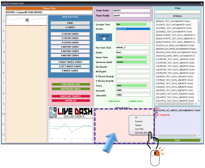
When required, advanced chart-specific settings can be defined through the
Card Additional Settings Entry Panel. These settings vary according to the
chart or gauge type being used.
The Alarm Filter Settings Screen in ReportDesigner is used to determine in a detailed and controlled manner which alarms will be included in or excluded from a report. This allows LIVE DASH reports to become selective, flexible, and multi-criteria reports based on the alarm structure defined in the SCADA project.
Specific alarms can be selected manually from the alarm list. Suitable for reporting a small number of clearly defined alarms.
Text filtering can be performed by alarm name or description. This makes it easier to locate a required alarm in projects containing many alarms.
Alarm locations such as Unit 1, Unit 2, and switchyard can be selected so that only alarms belonging to specific locations are included in the report.
Alarm type, alarm group, and alarm level can be included or excluded from the report.
Include: Add inc_ before the type, group, or level. Examples: inc_Critical, inc_Mechanical, inc_Analog.
Exclude: Add exc_ before the type, group, or level. Examples: exc_Info, exc_TestAlarms, exc_System.
Multiple filter criteria can be used together in the same report. This makes it possible to select alarms belonging to a specific alarm group and specific levels at a specific location, creating reports that are more meaningful from an operational perspective.
Example filter:
As a result of this configuration, only Critical and Warning alarms belonging to the Mechanical group at Unit 1 are included in the report; Info-level alarms are excluded.
This method removes unnecessary alarm clutter from reports and enables targeted alarm lists suitable for operational, maintenance, and management purposes.
When a previously defined alarm filter needs to be changed, double-click the relevant filter row in the Extra Settings panel. The Alarm Filter Settings Screen opens again, and the required changes can be made using the same methods.
Previously created reports can be reopened in the same ReportDesigner environment and updated in terms of report group, report name, cards, data sources, and visual settings.
The saved configuration becomes ready for use in the LIVE DASH WEB interface.
The LIVE DATA feature automatically updates display types selected as Color Cards in LIVE DASH at defined intervals. This transforms the report screen from a static report showing only historical data into a dynamic monitoring screen reflecting the latest values from the data source.
Used with cards configured as Color Cards that display current or most recent values.
Select Live Data in the Card Properties Entry Panel and use recent as the Operation Type.
Important: The Live Data feature can only be used with Color Cards. The refresh interval is defined in the EOSliveevents.xml file using the following parameter:
<LiveDataRefresh>5000</LiveDataRefresh>
The default value is specified as 5000 milliseconds (5 seconds). Very short refresh periods are not recommended because they can cause unnecessary data traffic.
After report design is completed, click the SAVE REPORTS button in the New Report Addition, Save, and Report Reset Panel.
After saving, the report becomes available in the LIVE DASH WEB interface. Before saving, it is important to verify that the validation status of all cards is green to prevent incomplete or incorrect card configurations.
Recommended workflow: Create the report → define the group and name → add cards → define card properties → select data → define alarm filters → configure additional settings → check validation status → save the report → view it in LIVE DASH WEB.
ReportDesigner can be considered not merely a chart creation tool, but a modular reporting layer that organizes operational data collected by the LIVE EVENTS infrastructure according to different decision-making levels.
Enables current and historical SCADA data to be examined using trends, tables, and summary indicators.
Enables alarm density and alarm behavior to be examined more meaningfully using location-, group-, type-, and level-based filters.
Hourly, daily, monthly, and annual evaluations can be performed using second- or minute-based data sets.
Color Cards and the LIVE DATA feature can make the report screen reflect current operating values.
This structure allows the same reporting environment to be configured for different purposes, including operations, maintenance, performance, alarm management, and management monitoring.
LIVE DASH ReportDesigner is a flexible report design tool used to transform process, event, and alarm data collected by LIVE EVENTS into web-based reports. Normal Card and Color Card structures allow detailed analyses and rapid status indicators to be combined within the same report.
Selecting the correct data set, appropriate operation type, correct display mode, and required alarm filters together ensures that reports are meaningful not only visually but also operationally. After report design is completed, the process is finalized by checking validation statuses, saving the report, and publishing it in the LIVE DASH WEB environment.

Free Software Download Center

Technical Support
For technical questions, software support, and information requests, please contact EOS Industrial Software Hub.