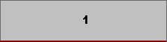
Single Card Layout
A single card occupies the horizontal card area. It is particularly suitable for detailed presentation of SCADA and ALARM data in graphical or tabular form.
Example: Unit active-power trend or detailed alarm list.
NORMAL CARD • COLOR CARD • CARD LAYOUT • CHART TYPES
LIVE DASH ReportDesigner supports different combinations of Normal Cards and Color Cards so that information can be presented clearly and effectively on report screens. Proper card placement allows different levels of information to be presented together on the same screen and helps users recognize critical information more quickly.
This page explains the supported card layout options and the fundamental chart types in LIVE DASH, together with their intended uses, applications in energy and SCADA systems, and the underlying design approach.

LIVE DASH ReportDesigner provides a range of design options to meet different reporting needs, from a single card to multi-card color matrices and mixed layouts in which Normal Cards and Color Cards are used together.
When selecting a layout, it is important to consider not only how many cards are displayed on the screen, but also the priority of the information, its relationship with other information, and how quickly it needs to be perceived by the user.
A single card occupies the horizontal card area. It is particularly suitable for detailed presentation of SCADA and ALARM data in graphical or tabular form.
Example: Unit active-power trend or detailed alarm list.
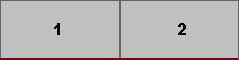
Two cards are positioned side by side horizontally. This layout is suitable for presenting two different data sets that need to be compared within the same field of view.
Example: Active power / Reactive power.
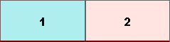
Two Color Cards are displayed side by side. This provides simultaneous monitoring of two different critical states or individual measurement values.
Example: Unit 1 status / Unit 2 status.
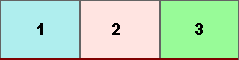
Three Color Cards are arranged horizontally. This is suitable for monitoring the status of subsystems or critical indicators at a glance.
Example: Boiler status / Turbine status / Generator status.
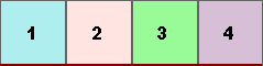
Four Color Cards are displayed in a single row. This enables rapid comparison of multiple critical status indicators.
Example: Electrical / Mechanical / Instrumentation / SCADA system status.
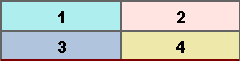
Four Color Cards are arranged in two rows and two columns. This creates a balanced and symmetrical visual layout.
Example: Status monitoring screen for four different generating units.
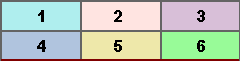
Six Color Cards are displayed in two rows and three columns. This layout is suitable for more detailed status monitoring in medium-scale systems.
Example: Cooling / Fuel / Steam / Water / Electrical / Emissions.
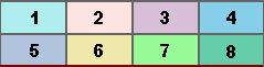
Eight Color Cards are displayed in a two-row, four-column layout. This is suitable for presenting the status summary of many subsystems on the same screen in large facilities.
Example: Comprehensive status summary screen for plant subsystems.
Mixed layouts allow Normal Cards and Color Cards to be used together at different sizes on the same screen. This structure is particularly effective in reports where a detailed primary metric needs to be presented alongside critical summary indicators.
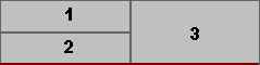
A large Normal Card is placed on the left, while two cards—Normal or Color Cards depending on the requirement—are placed on the right. This layout is suitable for presenting a primary metric together with supporting status information.
Example: Left: Total production; Right: Alarm and efficiency status.
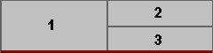
A large Normal Card is placed on the right, while two Normal or Color Cards are placed on the left. In this layout, operational status information has priority, while detailed summary information plays a supporting role.
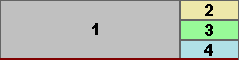
A large Normal Card is placed on the left, while three Color Cards are positioned on the right. This is suitable for highlighting critical KPI indicators alongside detailed analysis.
Example: Right: 3 KPI Color Cards; Left: 1 Alarm List Normal Card.
Design approach: When large Normal Cards are positioned to represent detailed analysis and Color Cards are used for rapid status awareness, the information hierarchy of the screen becomes easier to understand.
The purpose of a card layout is not simply to fit more information onto the same screen. A well-designed LIVE DASH screen shows the user important information first, followed by only as much detail as necessary.
Using too many Color Cards on the same screen can create visual clutter. Critical indicators should be selected carefully, while unnecessary color and indicator density should be avoided.
Color Cards should be preferred especially for conditions that require action or need to be recognized quickly.
Managerial reports may benefit from a simple layout with a limited number of cards, while engineering reports may use more detailed layouts suited to comparison and analysis.
These combinations allow LIVE DASH to create flexible and scalable screens suitable for both operational monitoring and management reporting requirements.
LIVE DASH is a web-based reporting platform designed to visualize information obtained from SCADA and operational data sources in an understandable, comparable, and decision-supporting manner.
Fundamental chart types form the visual backbone of reports and are used to monitor changes over time, compare magnitudes, understand distributions, and analyze relationships between variables.
Time-series charts focus on showing how a quantity changes over time. In LIVE DASH, they can be used particularly for real-time monitoring, performance tracking, and trend analysis.
Shows the time-dependent behavior of continuously changing values such as generation power, flow rate, temperature, and pressure. Spline types provide a smoother and more readable representation of change.
Can be used to visually emphasize cumulative effects or total contribution over time. It can be preferred for energy generation, consumption, and cumulative values.
Time-series charts help operators and engineers quickly identify abnormal behavior, sudden changes, and long-term trends.
Comparison charts allow values belonging to different categories or periods to be compared with one another.
Suitable for comparing generation between units, alarm counts by system, or energy values across different periods. Because of their high readability, they can also be used effectively in management reports.
Uses a logarithmic scale to make comparisons easier when there are very large differences between values.
These charts are primarily intended to provide quick answers to questions such as which value is larger, which unit is falling behind, or how large the difference between periods is.
Distribution charts are intended to visualize the subcomponents of a whole and the proportion represented by each component within the total.
Used to show the proportions of categories within a total. It can be used in summary analyses such as the distribution of generation sources or the proportions of alarm types.
Similar to a Pie chart, it shows proportions; the center area can be used for additional information or visual emphasis.
These chart types are particularly suitable for reports requiring an overview and management perspective.
Visualizes the relationship between two variables. It can be used in engineering analyses such as flow rate–power or temperature–efficiency relationships.
Scatter charts can help identify possible correlations between variables and points that deviate from normal behavior.
In addition to basic visualization, LIVE DASH supports chart types that provide more advanced analytical perspectives. These types create visual models for evaluating multiple dimensions or categories together.
A multidimensional visualization approach that enables several parameters to be compared within the same visual field.
An analytical visualization used to highlight the factors with the greatest impact and associated with the 80/20 principle.
Represents how values leaving a source are transferred to different destinations and in what proportions through visual flow paths.
Timeline charts are a special chart type that visually represents the chronological flow of events, state changes, and time-based processes.
In LIVE DASH, Timeline helps provide quick and clear answers to questions such as what happened when, how long an event lasted, and how events were related to one another.
Timeline displays provide a meaningful visual summary, particularly in reports where alarm and event records need to be examined along a time axis.
Tabulator is a chart/table type that presents data in an organized and detailed row-and-column structure. It plays a complementary role for users who want to examine the information summarized by charts at a raw, numerical, and detailed level.
Unlike charts and indicators, Tabulator does not merely visualize data; it transforms data into a structure that is readable, sortable, and comparable. Therefore, it can be used together with charts in detailed engineering and operational reports.
Alarm lists are fundamental monitoring components in SCADA and monitoring systems for listing alarms that have occurred and their occurrence counts. They provide not only a graphical summary of alarm data, but also a detailed list view when required.
Enables alarm records that have occurred to be examined directly and systematically within a report.
Alarm lists can be used together with Pareto, Radar, Heatmap, Timeline, and similar analytical visualizations to provide different perspectives.
The choice of chart type is as important as the data itself. The same data can communicate different messages when presented using different chart types. Therefore, the first step in selection should be to determine the question the report needs to answer.
| Analysis need | Suitable chart approach |
|---|---|
| View changes over time | Line, Spline, Area |
| Compare categories or units | Column, Bar |
| View proportional distribution | Pie, Doughnut |
| Examine the relationship between two variables | Scatter |
| Compare multiple dimensions | Radar |
| Identify the most influential factors | Pareto |
| View source-to-destination flow relationships | Sankey |
| Examine the chronological flow of events | Timeline |
| Examine detailed numerical records | Tabulator |
| List alarm records | Alarm List |
The examples given while explaining the chart types below are provided to illustrate potential areas of analysis in which the relevant chart types may be used. Some of the analyses included in these examples may not currently be supported by LIVE DASH.
Nevertheless, these analysis types may be developed and added to the capabilities of LIVE DASH in the future.
LIVE DASH card combinations and chart options do more than simply display data: they help ensure that data is perceived by the user at the right speed and in the right context. Normal Cards provide a strong area for detailed analysis, while Color Cards highlight critical individual information.
Likewise, charts such as Line, Spline, Area, Column, Bar, Pie, Doughnut, Scatter, Radar, Pareto, Sankey, Timeline, and Tabulator address different analytical needs. Selecting the right card layout together with the right chart type makes LIVE DASH reports more effective for operational monitoring and management decision support.

Free Software Download Center
Technical Support
For technical questions, software feedback, and EOS-related communication, please contact the EOS Industrial Software Hub.